
Star Wars opening crawl and titles
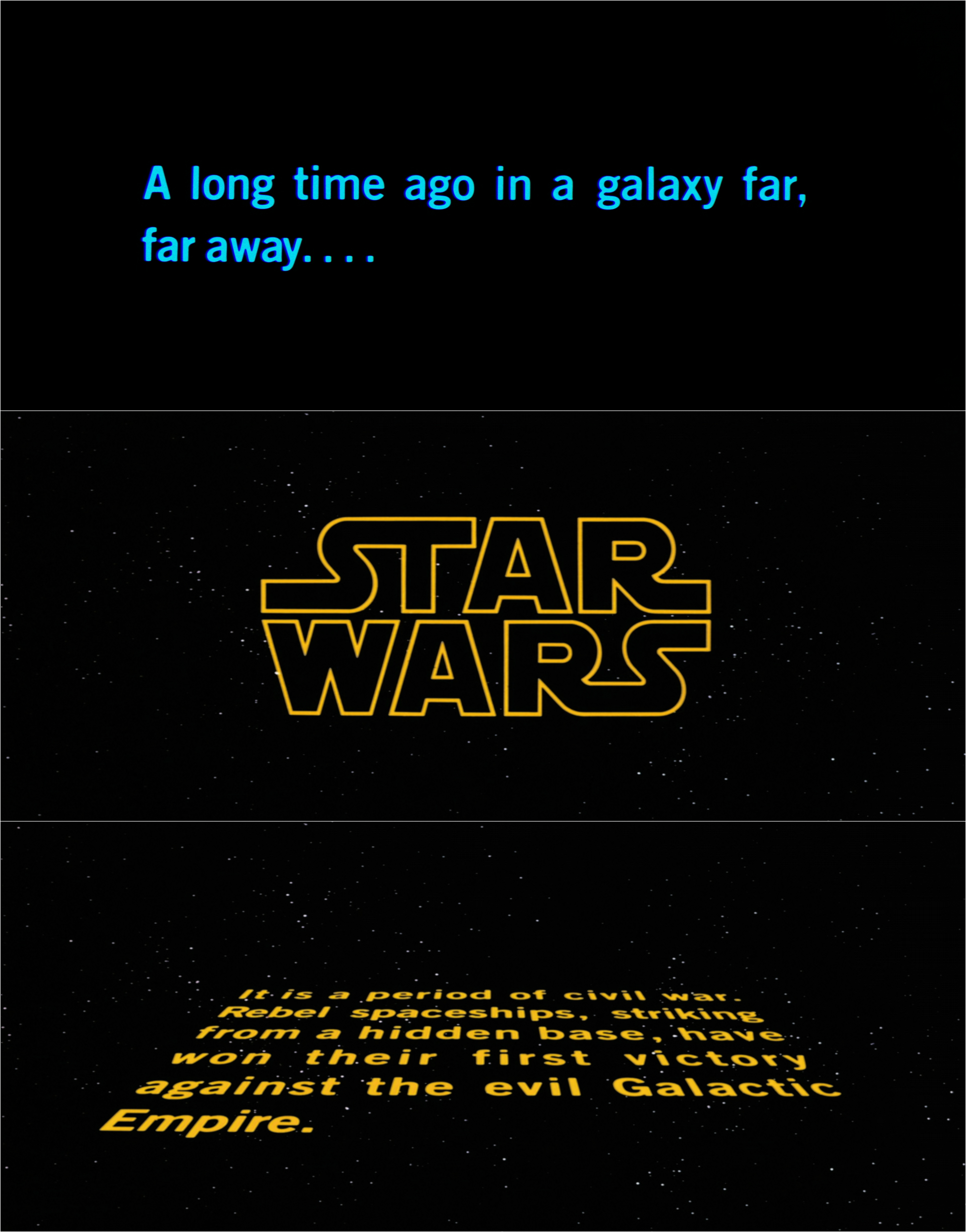
As seen in the original 1977 release, the “A long time ago” titlecard and opening crawl are set in Trade Gothic Bold No. 2.
Opening crawl and titles designed by Dan Perri for the 1977 epic space opera film Star Wars, written and directed by George Lucas.
The “A long time ago” titlecard, opening crawl and end titles are set in Trade Gothic Bold No. 2. The subtitles used for alien characters are set in Trade Gothic Bold with shadow. For the 1981 re-release, the opening crawl was revised and reset in its entirety in News Gothic Bold, with a new episode title set in News Gothic Extra Condensed.
For the film’s title, Perri initially designed a vanishing point logotype for the opening crawl, which was used on posters and merchandising for the film. However, Lucas ultimately settled on using the Star Wars logotype designed by Suzy Rice, which had been featured on early teaser posters and promotional packages. Some revisions to this logotype were made by Joe Johnston with additional adaptations for widescreen presentation made by Perri. According to Rice, the design of the logotype was influenced by Helvetica Black, which is also used for the film’s title in a 1976 teaser trailer, as seen in the last image presented here.
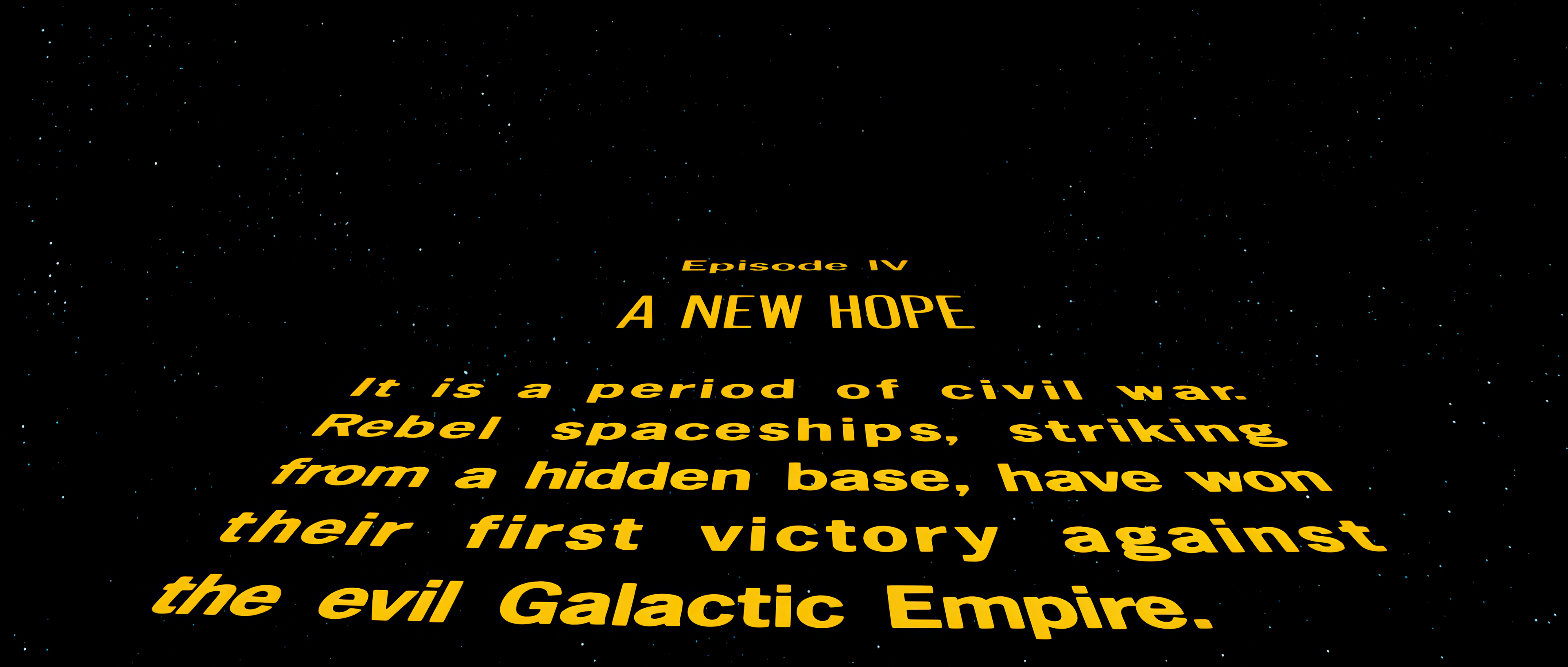
For the 1981 rerelease of the film, the opening crawl was revised and reset in its entirety in News Gothic Bold, with a new episode title set in News Gothic Extra Condensed.
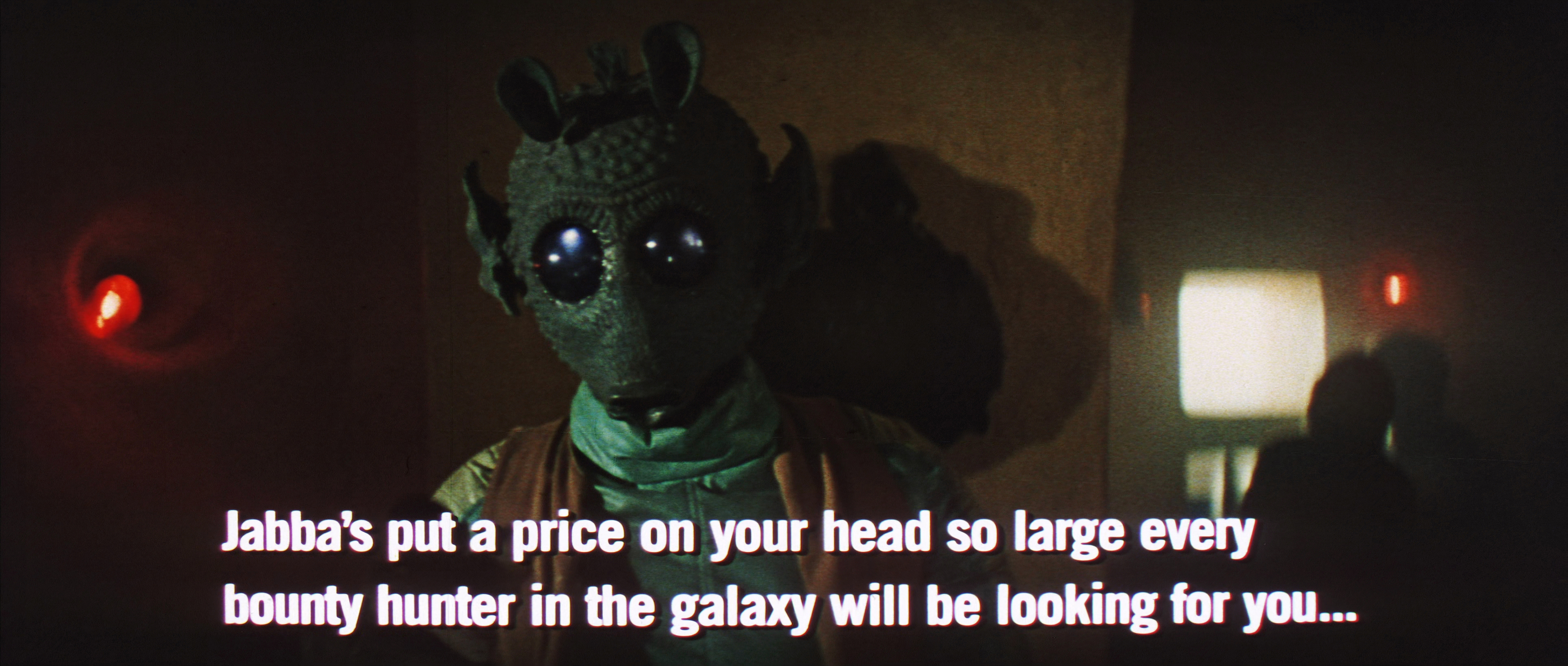
The subtitles used for alien characters are set in Trade Gothic Bold with shadow.
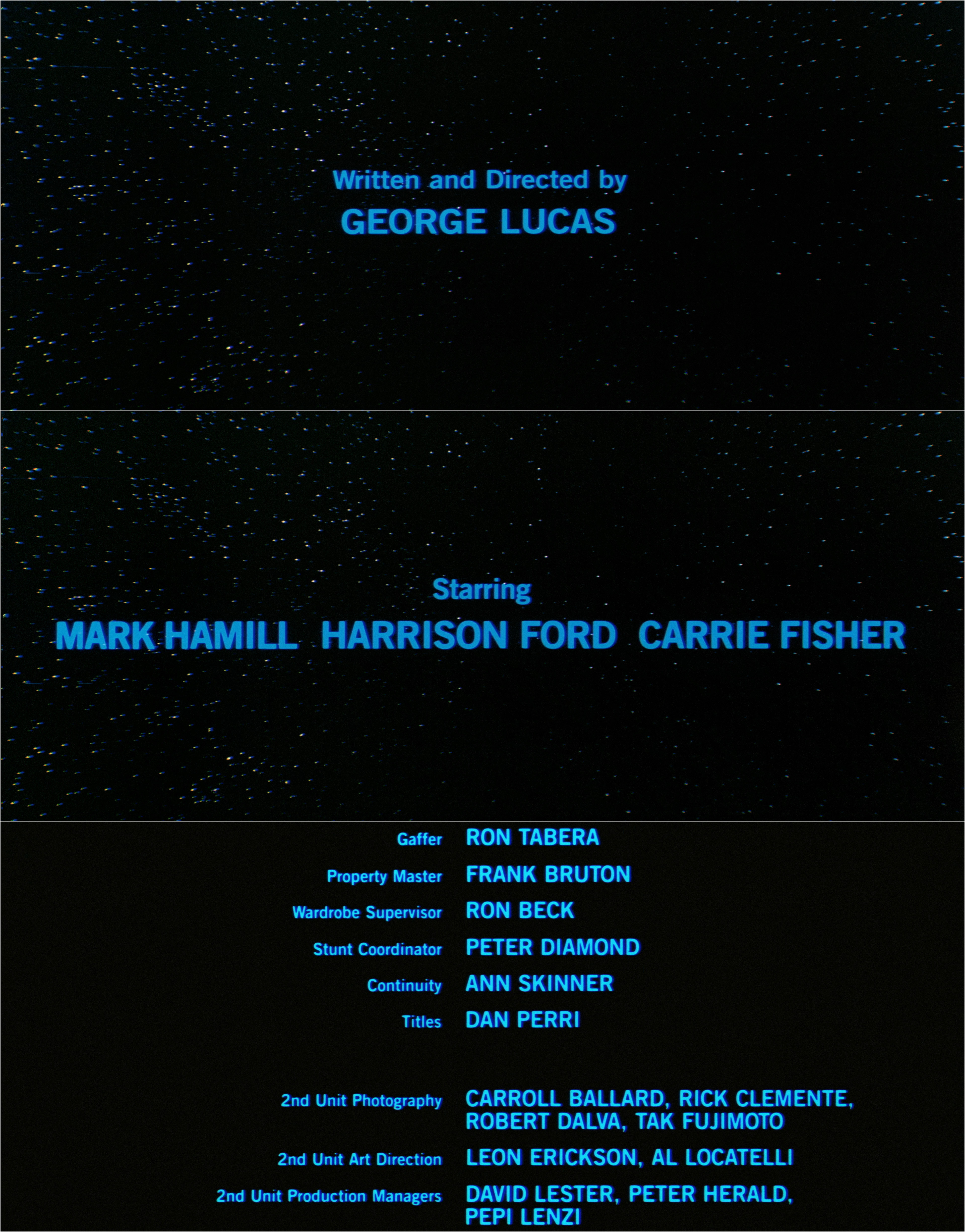
For the 1977 release, the end titles are set in Trade Gothic Bold No. 2.

Said to be a reference for the logotype created by Suzy Rice, Helvetica Black is also used for the film’s title in a 1976 teaser trailer.


 film titles, posters, soundtrack cover")


1 Comment on “Star Wars opening crawl and titles”
See also Justin’s post about the opening crawl for and titles for Star Wars: The Empire Strikes Back:
I’m noticing some inconsistencies (anomalies) with kerning between the letterforms. Anybody have any thoughts on this? It seems like too big of a “universe” for that to be an accident.