

Jonathan Schubert. License: All Rights Reserved.
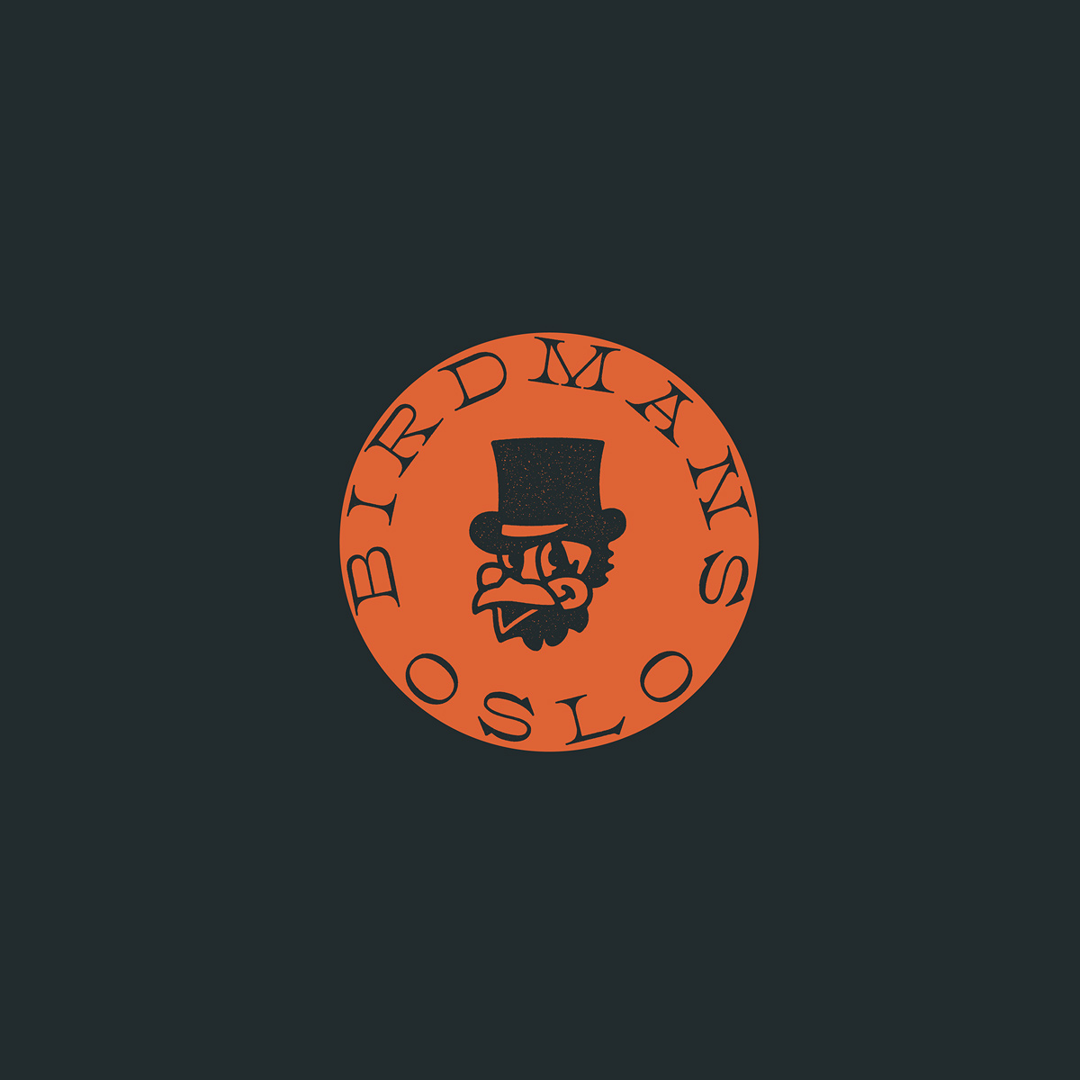
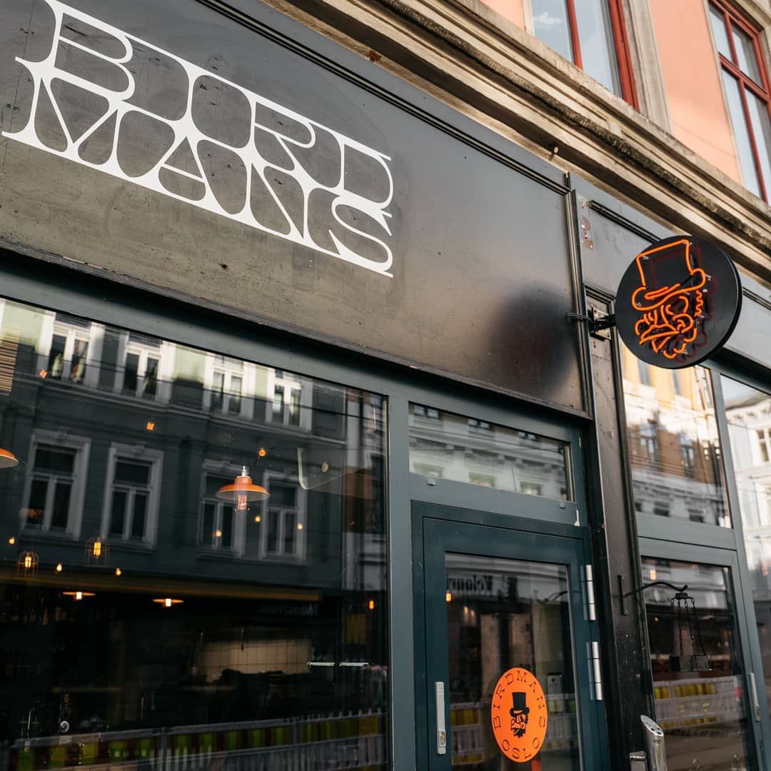
Birdmans was a pop-up chicken restaurant in Oslo, that ran from March through September 2019. Their identity was designed by Jonathan Schubert (The Schubert Studio), using a combination of four contrasting typefaces: Clifton from 205TF is used for the logo, and in some logo variants it is paired with Fern Micro from DJR’s Font of the Month Club. For additional typography, the restaurant uses Kvetch (Love Letters) and KH Sober Draftsman (Kern + Hyde Creation Co.) – both used exclusively in capitals.
Jonathan Schubert. License: All Rights Reserved.

Jonathan Schubert. License: All Rights Reserved.

Jonathan Schubert. License: All Rights Reserved.


")


