Champagne M. Marcoult
This project is proof that the cooperation between small players can produce great results, and this on all levels. In this post we feature the redesign of Champagne M. Marcoult, skillfully conceived, designed and realized by artistic director and photographer Camille Gabarra of vrai studio from Paris. The scope of the project is quite impressive and ranges from designing the logo and the bottles, to the packaging and the stationery paperwork, to the website.
At the core of the design concept are two colors, cream representing champagne and a dark green that stands for the vineyard. The pictorial logo element resembling a crown is derived from playing with the initials of the company’s founder, Michel Marcoult. The crown was further developed into a pattern that you will see in various places, including corks, cardboard boxes, and the website. The whole approach is rounded off with beautiful photography and an interesting mix of typefaces.
Looking at the bottle labels you find, from top to bottom: the roman Spectral for “Champagne”, the narrow sans serif Tungsten for “M. Marcoult”, followed by the serviceable Trade Gothic on the lowest level of typographic hierarchy, in two widths. Designed by Jean-Baptiste Levée and available from Production Type, Spectral has all the features of a classic roman. It brings a flair of tradition and timeless elegance into the scene – while its counter-part Tungsten from Hoefler&Co. is reminiscent of letter painting and 19th century ephemera. The two typefaces complement each other and create an exciting brand image.
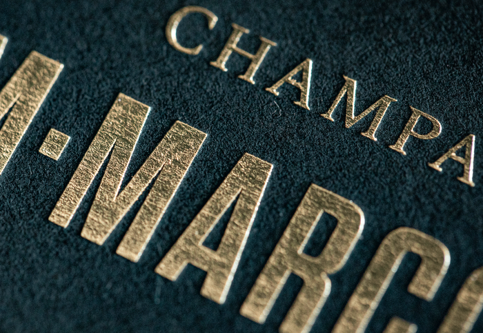
For their use in print one has to acknowledge also the fine craftsmanship in terms of enhancement through relief embossing, foil gilding, and UV varnishing. It takes a network of competent partners to achieve such quality, in this case Autajon Etiquettes Atlantique in Gradignan for the labels and Spind Artisan Imprimeur in Lognes (with papers from G.F Smith and Colorplan) for the stationery.
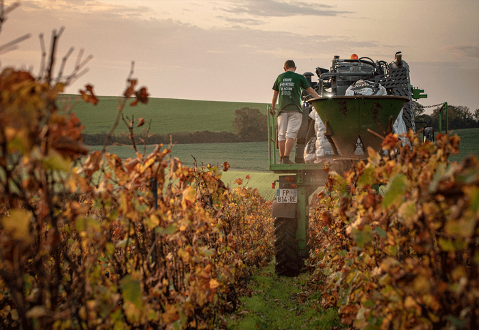
Founded in 1967 in Barbonne-Fayel, Champagne M. Marcoult is a family business, run today in the third generation by Florence and Julien Marcoult. They are members of the Vignerons Indépendants. This means that they exclusively produce from their own vineyards which they cultivate with utmost environmental responsibility. Certified by the French state as an agricultural business of High Environmental Value (H.V.E.), the soil of their vineyards is covered with natural gras and grazed by sheep. In cooperation with a local cooper, they design their own barrels made from acacia and oak wood available in the region. This way they are able to fine-tune on the wine aging process of each of their ten different sorts of champagne. Their cuvée Authentique les Macrêts was selected for inclusion in the Guide Hachette des Vins.
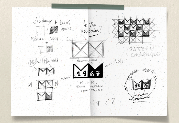
Sketches by Camille Gabarra for the development of the logo and the pattern from two M shapes.
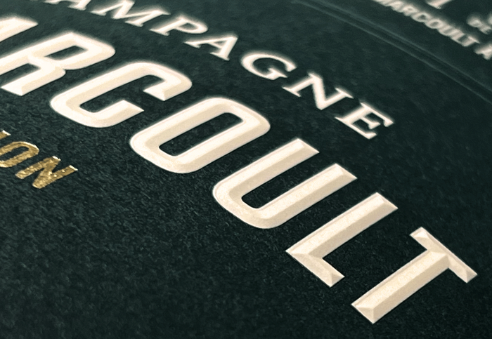
3D effect through relief embossing and foil gilding
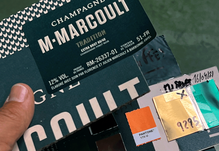
Behind the scenes: reference material used during the production process
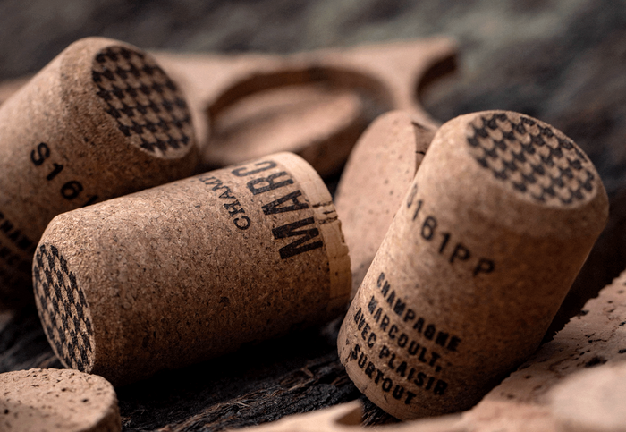
Love is in the details: even the corks were carefully designed.

A variant of the Marcoult lettering with a drop shadow
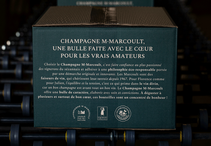
Spectral providing a box with splendor. The typeface is used in all caps, mixed case, roman, italic, and bold.
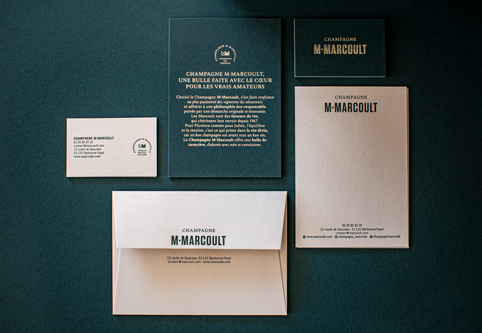
Champagne M. Marcoult stationery, printed by Spind Artisan Imprimeur.
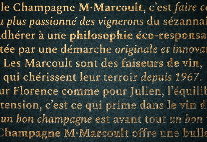
Spectral in gold: detail of the metallic foil stamping

Detail from the Champagne M. Marcoult website featuring Spectral Italic and Trade Gothic
Formats
- Web (4537)
- Packaging (1982)
- Branding/Identity (6664)
Topics
- Product (1592)
- Food/Beverage (2555)
Designers/Agencies
- vrai studio (1)
- Camille Gabarra (1)
Tagged with
- champagne (4)
- sparkling wine (6)
- alcohol (278)
- brands (1103)
- logos (3874)
- initialisms/monograms (339)
- crowns (31)
- French (language) (1981)
- bottles (376)
- labels (308)
- 3D effects (259)
- embossed/debossed (497)
- faceted (12)
- foil stamping (142)
- metallic foil (311)
- gold (351)
- green (648)
- gold and green (2)
- shadow effects (977)
- packaging (653)
- boxes (409)
- cork (13)
- stationery (711)
- business cards (1242)
- letterheads (344)
- envelopes (194)
- websites (2541)
- typeface combinations (3122)
- italics (399)
- multiple widths (453)
- process (127)
Artwork location
- France (2250)
- Paris (1054)
- Champagne (2)
- Barbonne-Fayel (1)

