
Luke Dorny website
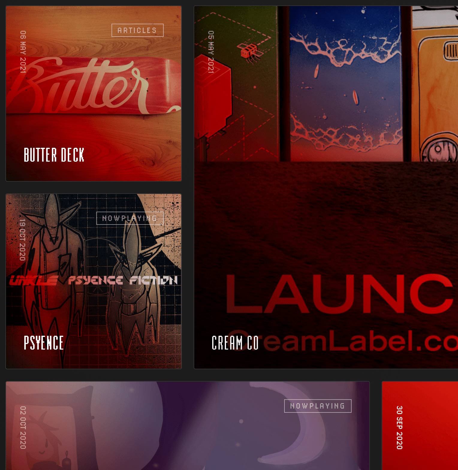
Homepage has square blocks with Lo-Res 12 in all caps.
In 2020, I finally redesigned my decrepit personal site and went straight low-res with Zuzana Licko’s Lo-Res 12 Emigre typeface. It was a minor challenge to create a readable site but it allowed very little customization options and in the end I felt that the text worked well enough at most sizes. It hopefully honors the decades of arcade and digital design during my lifetime. What better way to do this than with Ms. Licko’s fantastic type design?
Coming up on three years later, I’m still happy with the way it turned out, but the web has again moved forward and it will undergo another redesign soon.
It is not groundbreaking, but criticism is always appreciated.

Actual body copy design was very straightforward.
Readability was a bullet point during design, but the site is mostly used as a design sandbox.
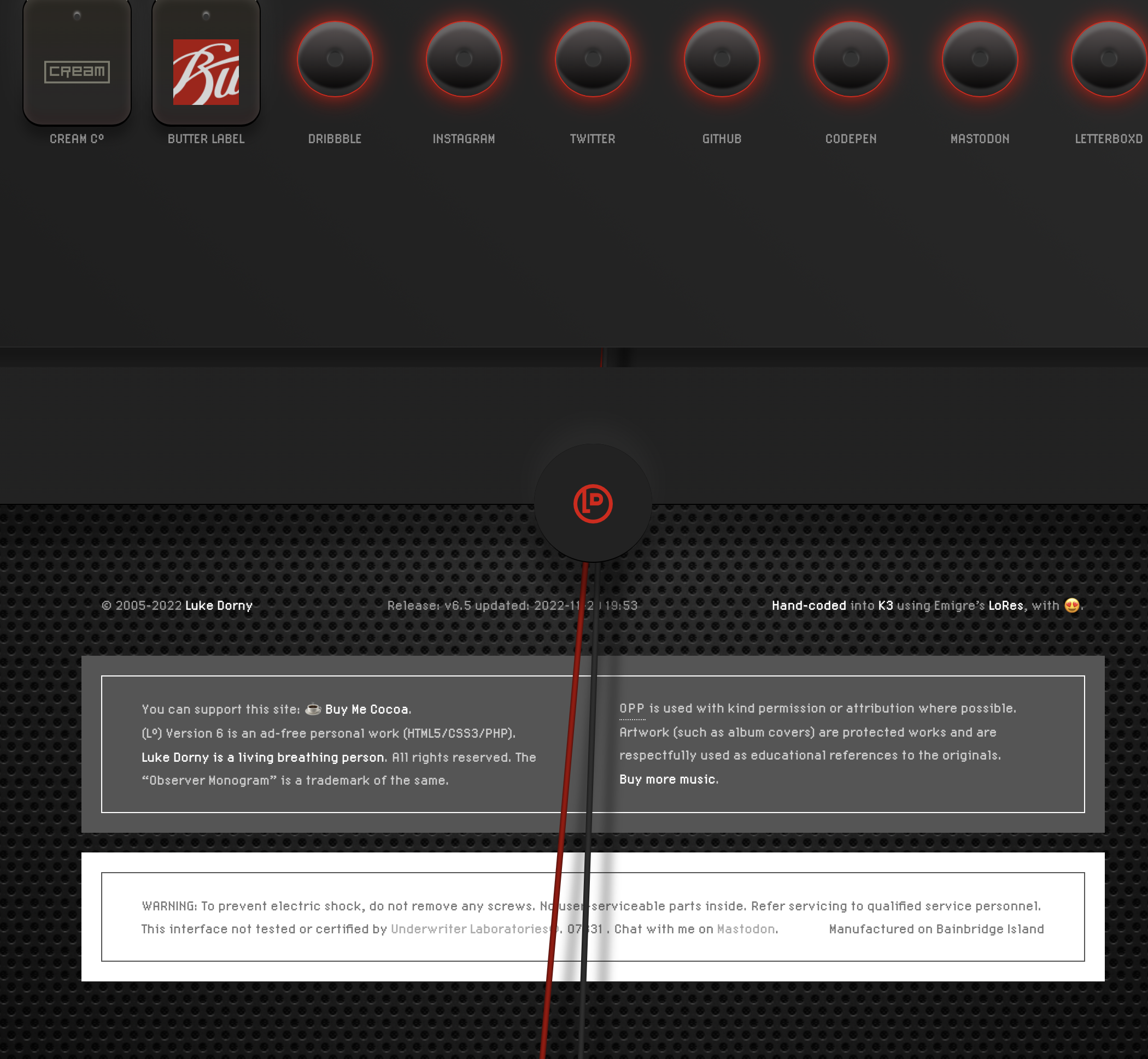
Pixelated type on designs reminiscent of paper decals on electronic and hi-fi equipment? Sure.


