Mado à Paris
When you close your eyes and think of Paris, three things will come to your mind immediately: the Eiffel Tower, madeleines, and upright cursive handwriting. We will show all three of them in this post.
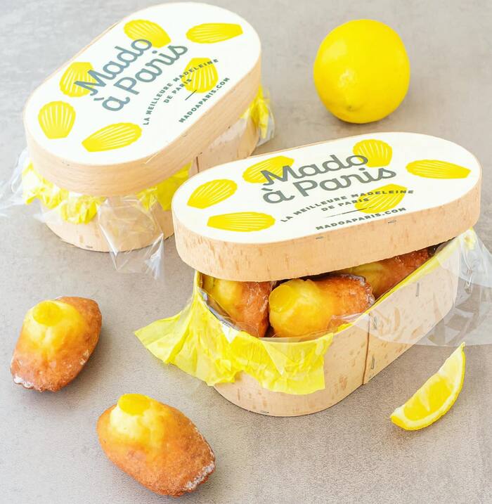
Flour, powdered sugar, eggs, butter, and lemon zest are the basic ingredients for a madeleine. In France’s everyday life the madeleine is popular to accompany the morning coffee, but even more so for short breaks in the afternoon, for example the goûter children earn upon leaving school mid-afternoon.
A beacon of French pastry, many stories hover around these sponge cakes, from their scallop shape linking them to the pilgrimage to Santiago de Compostela, via a Polish king exiled in Lorraine who might have called these cakes madeleine in honor of his servant, to Marcel Proust’s seminal In Search of Lost Time where the dipping of a madeleine into tea ignites involuntary remembrance of childhood days.
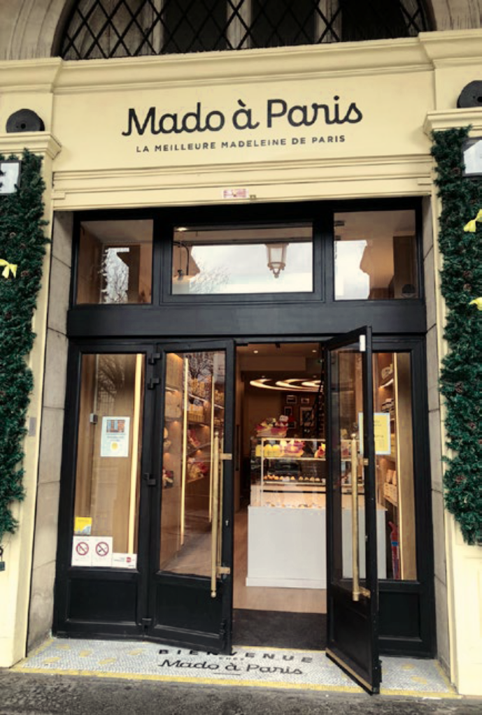
The reference to the first name of its presumable inventor is paralleled in the name of the business portrayed here: Mado à Paris draws its title from the nickname of the owner’s beloved aunt Madeleine who passed her love for madeleines on to her niece. Promising to serve “the best madeleine of Paris”, the boutique-restaurant is placed in the very center of the city, just across the Tuileries Garden and – no joke – in direct vicinity of the Madeleine Quarter.
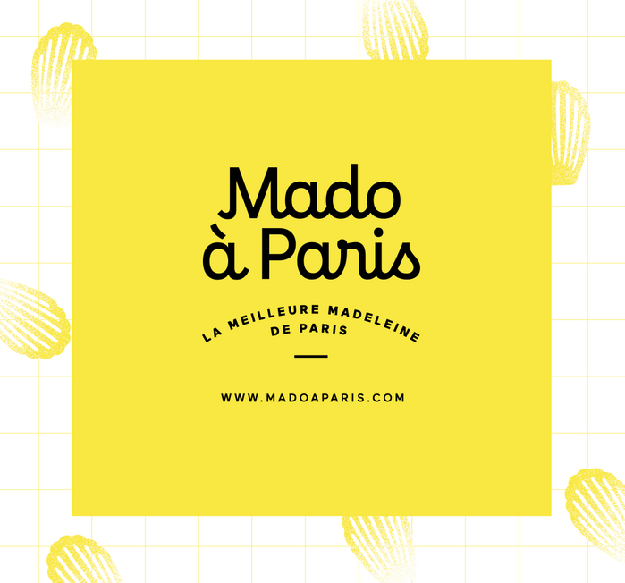
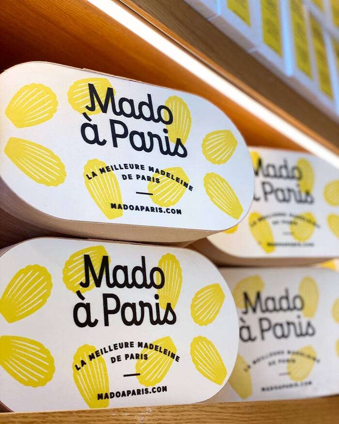
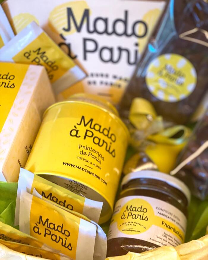
The art director responsible for the visual identity of Mado à Paris is Bastien Bouvier. He chose yellow as the principal color, evoking both eggs and lemon. The recurring illustration of a scallop-shaped madeleine is the second element of the design. What most coins the visual identity, though, is the lettering “Mado à Paris” in an upright cursive script. It is set from the typeface Enfantine. Designed by Jean-Baptiste Levée, it’s available from Production Type. Enfantine is complemented by the geometric sans-serif Maax, designed by Damien Gautier and published at 205TF.
Enfantine is an intriguing typeface. On one hand, it combines script-like lowercase characters with “normal” capital letters which allows for all-caps typesetting. Secondly, it is cursive but upright – which might seem unusual to many but is perfectly common for French people: in their handwriting tradition the Ronde calligraphic style played an eminent role deep into the 20th century, largely influencing school scripts. You can see a typographic reflection of this style in Typo Upright, which is a variation of the tellingly named French Script. And to conclude with, the whole concept plus the monolinearity of the stroke clearly roots Enfantine in the 21st century.
All of the above makes Enfantine an excellent choice for this project: it alludes to the afternoon goûter, it conveys French tradition, but it also embodies innovation just as much as Mado à Paris in the field of madeleine bakery.
Formats
- Packaging (1908)
- Signs (1747)
- Object/Product (896)
- Branding/Identity (6321)
Topics
- Product (1490)
- Food/Beverage (2464)
- Retail/Shopping (859)
Designers/Agencies
- Bastien Bouvier (2)
Tagged with
- madeleines (1)
- pastries (17)
- French food (19)
- local food (99)
- Paris (68)
- brands (1026)
- logos (3672)
- script (278)
- local type (201)
- typeface combinations (2988)
- type on a curve (830)
- all caps (5668)
- yellow (356)
- yellow and black (383)
- scallops (1)
- URLs (115)
- packaging (612)
- boxes (387)
- jars (72)
- tea labels (6)
- tea (46)
- identities (1479)
- style guides / brand manuals (214)
- cups (75)
- shop fronts (336)
- signs (468)
- point of sale (39)
- tricycles (1)
- French (language) (1857)
- slogans/claims (106)
- chocolate (76)
- embossed/debossed (473)
- unconventional materials (56)
- edible type (17)
- jam and marmalade (8)
In Sets
- Production Type (Production Type) (421)
- Fonts (Jon) (6)

