
US, The paperback magazine covers
Contributed by Nick Sherman on Jan 22nd, 2014. Artwork published in
.

Source: retrophile.co License: All Rights Reserved.
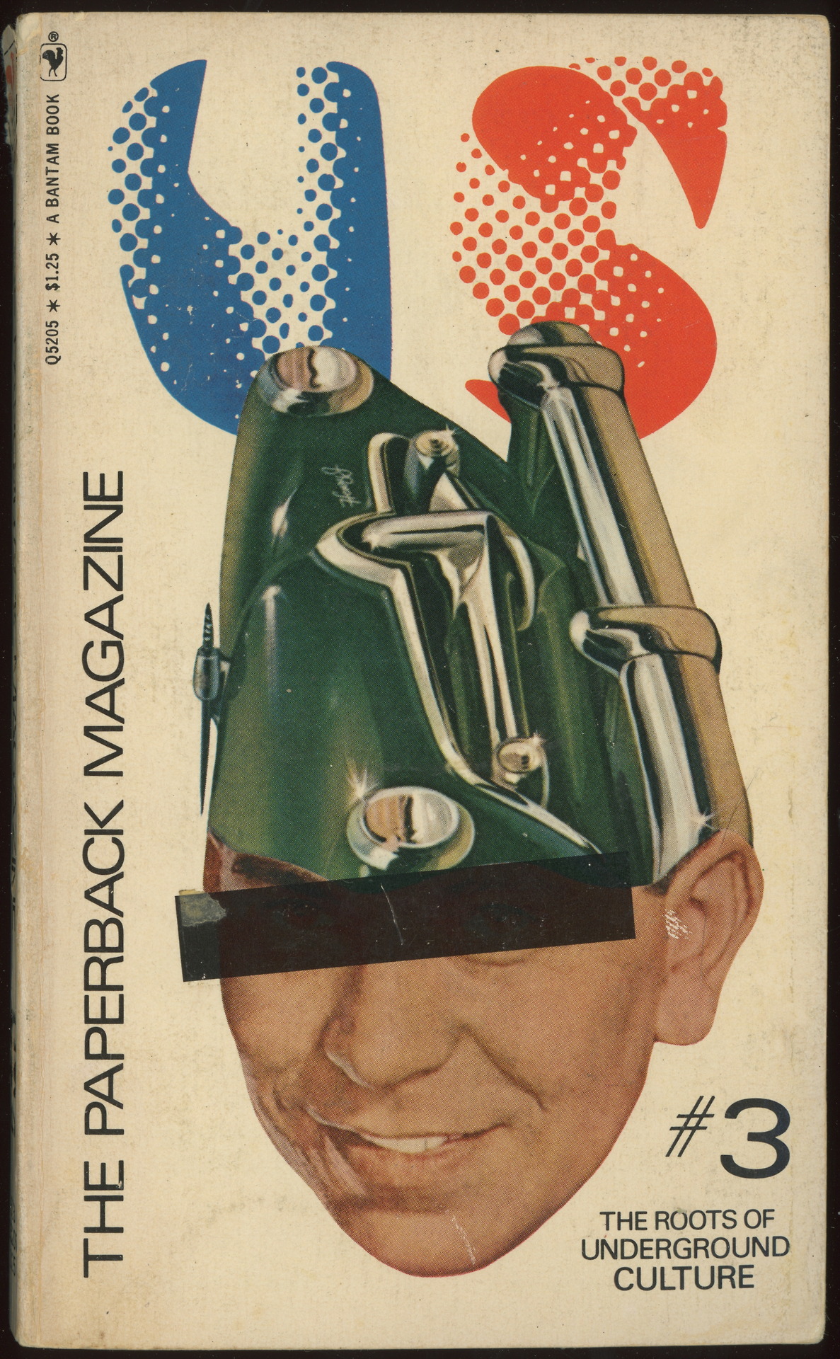
Issue #1 front cover
Project Projects explains this short-lived countercultural publication on the Design Envy blog:
Combining an underground press outlook and aesthetic with mass market distribution, US: A Paperback Magazine, was edited by Richard Goldstein and published by Bantam Books. US provided “all the news that’s fit to eat” over a three-issue run from June 1969 through May 1970.
The Design Envy post also generously includes videos showing the internal contents of all 3 issues of the publication.
The interior design of each issue includes a bevy of other typefaces – perhaps the topic of a separate post.
Source: jellobiafrasays.tumblr.com License: All Rights Reserved.
Issue #3 front cover
Source: www.ebay.com License: All Rights Reserved.
Issue #1 spine
Source: ihavegoodbooks.blogspot.com License: All Rights Reserved.
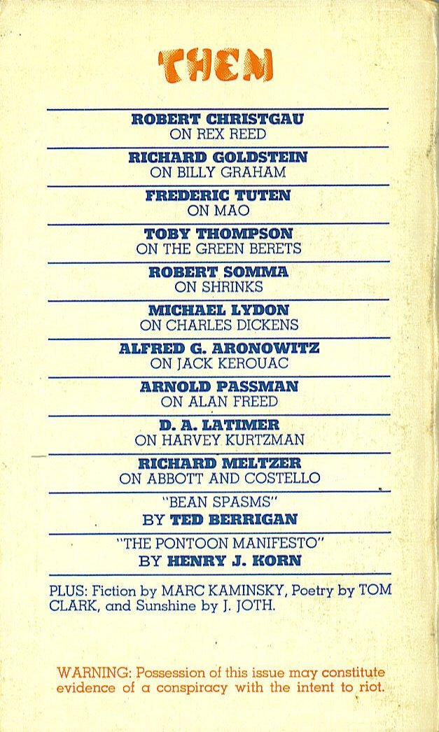
Issue #3 back cover

Source: retrophile.co License: All Rights Reserved.
Issue #1 back cover
Source: www.philsp.com License: All Rights Reserved.
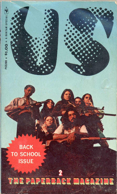
Issue #2 front cover


 Polish movie poster")


")


3 Comments on “US, The paperback magazine covers”
I should note that even though I’ve ID’d the geometric slab as Karnak, I haven’t matched it exactly with an original sample yet (my Ludlow book is not at my side at the moment). Similarly, it’s possible that the heavier style seems to be a closer match to Beton than Karnak. They very well may be from separate families.
The extra bold K especially caught my eye. Frank-on-the-Quixo swiftly provided this image, confirming the alternate Beton Extra Bold K and R:
I think you’re right about separate families. The light “G” is more like Memphis than Beton or Karnak.
Confirming Memphis Light for subheads; by the power of Jaspert, Berry & Johnson.