
M.A.P
Contributed by Stephen Coles on Mar 15th, 2014. Artwork published in
.
Source: www.yesstudio.co.uk License: All Rights Reserved.
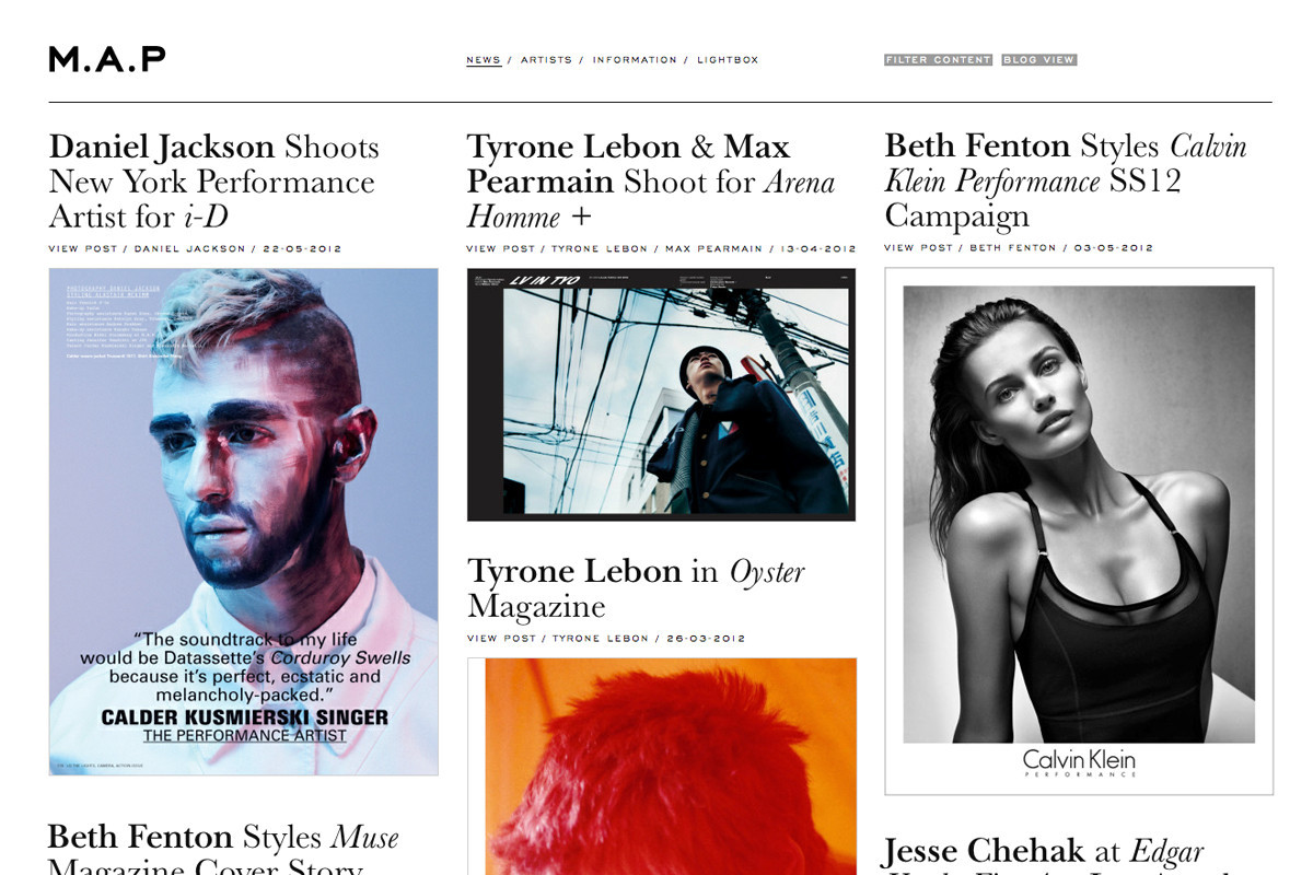
“M.A.P are a creative management agency, representing the top tier of fashion photographers and styling talent worldwide. Commissioned by founder Julie Brown, YES proposed a complete overhaul of visual communication both digitally and in print. We developed a typographic identity based around a strong graphic contrasts — between the bold company letterforms and the more delicate supporting typography.” — YES
I like the typographic approach here: antique type constrasting with distinctly modern content. Though they may get better results from the screen-optimized Sweet Sans or Trio Grotesk (replacing the limited Engravers Gothic) and Harriet (for ITC New Baskerville).
Source: www.yesstudio.co.uk License: All Rights Reserved.
Source: www.yesstudio.co.uk License: All Rights Reserved.


")


")


