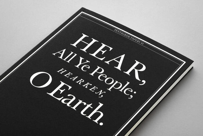
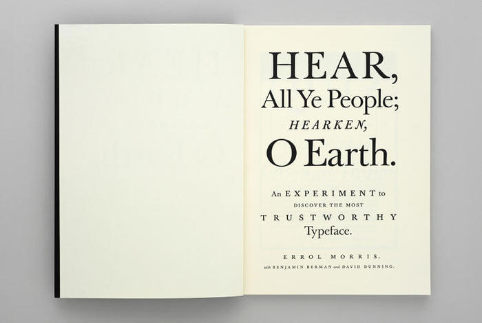
Pentagram Papers 44: Hear, All Ye People; Hearken, O Earth!
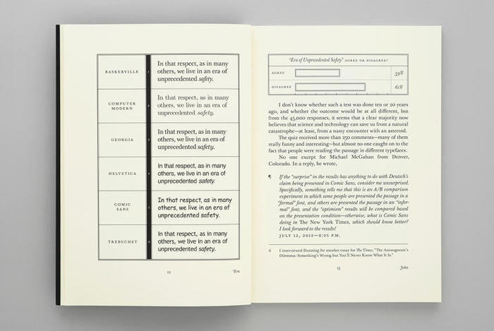
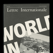
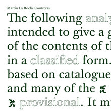
Errol Morris’s declaration of Baskerville as the most truthworthy typeface isn’t particularly trustworthy, but his study is interesting, and Pentagram’s book looks great.
Contributed by Stephen Coles on May 18th, 2015. Artwork published in
.
















9 Comments on “Pentagram Papers 44: Hear, All Ye People; Hearken, O Earth!”
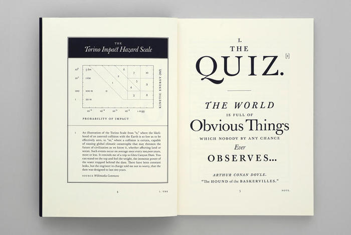
Karsten Luecke provides a “Pro tip. Historic words set in historic typefaces ask for historic typography. (What about some space before the semicolon?)”
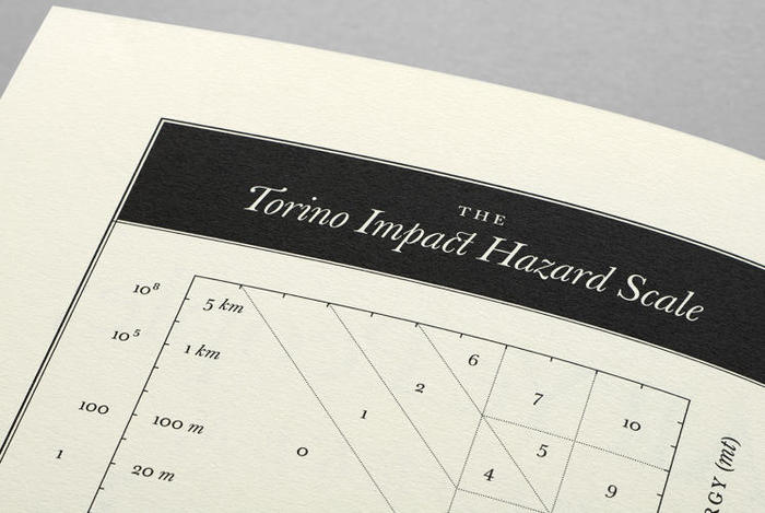
Once I’ve noticed the ‘Th’ ligature, it became really importunate. Such gimmicks are better served as discretionary ligatures.
A lovely and essential paper for anyone interested in communication and persuation through art direction. Kindly contact me if it is available for purchase or when it does becomes available for purchase. Thank you.
I think the study he ran was fine. There is no perfect way to select six typefaces, though it would certainly be entertaining to watch a group of typographers try. The correct critique isn’t that the methodology was week, but that the findings are limited to the typefaces that were tested. Baskerville is the best of that particular bunch.
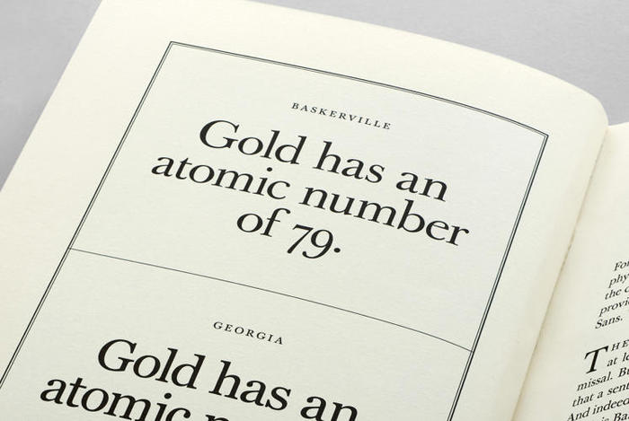
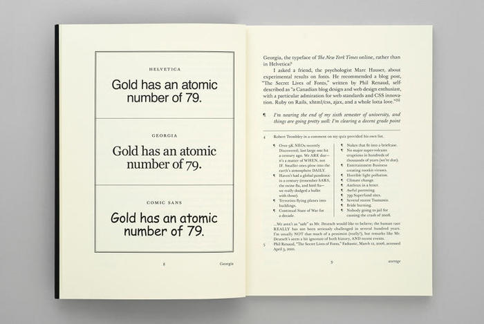
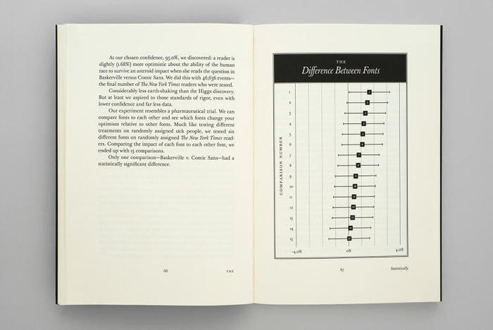
I find the winners and the losers to be the least interesting art of the study. I’m far more fascinated with the finding that a reader’s perception of truth — gold has an atomic number of 79 — and optimism for the future are impacted by the choice of typeface. This isn’t the only recent study that has demonstrated some aspect of this. While typographers may be nonplused by this, it is hugely surprising to everyone else.
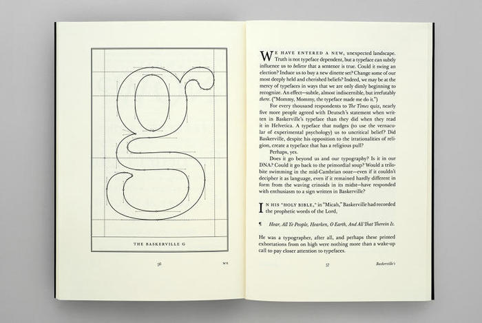
Thanks for your response, Kevin. Given your experience I’ve been wondering what you thought of this. I guess the main problem is that the headlines for this experiment were misleading and missed the point. Instead of “Baskerville is the most trustworthy typeface” it should be “The typeface you choose can affect your reader’s perception of truth”.
The author attributes people’s credulity judgments to the typeface design but not to the content of the passage. In this study cognition (reading, understanding, and knowing) interacts with visual perception (design features of the typeface). These two variables must be enumerated and isolated for repeatability of the study, if one wants to discern the design factors contributing to the results. Without asking each participant to evaluate all of the typeface designs, there is nothing to compare, just a vote for or against a given typeface. Or is it enough to say that Baskerville is most credulous to optimists. Is there a connection between a typeface design and optimism?
People today are acclimated to reading in the Baskerville typeface, which has been used in textbooks and books for hundreds of years—the very purpose of the typeface design was for book printing (i.e. reading).
As I continue my own research about people’e emotion responses to typeface designs, I will revisit this study for a closer reading. You can find my dissertation, “Human emotion response to typographic design” (2011), papers, and presentations at www.bethekoch.com. My dissertation has an extensive review of methodology of typeface studies, and I welcome collaborators in the research.
I totally agree with Stephen Coles. Why wasn’t Bembo included in the set of 6 typefaces? Also, I really despise when Comic Sans is thrown into the mix. It’s obvious that it’s not a convincing typeface so why include it? WHY
Kevin Larson—great to see you on the comment list! Do you have any references to other studies like this—that show how typographical choices impact/influence reader perceptions (of truth)? I’d be very interested to read more along these lines of inquiry!
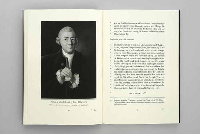
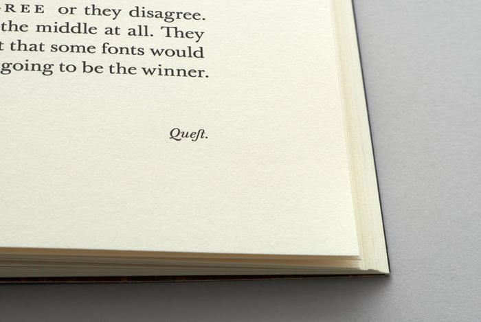
One of the photos (#8 from the top by my count) shows that they used the long s as basically an affectation in some headings. A bit weird