
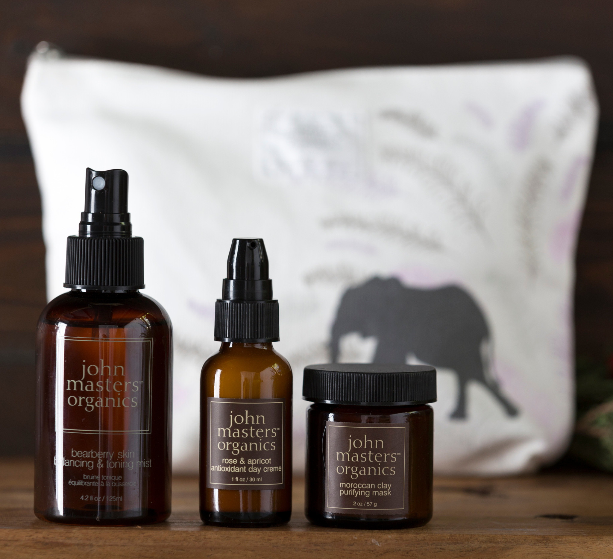
John Masters Organics
Contributed by Barry Parker on Apr 21st, 2017. Artwork published in
circa 2017
.
License: All Rights Reserved.
Clean, minimal and beautiful typography for high-end natural beauty products from John Masters.
The logotype uses Diotima in all lowercase letters, which was designed by Gudrun Zapf-von Hesse (1918–), wife of Hermann Zapf (1918–2015).
The design is named for the philosopher Diotima of Mantinea, perhaps appropriately highlighting its status as one of the few typefaces designed by a woman up to this point. — Wikipedia
Source: johnmasters.com License: All Rights Reserved.


