
Four Tops – Reach Out
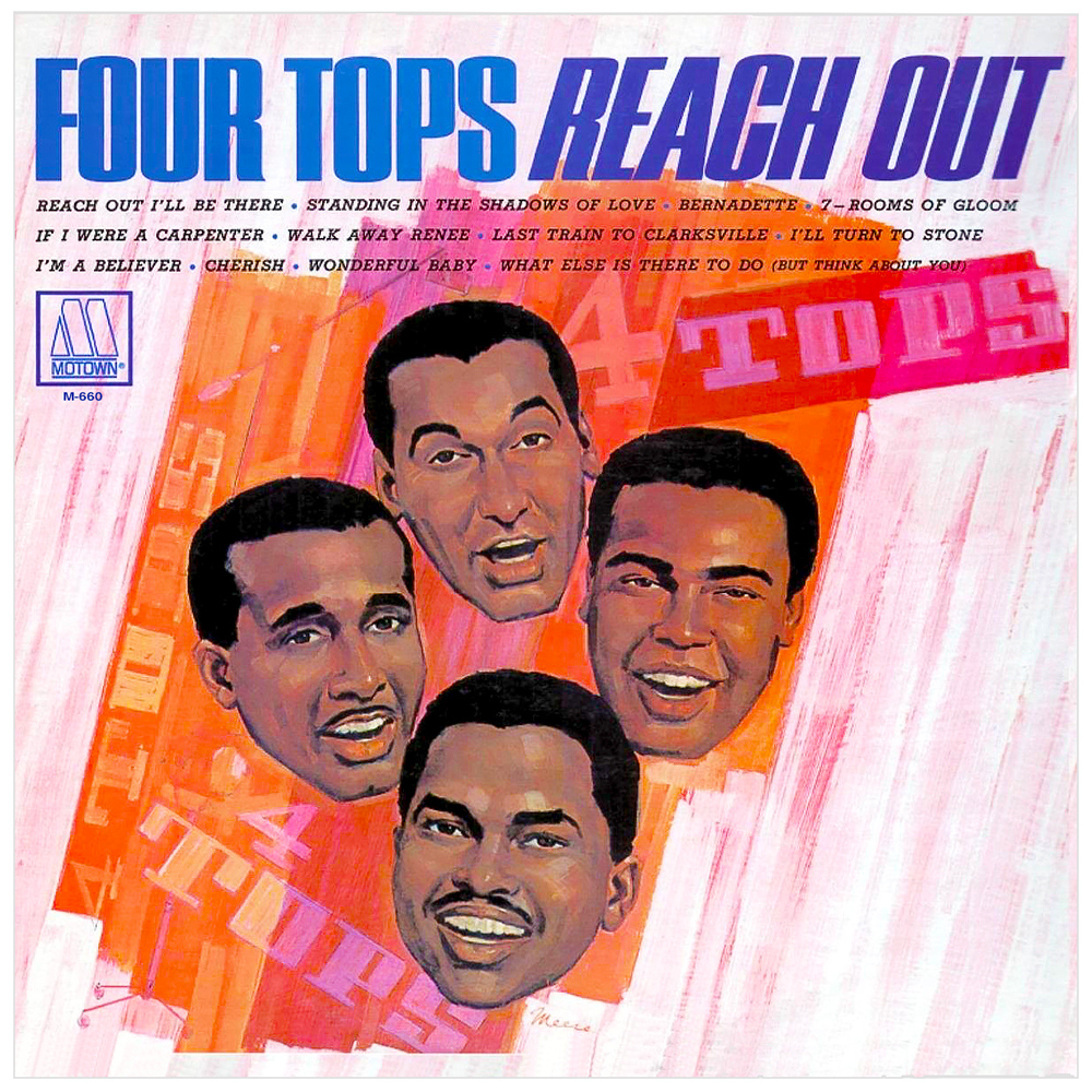
This is one of the album covers that really started my love of typography, design and use of color. Something about the typeface used for “FOUR TOPS REACH OUT” just caught my eye and I fell in love with its bold, simple but very “masculine” style. Many of Motown’s album covers of the 1960s used this font (and as I learned in ongoing years, so did a lot of other record companies) and it was the first one I learned to draw freehand when we had to do a design project in high school. I never knew what the official name of this font was. Some years ago, someone stated this typeface was called Haettenschweiler. I went with it for awhile, but noticed the digital forms of Haettenschweiler are slightly different from what I see on this cover and other print material from the 1960s. o my question is if this is indeed Haettenschweiler or is it a variation. The closest I’ve seen on this site is Permanent Headline. I would really appreciate learning what typeface this truly is.


")


")


3 Comments on “Four Tops – Reach Out ”
Tomovox,
Whatever it is, it is not Haettenschweiler or Permanent Headline. This face is more angular and has more contrast between the thick and thin strokes.
The best match I could find is Europa Grotesque RR ExtraBold. This style is part of Steve Jackaman’s 1994 revival of an unnamed “1960s design”, probably Les Usherwood’s LU Grotesque. I don’t have access to a showing of LU Grotesque to confirm.
I realize there are some differences, but this is a showing of the digital interpretation, not of the original 1960s face.
Photo-Lettering’s One Line Manual of Styles includes a number of related typefaces, too. Consul Condensed and Haft Grotesque Narrow look particularly relevant.
Keep in mind that phototype could be easily stretched, slanted and otherwise distorted, which may explain differences in the exact proprtion, weight and contrast. Also, it can always be lettering, i.e. drawn letterforms that are not derived from a typeface.
Edit: The woods for the trees … Matterhorn 2, the typeface mentioned in the comment to your other submission, looks like a match here, too. It comes even closer than Europa Grotesque, especially in regard to the height of the bowl in ‘P’.
I went to the links you sent and Matterhorn 2, if not the exact same typeface is a pretty close identical twin. I appreciate that you write in-depth about this subject as it fascinates me that there is so much more to the history of typeface than I ever realized. What started out as a mere fascination with album covers has grown into something causing me to pay close attention to all types of commercial designs, print ads and nearly every other type of printed material. Thank you for such great responses to my submissions.
You are very welcome! Thanks for getting back.