
Source: www.demetriomancini.it License: All Rights Reserved.
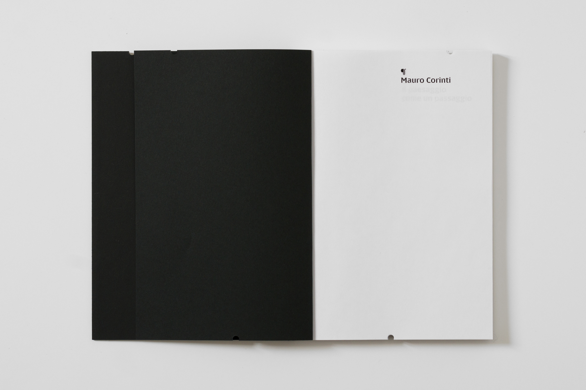
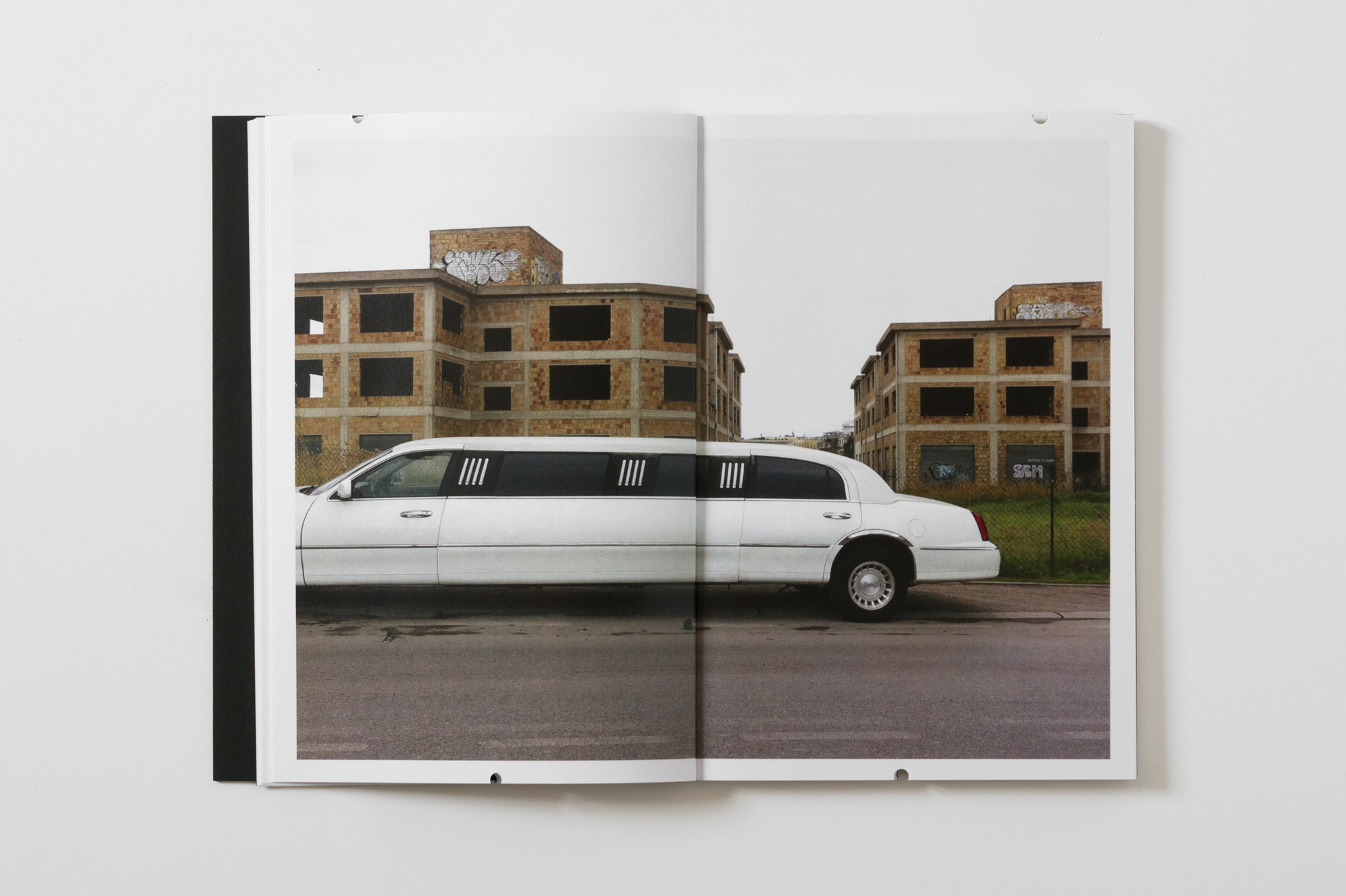
Mauro Corinti’s pictures are like frames. Very thin frames. Frames as delicate as tissue paper. Frames of icing sugar. When you lean on them you can fall into a cliff, into a lift. They are flimsy layer of tissues, cigarettes paper, sheets of paper which can be broken by the idea to write or to engrave a word on them.
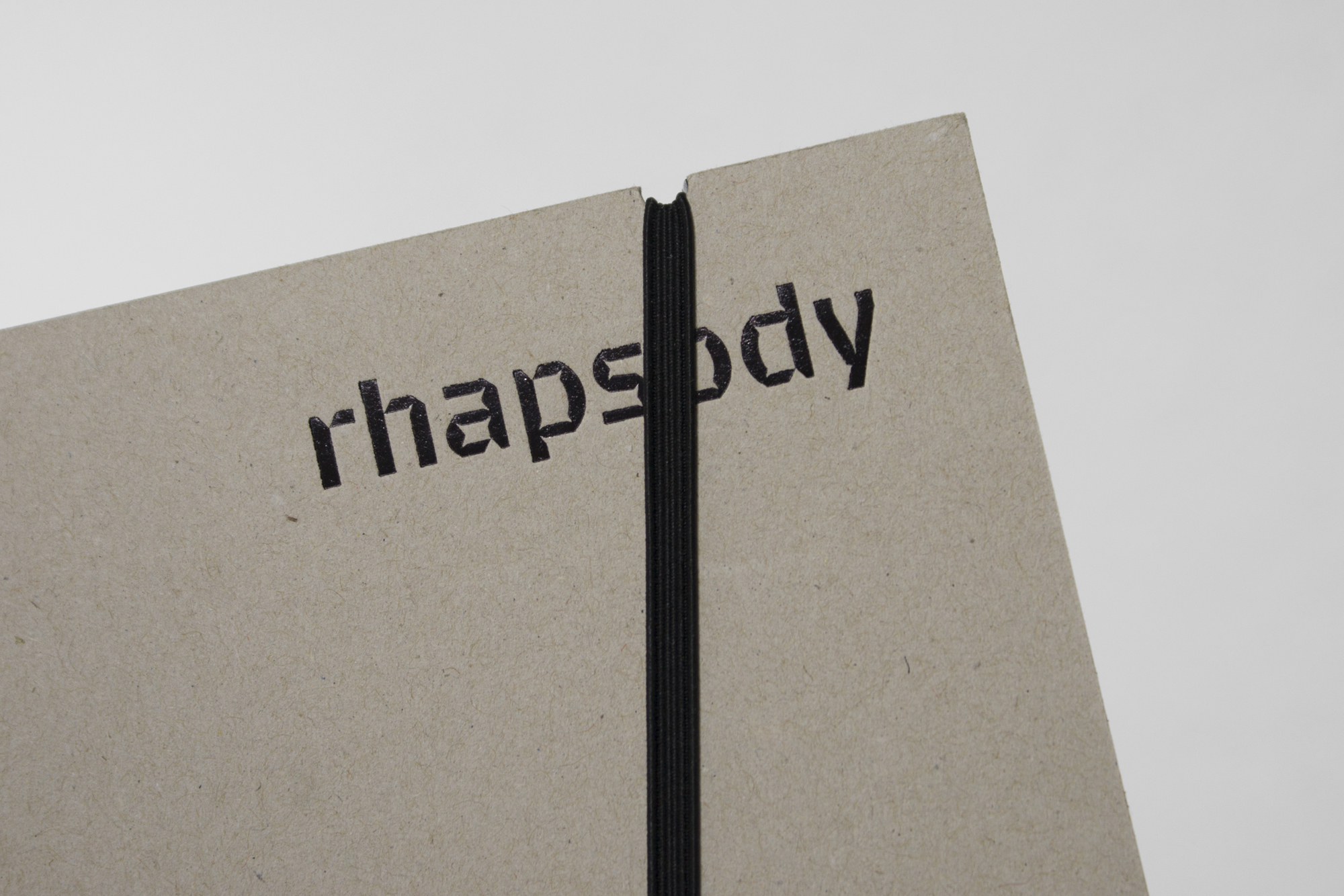
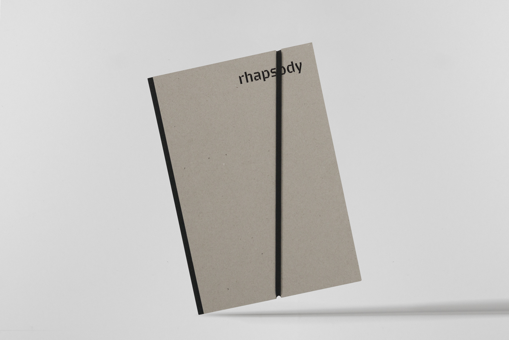
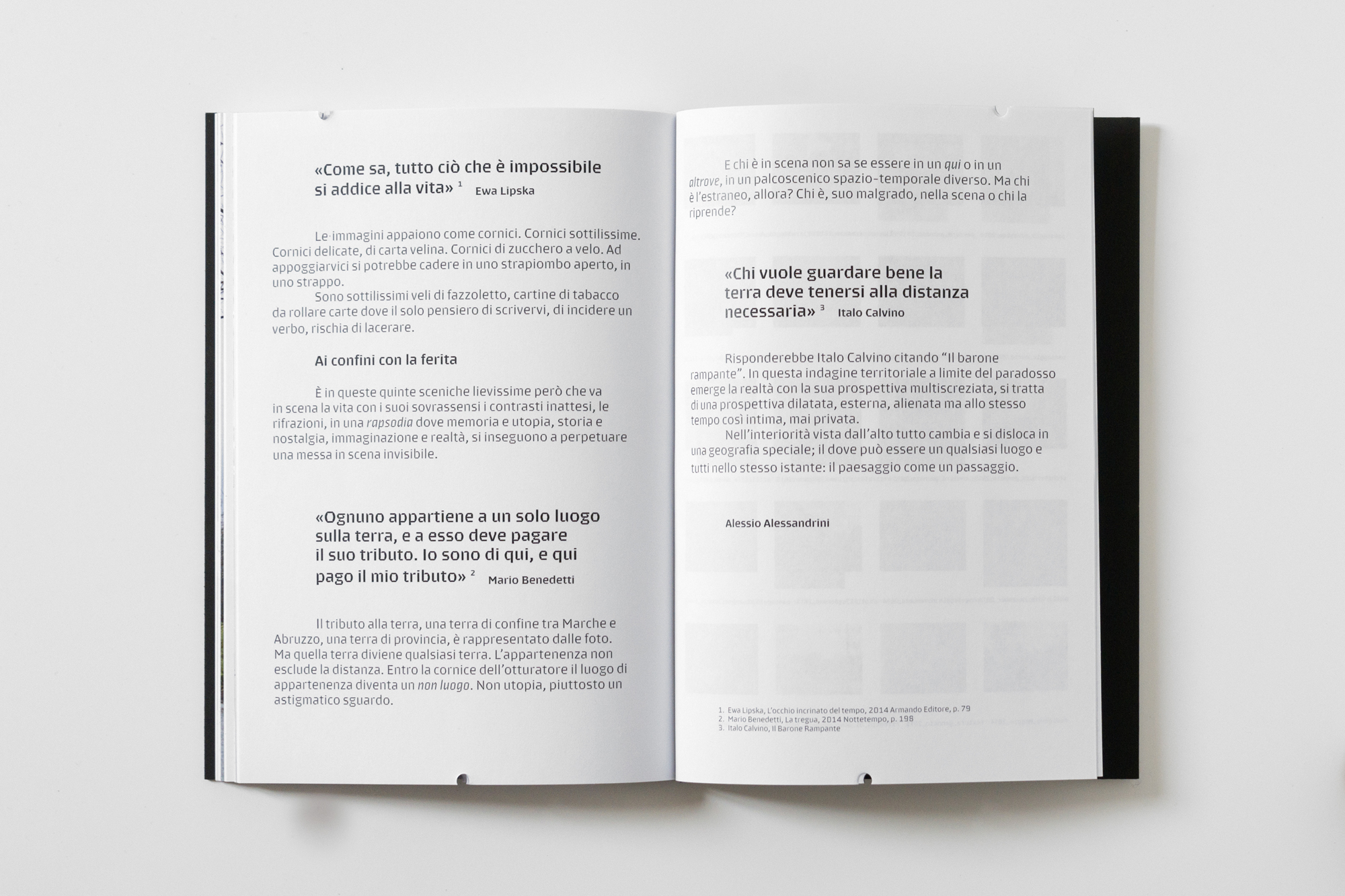
The main typeface used in the book is Brevier by CAST foundry. Even if it was designed to be legible at very small sizes, down to 3 pt, it looks unique as display face.
Source: www.demetriomancini.it License: All Rights Reserved.
Source: www.demetriomancini.it License: All Rights Reserved.
Source: www.demetriomancini.it License: All Rights Reserved.

Source: www.demetriomancini.it License: All Rights Reserved.
Source: www.demetriomancini.it License: All Rights Reserved.

Source: www.demetriomancini.it License: All Rights Reserved.
Source: www.demetriomancini.it License: All Rights Reserved.
Source: www.demetriomancini.it License: All Rights Reserved.


")


