
“Die moderne Typographie” ad, D. Stempel AG (1930)
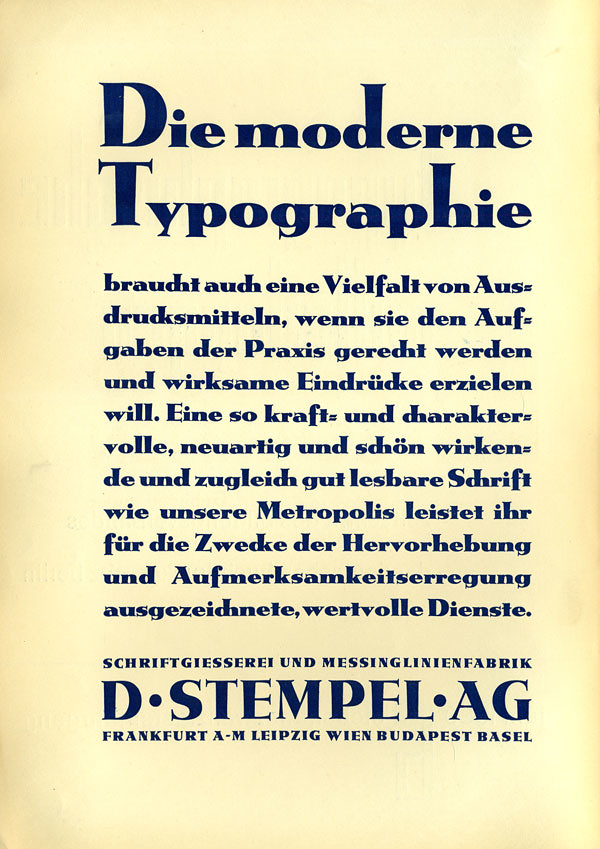
Ad for Metropolis in Typographische Mitteilungen, Vol. 27, No. 6, June 1930.
Modern typography also needs a variety of means of expression if it wants to do live up to the tasks of practical work. A typeface that is as powerful and full of character, as novel and beautiful-looking, and at the same time as well legible as our Metropolis, does excellent and valuable service [in modern typography] for the purpose of highlighting and attracting attention.
The first two lines show Hohe Metropolis, a variant with elongated ascenders and capitals.
Die moderne Typographie braucht auch eine Vielfalt von Ausdrucksmitteln, wenn sie den Aufgaben der Praxis gerecht werden will. Eine so kraft- und charaktervolle, neuartig und schön wirkende und zugeich gut lesbare Schrift wie unsere Metropolis leistet für die Zwecke der Hervorhebung und Aufmerksamkeitserregung ausgezeichnete, wertvolle Dienste.
SCHRIFTGIESSEREI UND MESSINGLINIENFABRIK D · STEMPEL · AG FRANKFURT A · M LEIPZIG WIEN BUDAPEST BASEL


")


")


")


1 Comment on ““Die moderne Typographie” ad, D. Stempel AG (1930)”
Between the lines, this reads as a stab at Futura by Stempel’s local competitor Bauer. Released in 1927, it soon was all the rage. The ad copy sounds like a plea for modern typography to be more than just geometric sans serifs – let alone Futura – for everything.