
Clip Books of Line Art, Volk (1969)
![“Old Fashioned” (No. 186), featuring a modified version of Othello or similar for the headline. It’s distinguished by notches in the counters, descending stems, and tiny serifs (like or ). [Edit: It’s , see comments.] Like the pictured locomotive, Othello was old-fashioned at the time of this booklet’s publication: Originally designed by Gustave F. Schroeder in the late 1800s, it was revived by Morris Fuller Benton for American Typefounders (ATF) in 1934.](https://assets.fontsinuse.com/static/use-media-items/102/101804/full-2700x1800/5eae83d8/49231577126_9a26949ef7_3k.jpeg)
“Old Fashioned” (No. 186), featuring a modified version of Othello or similar for the headline. It’s distinguished by notches in the counters, descending stems, and tiny serifs (like Rubens or Hess Neobold). [Edit: It’s Davison Bolero, see comments.] Like the pictured locomotive, Othello was old-fashioned at the time of this booklet’s publication: Originally designed by Gustave F. Schroeder in the late 1800s, it was revived by Morris Fuller Benton for American Typefounders (ATF) in 1934.
Covers for various clip books of line art published in 1969 by Harry Volk Jr. Art Studio, Pleasantville, New Jersey. See the previous post about the clip books issued in 1955 for more information on Harry Volk Jr. Art Studio.

“Science” (No. 523) is at the opposite end of the spectrum. The depiction of an astronaut in front of the Apollo 11 Lunar Module Eagle is accompanied by the futuristic Eurostile Bold Extended, Aldo Novarese’s extension of Microgramma, originally designed by Alessandro Butti for Nebiolo in the 1950s. As in “Old Fashioned”, the bottom lines use Alternate Gothic Compressed and Helvetica.

“The Wedding” (No. 178) ft. Koch-Antiqua-Kursiv.
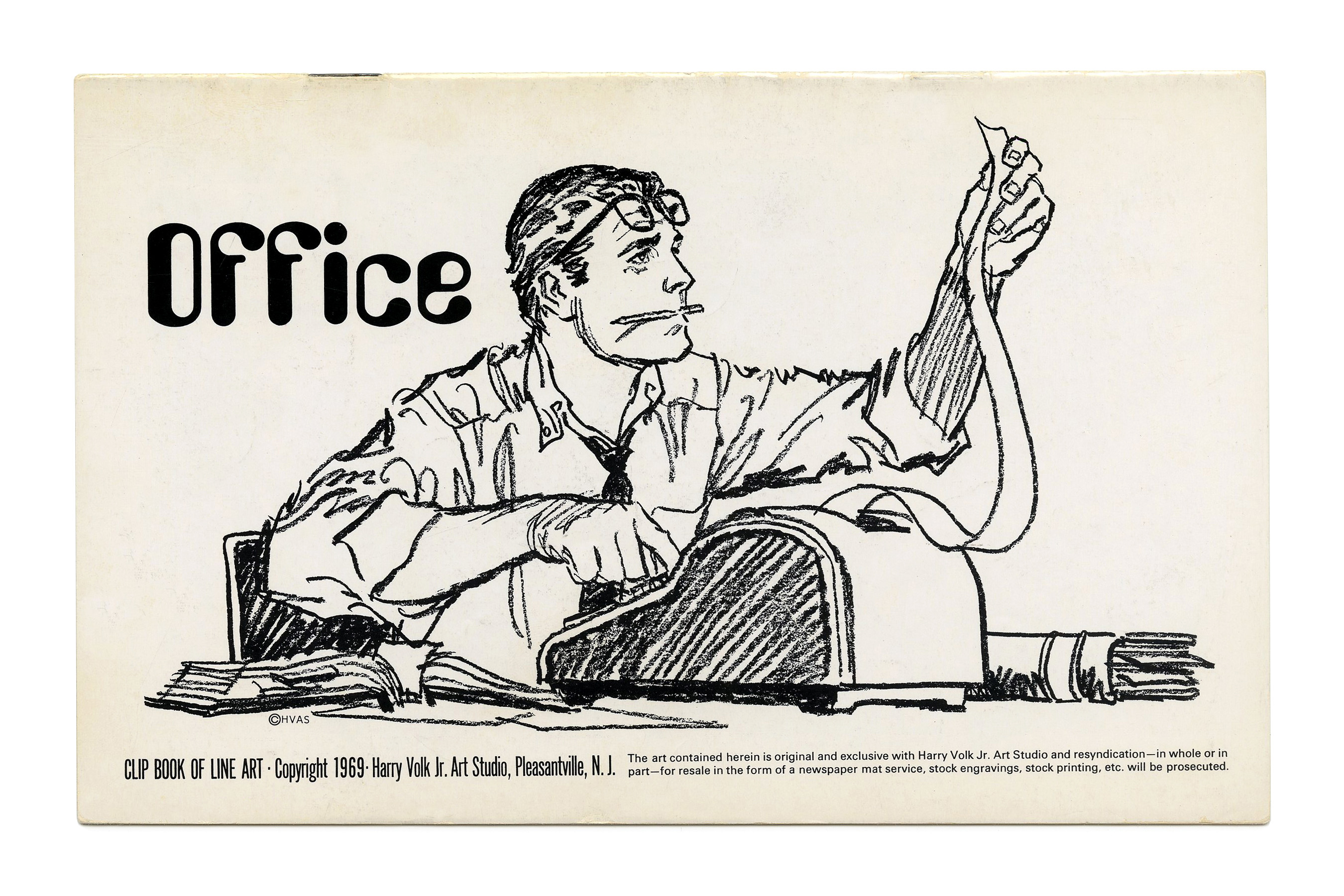
“Office” (No. 180) ft. illustration by Tom Sawyer and the trendy Amelia.
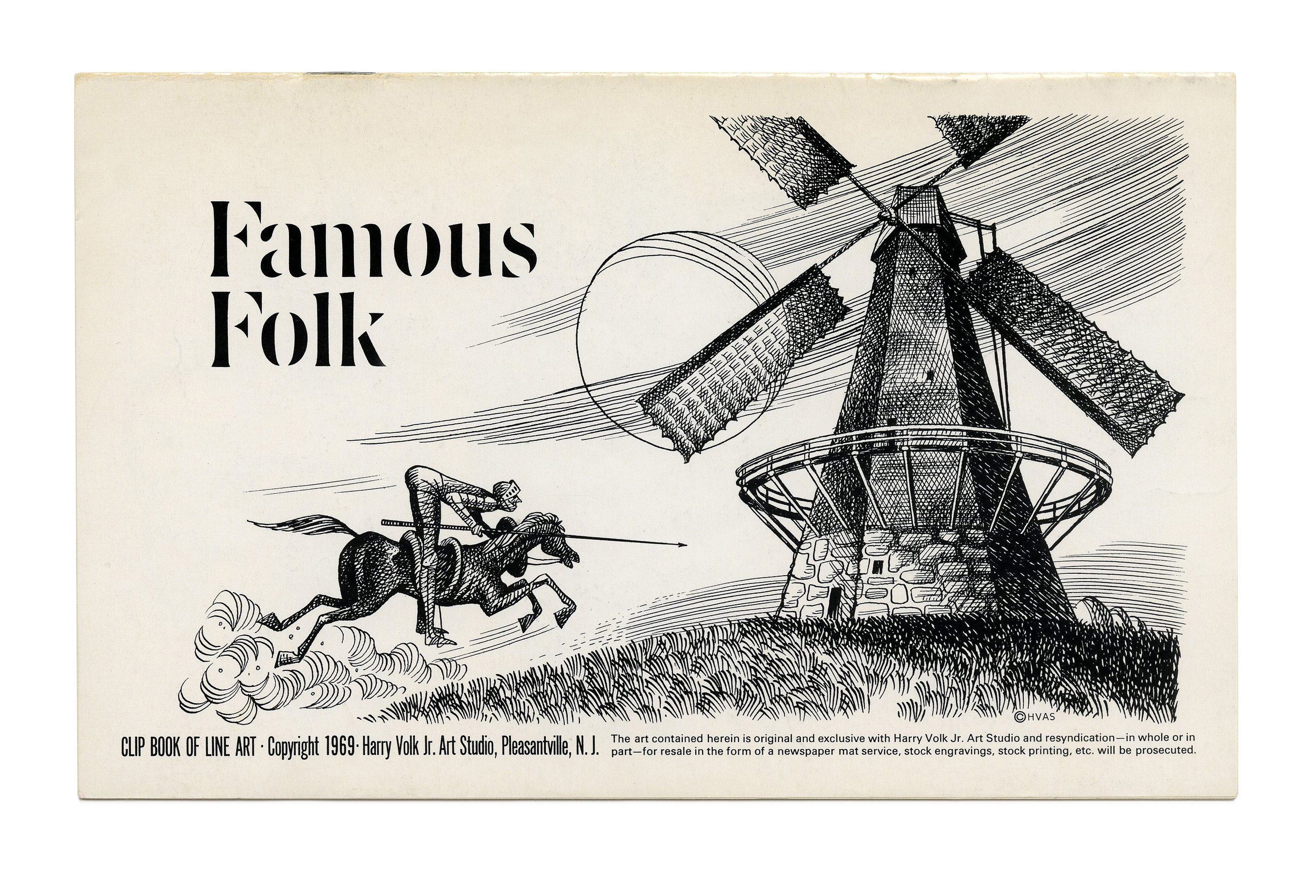
“Famous Folk” (No. 181) ft. Don Quixote and Visa.
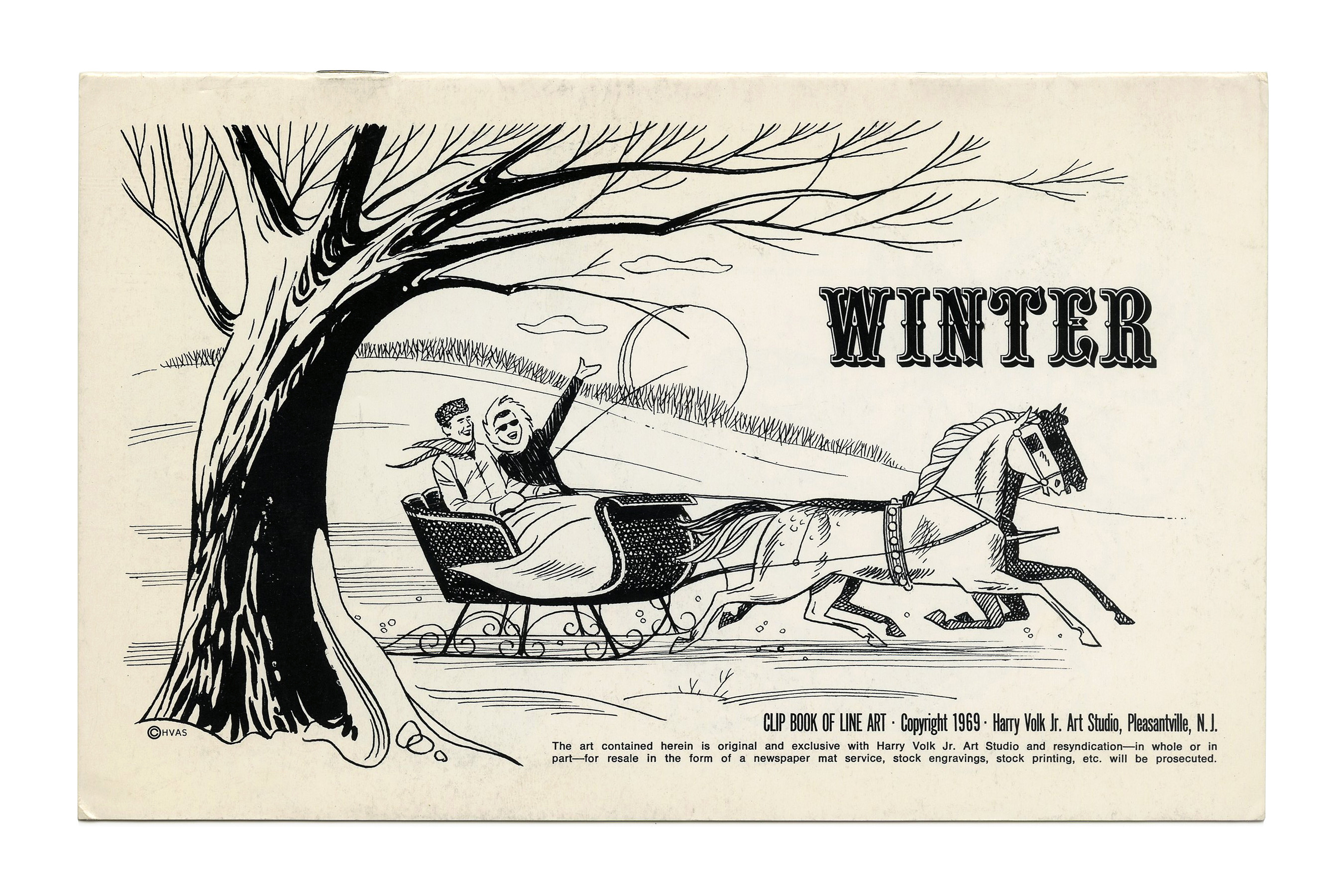
“Winter” (No. 185) ft. Filmotype Quentin.
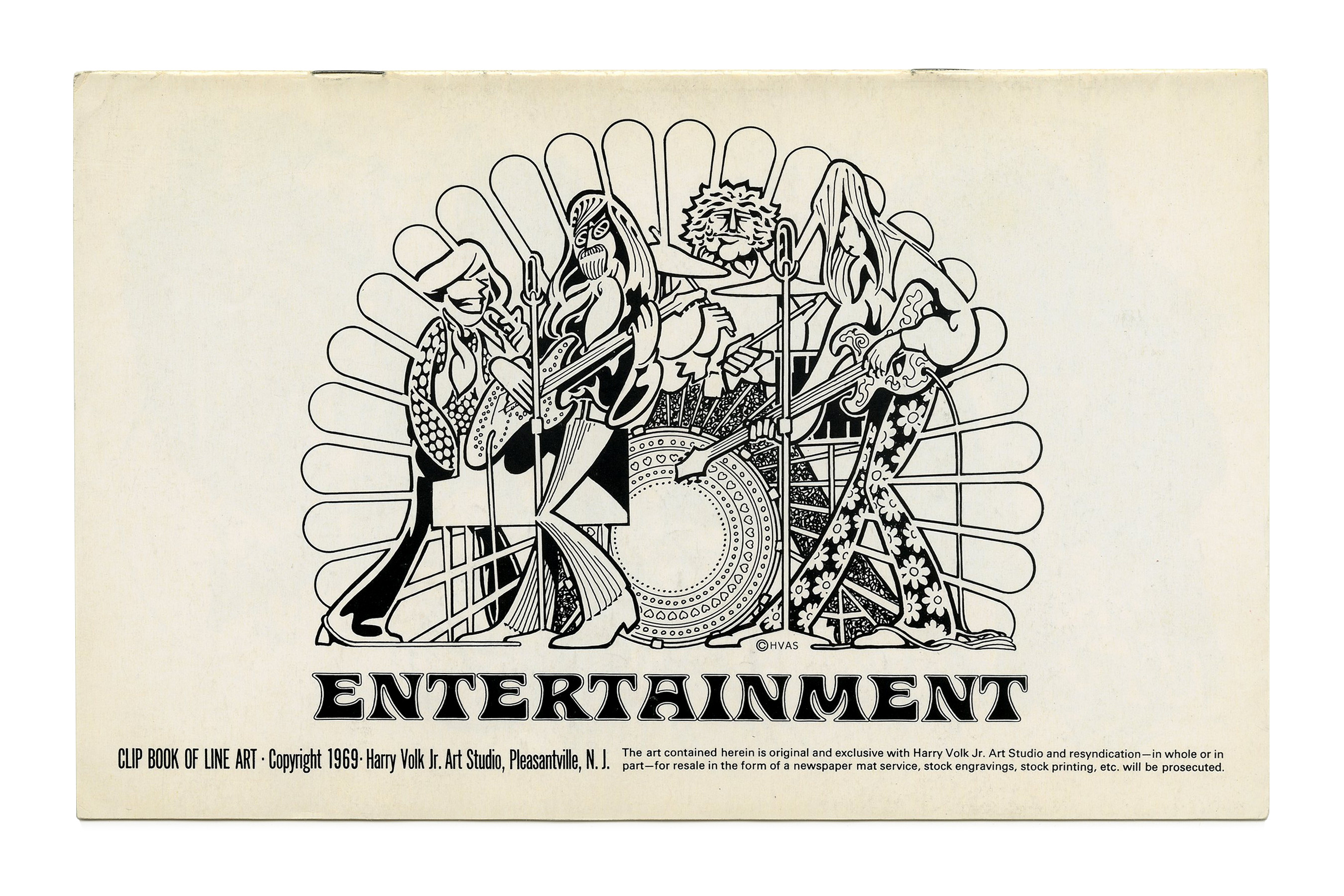
“Entertainment” (No. 187) ft. Tacan.

“Crowds” (No. 502) ft. Grotesque No. 9 in italic caps.

“Senior Citizens” (No. 503) ft. Eurostile.
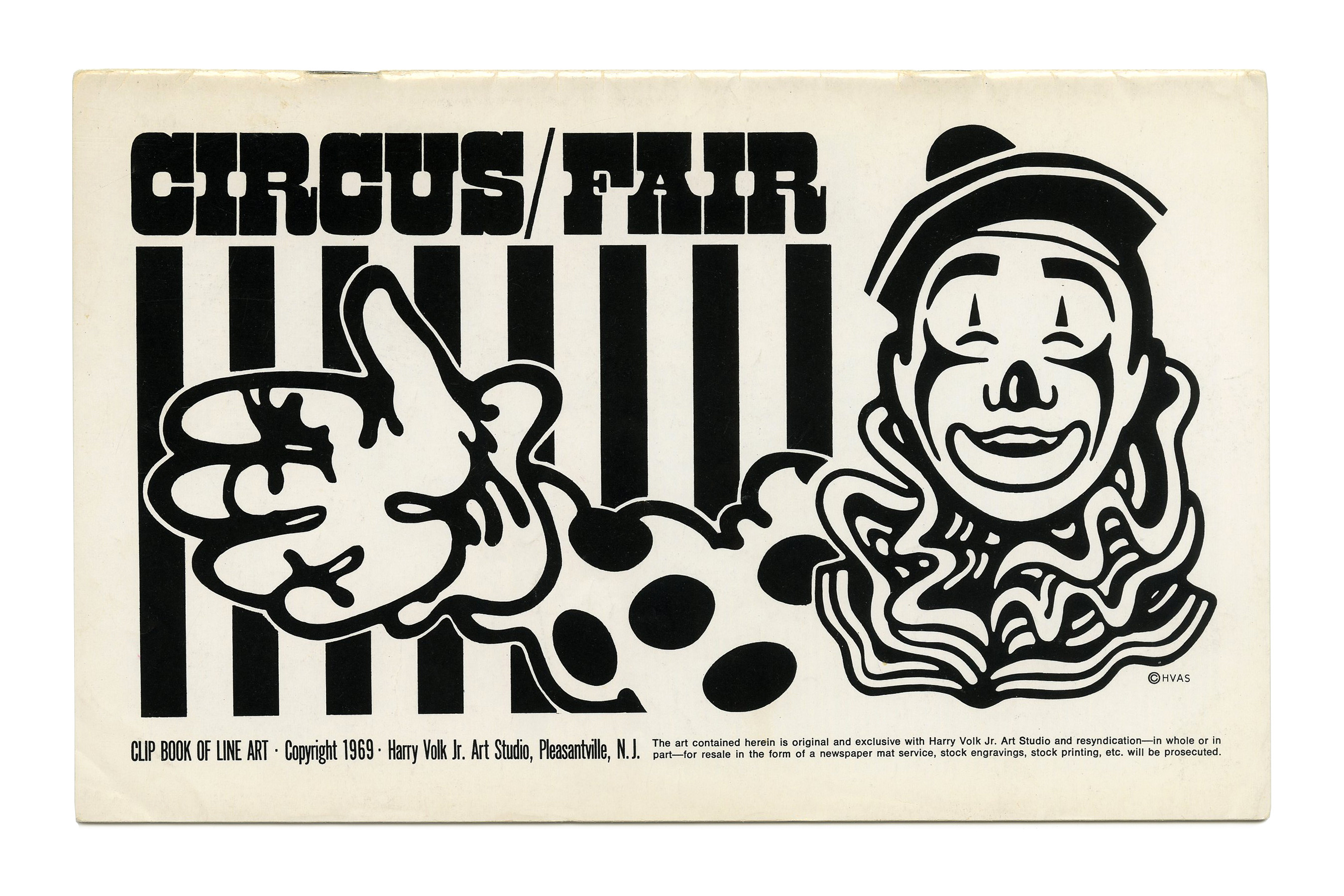
“Circus/Fair” (No. 504) ft. West Barnum.
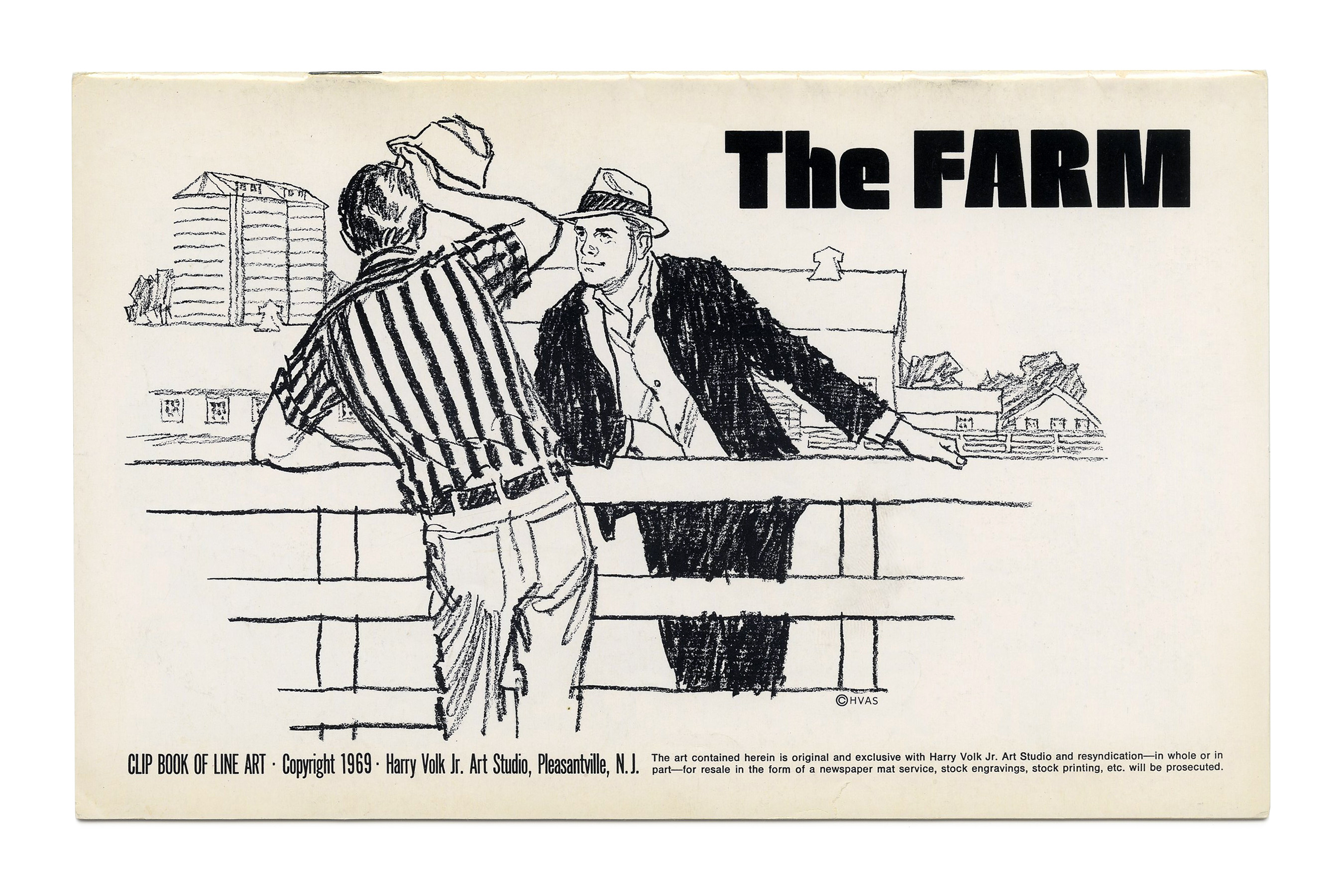
“The Farm” (No. 506) ft. Neil Bold. Illustration by Tom Sawyer.
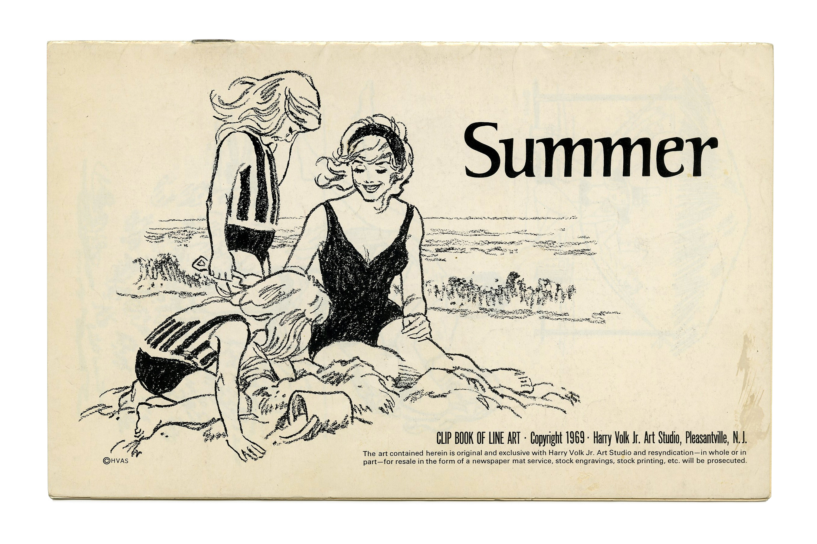
“Summer” (No. 507) ft. York. Illustration by Tom Sawyer.
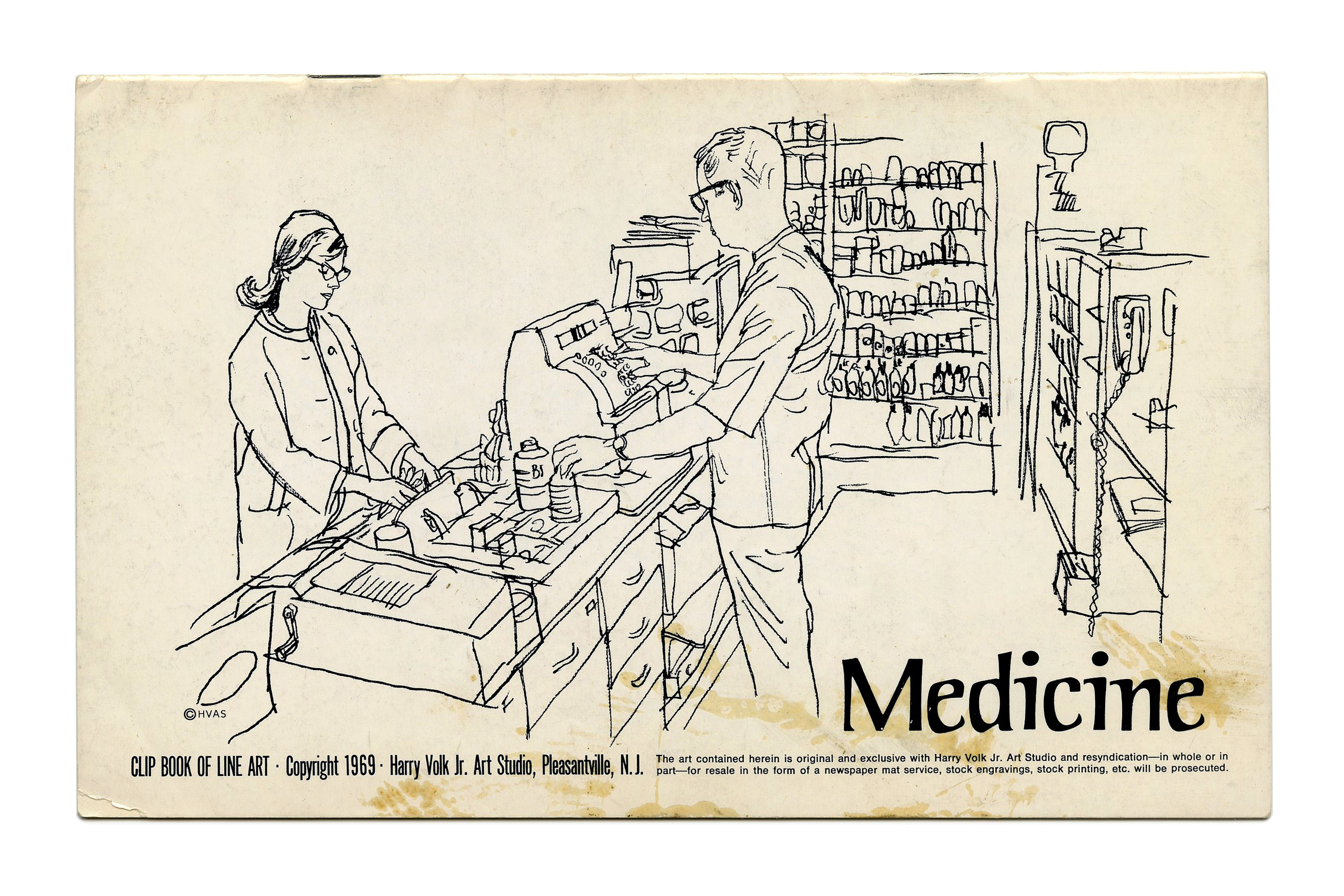
“Medicine” (No. 508) ft. York.
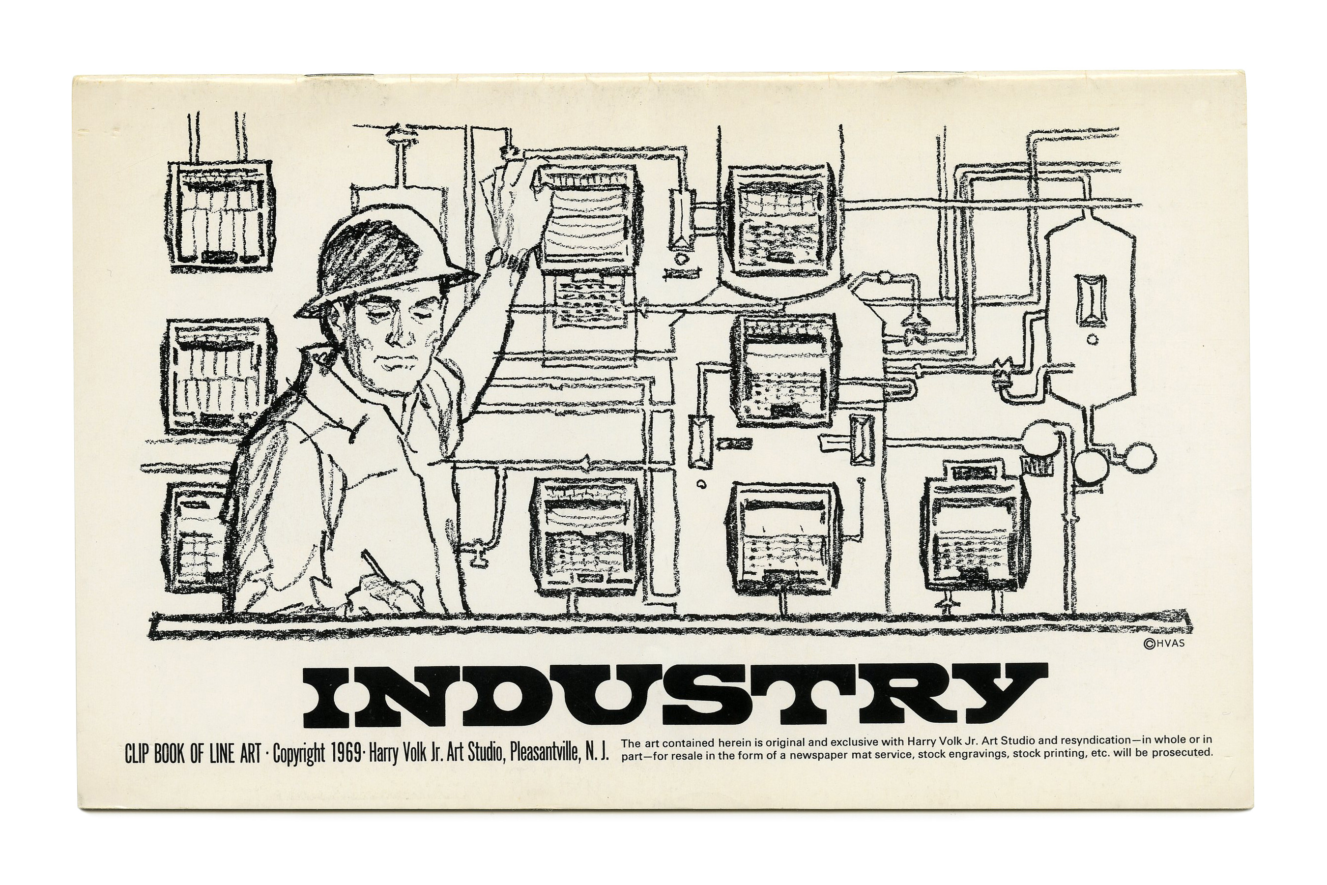
“Industry” (No. 511) ft. Giorgio (VGC). Illustration by Tom Sawyer.
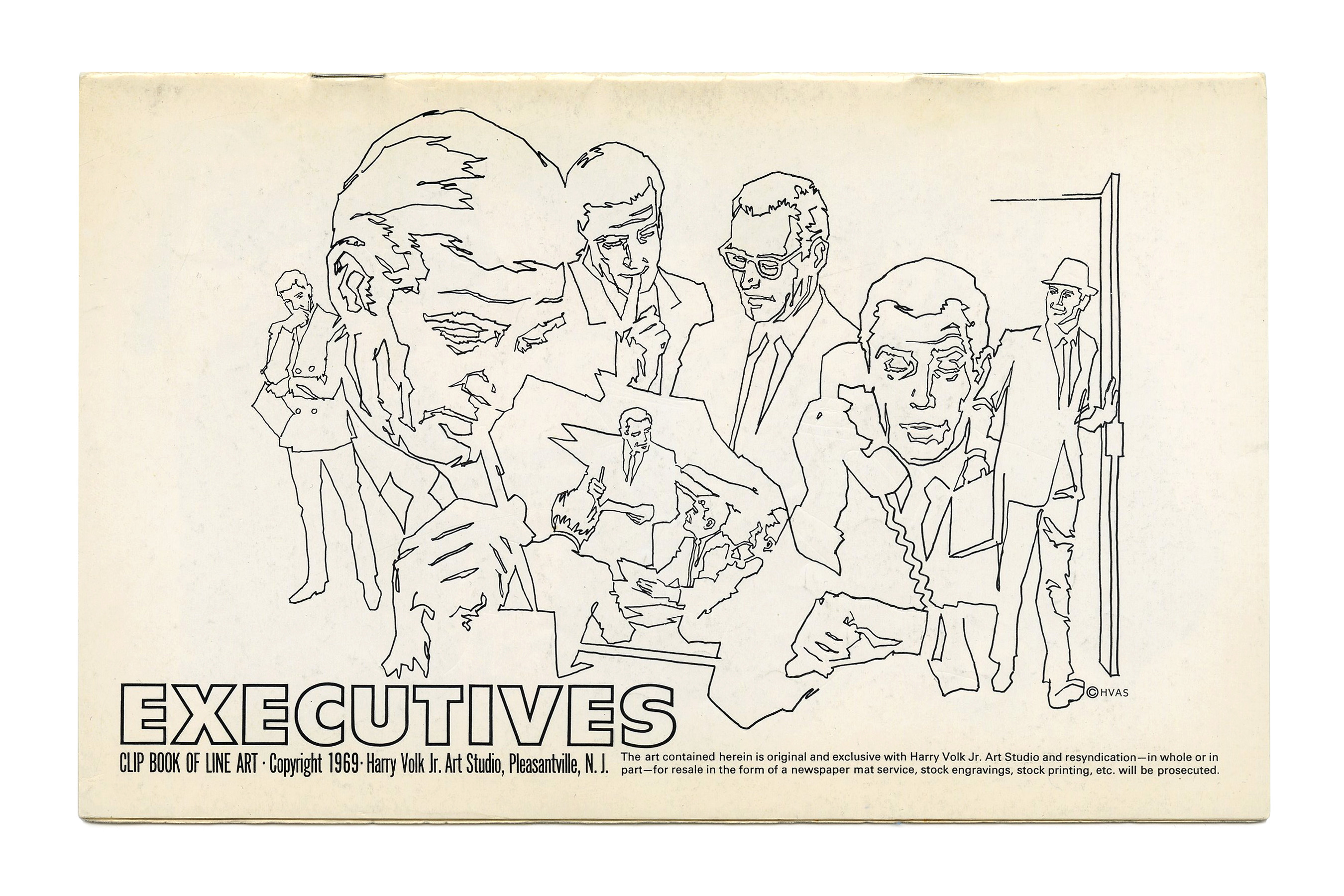
“Executives” (No. 518) ft. Filmotype Veteran.

“Service” (No. 519) with what looks like an apocryphal Cooper Black, obliqued with a fancy S.
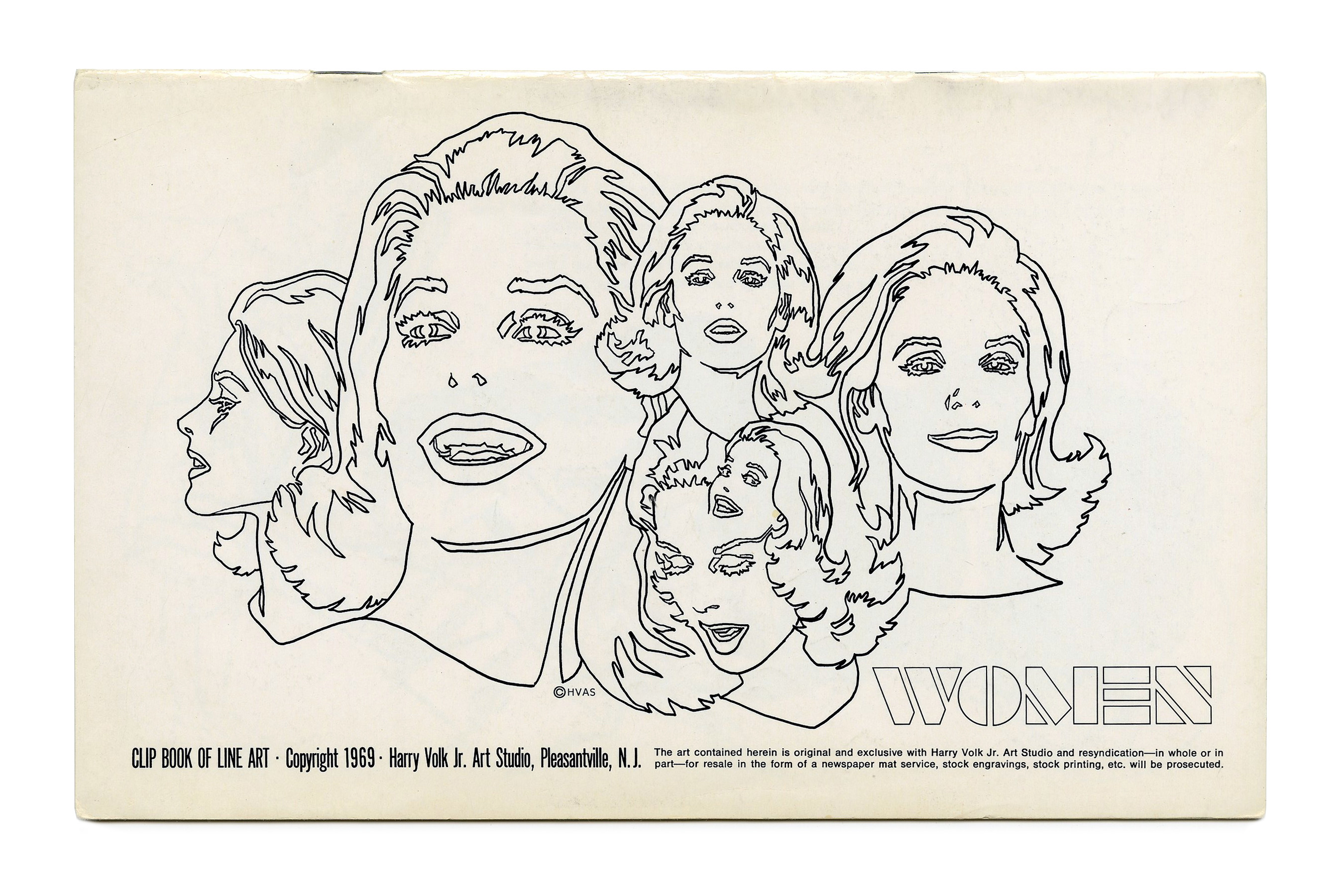
“Women” (No. 521) ft. Calendar.

“Couples” (No. 522) ft. obliqued caps from Futura Dot.
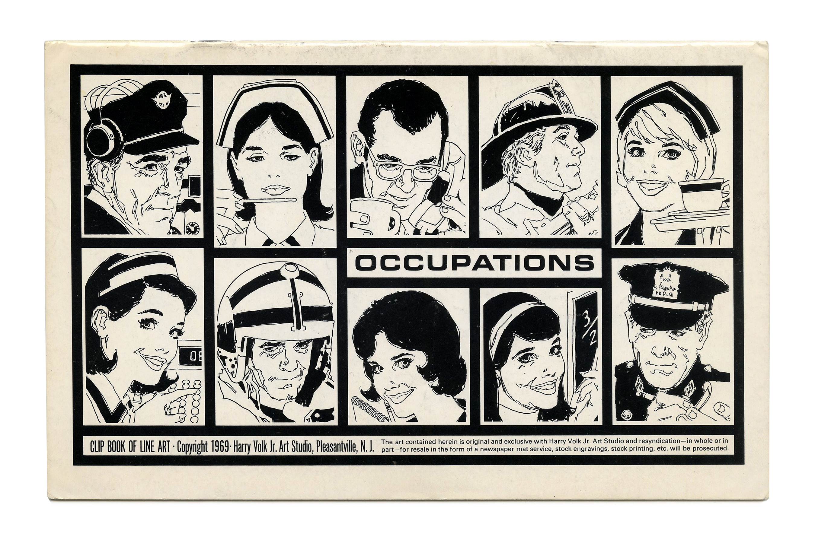
“Occupations” (No. 524) ft. more Eurostile Bold Extended.
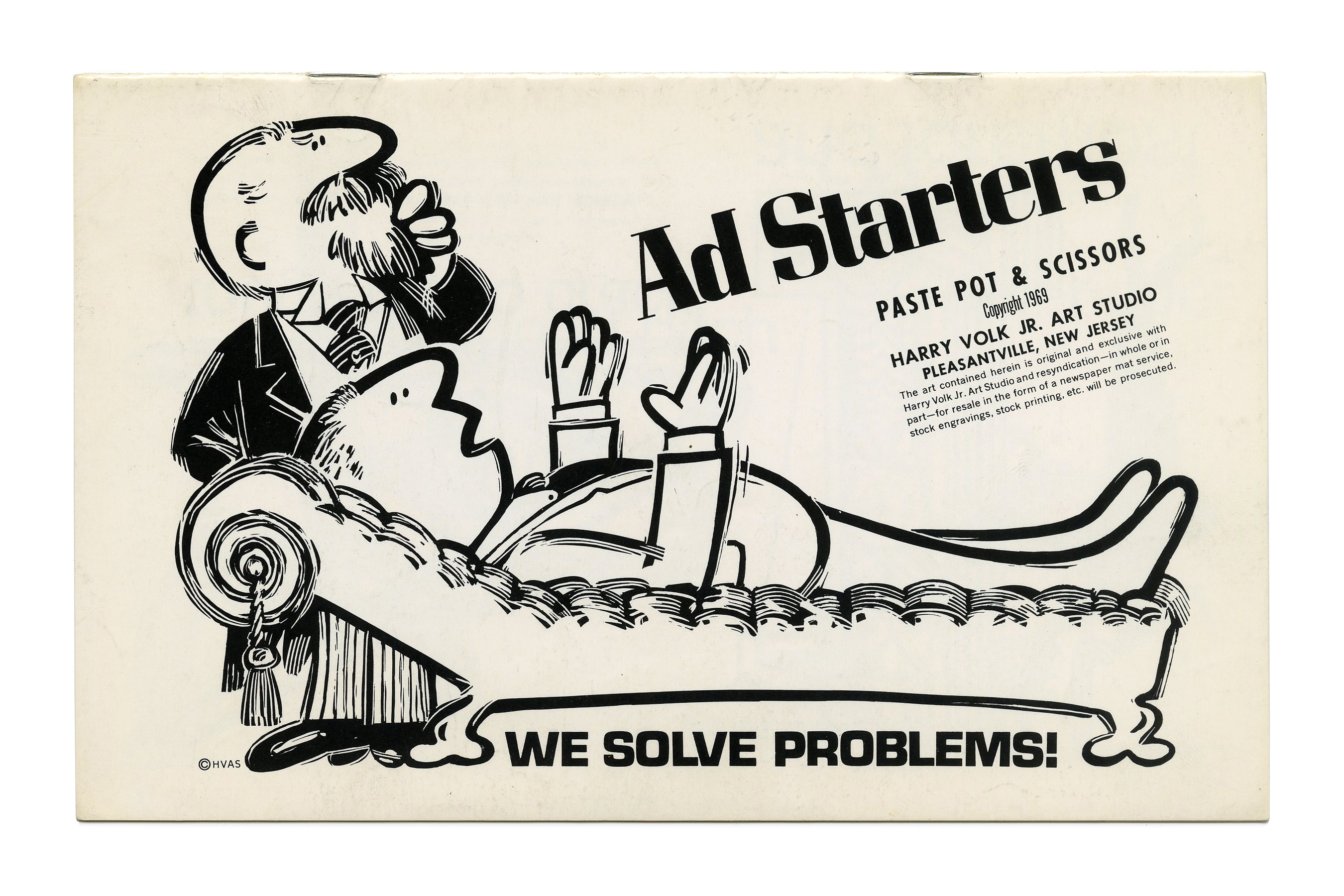
“Ad Starters” from the Paste Pot & Scissors series (No. PP117), featuring Corvinus and a regular width of Microgramma. The small print here includes Futura, Futura Condensed, and News Gothic.

“Time” (No. PP118) ft. Filmotype Quincy.
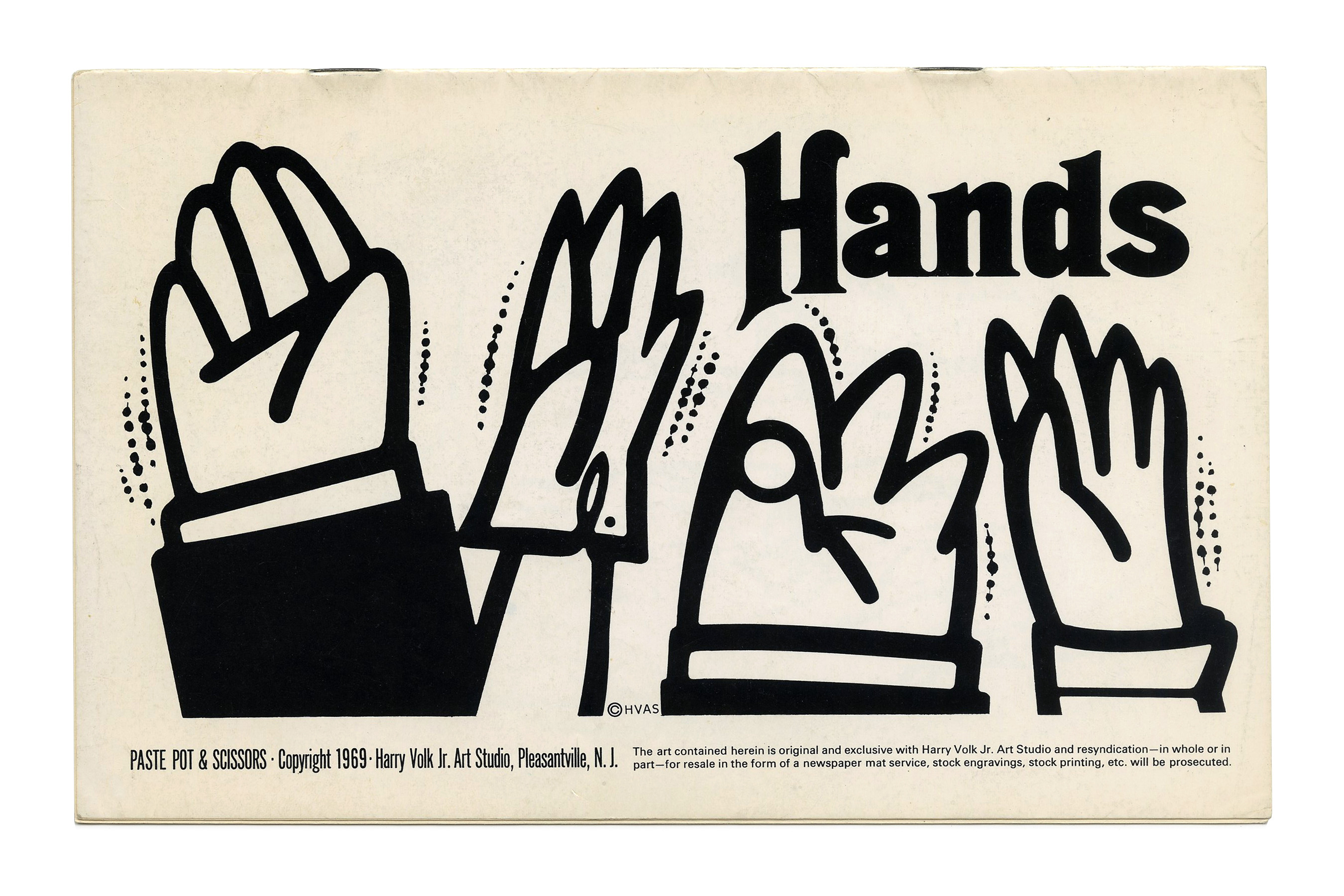
“Hands” (No. PP119) ft. Thalia.
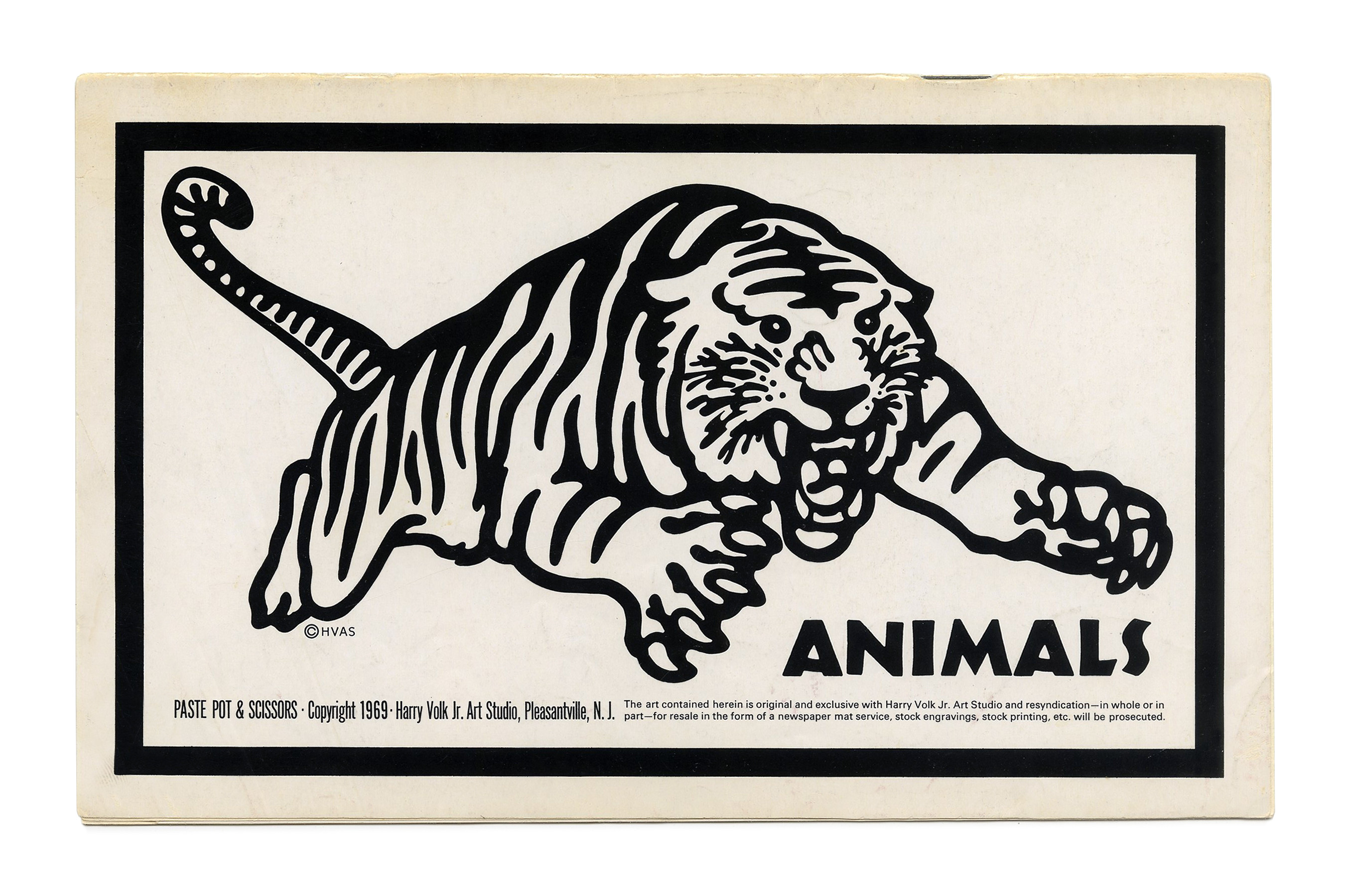
“Animals” (No. PP120) ft. Neuland.

“Elfie & Gremmie” (No. PP122) ft. Whimzitype 3600, stretched.

“Eye, Ear, Mouth” (No. PP124) ft. an early use of Davison Jumbo.

“Design Devices” (No. PP128) ft. Urban.
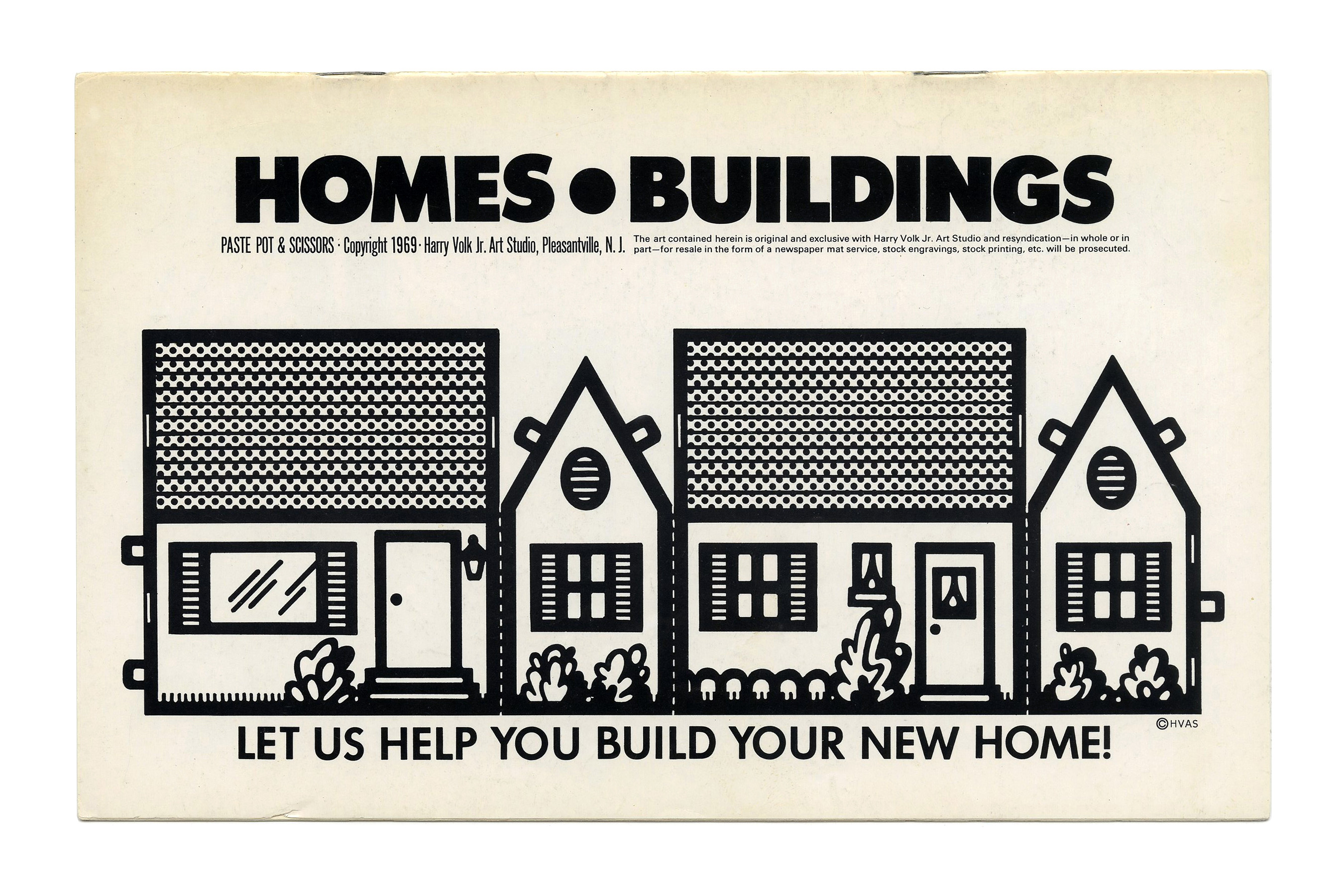
“Homes • Buildings” from the Paste Pot & Scissors series, ft. Twentieth Century.


")


1 Comment on “Clip Books of Line Art, Volk (1969)”
“OLD FASHIONED” is not an ad hoc modification of Othello, but an existing photo typeface. It’s called Davison Bolero and was also used for the cover of JP Miller’s The Skook.