
“It’s the real thing.” Coca-Cola Ads (1969–74)
Contributed by Stephen Coles on Feb 4th, 2013. Artwork published in
.

Source: www.eatsleepwork.com License: All Rights Reserved.
1970
“It’s the real thing. Period! Coke. Period! In Helvetica. Period! Any questions? Of course not. Drink Coke. Period! Simple.” — Michael Bierut in Helvetica. Video clip below:
Source: www.eatsleepwork.com License: All Rights Reserved.
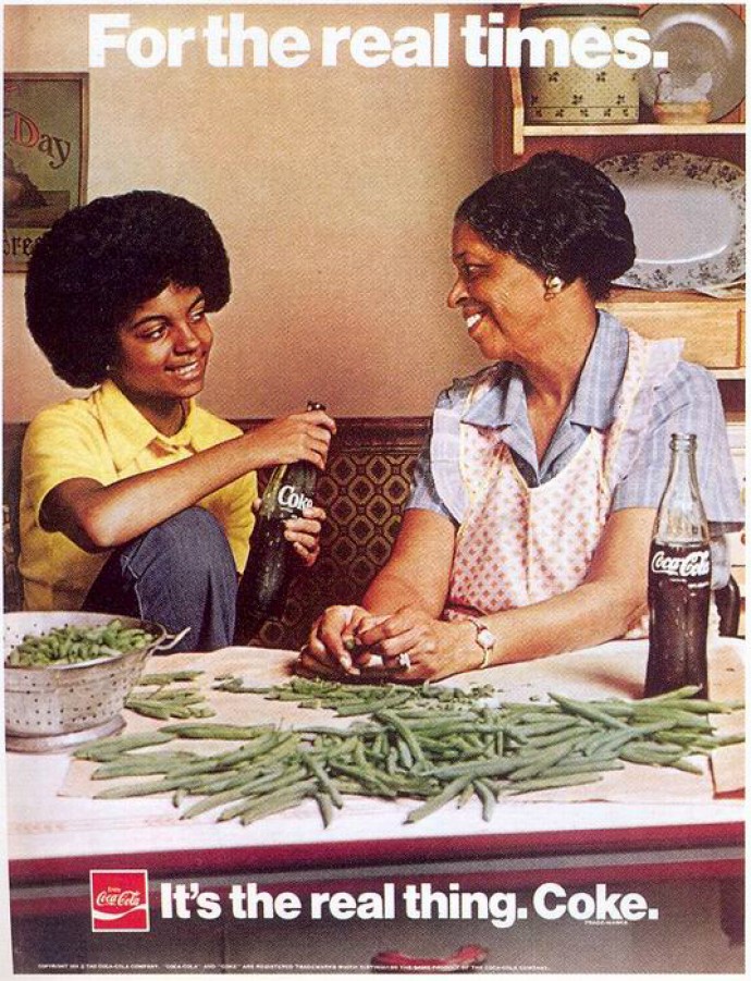
1974

Source: rolexblog.blogspot.com License: All Rights Reserved.
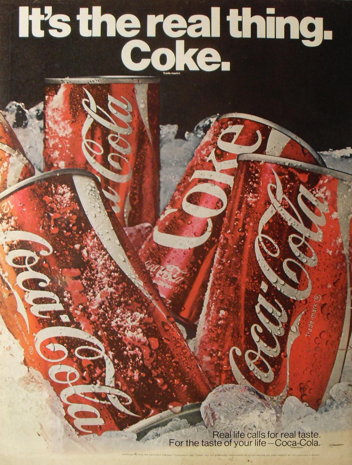
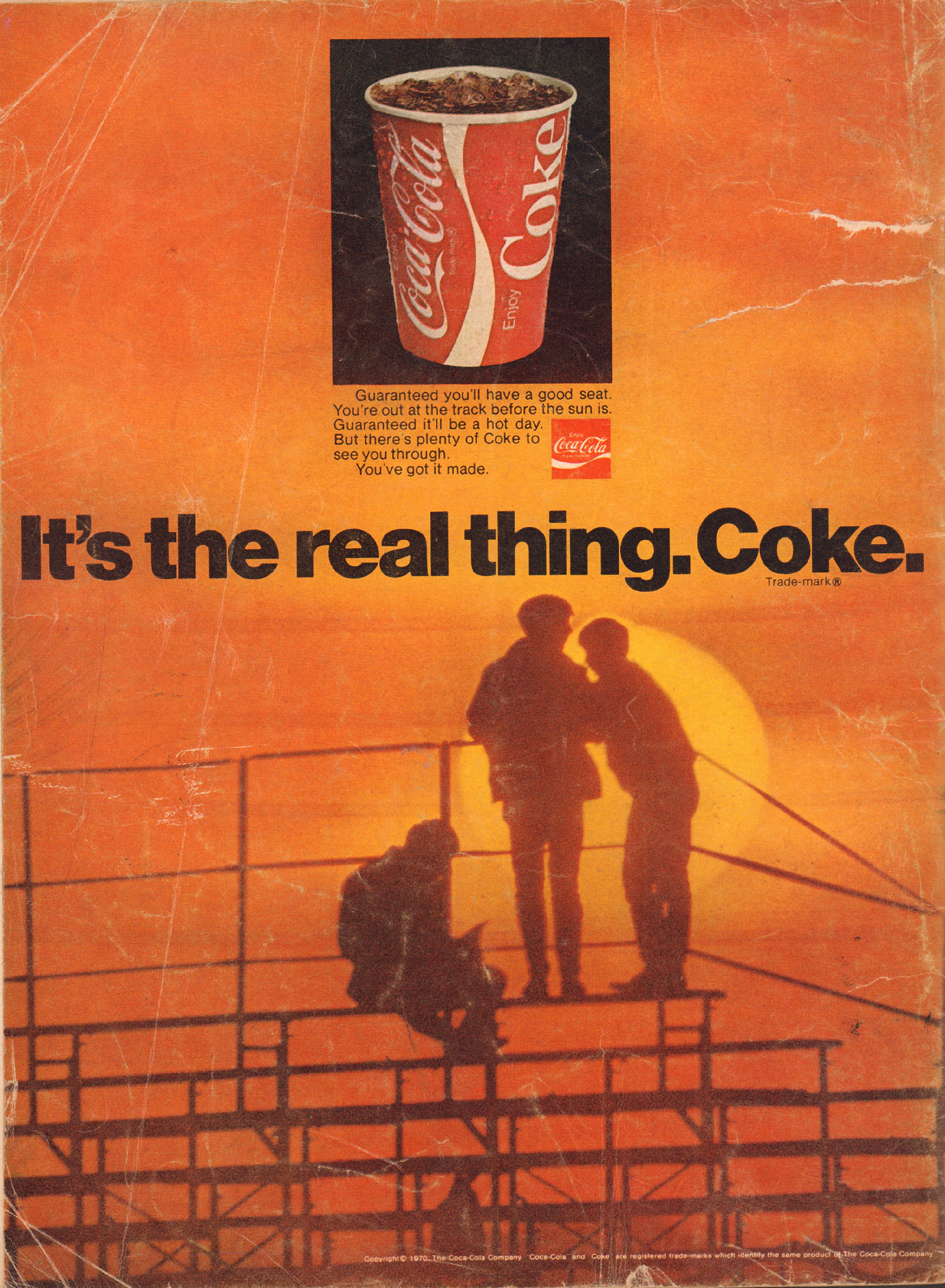
Dec, 1970
Source: www.flickr.com License: All Rights Reserved.
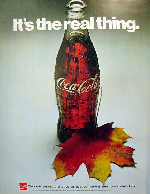
1970

Source: www.adbranch.com License: All Rights Reserved.
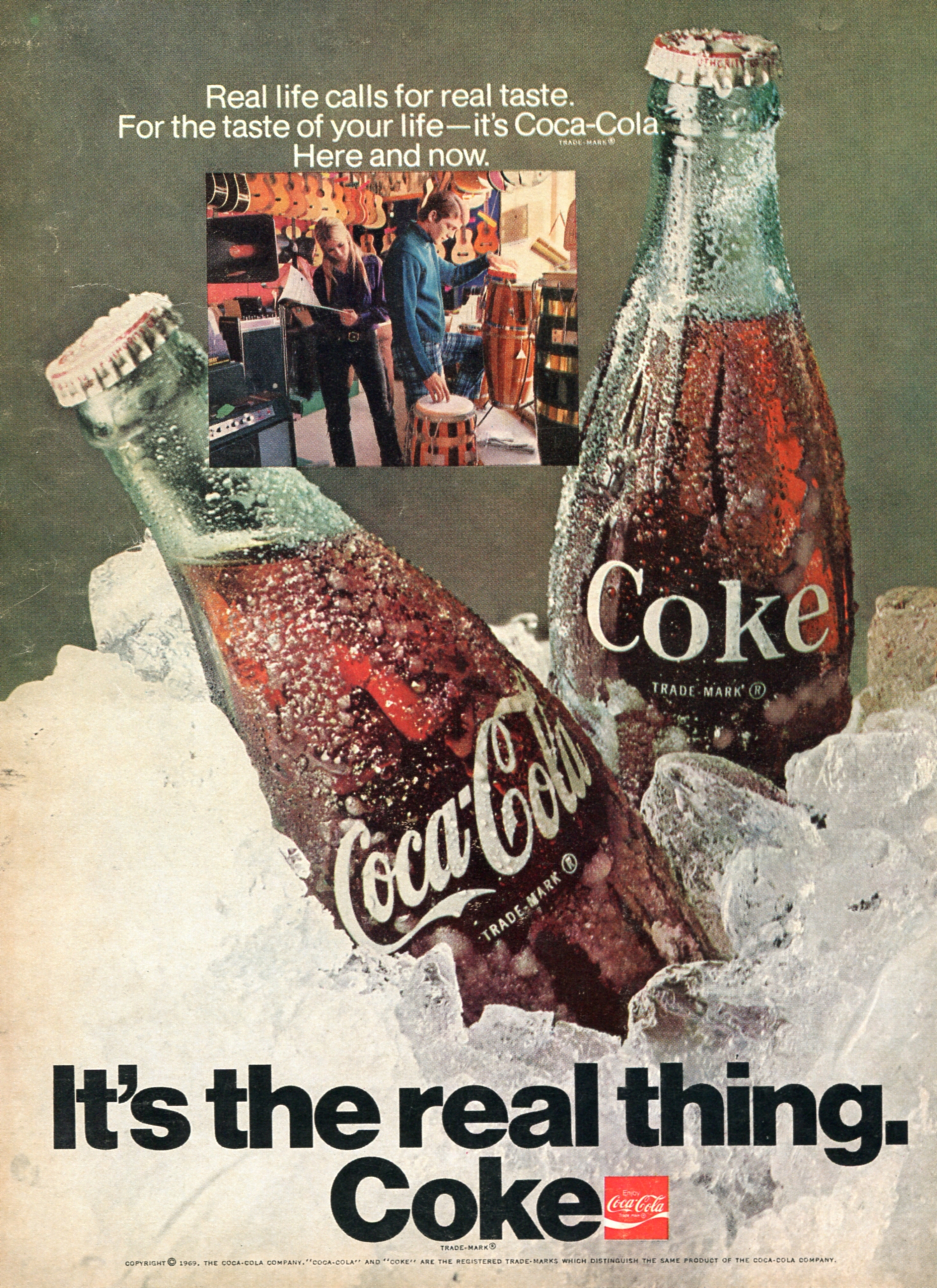
1969

Source: www.adbranch.com License: All Rights Reserved.
1970

Source: www.adbranch.com License: All Rights Reserved.
1969
Source: www.adbranch.com License: All Rights Reserved.
1971
Jan, 1970
1971. A rare departure from the centered headline.
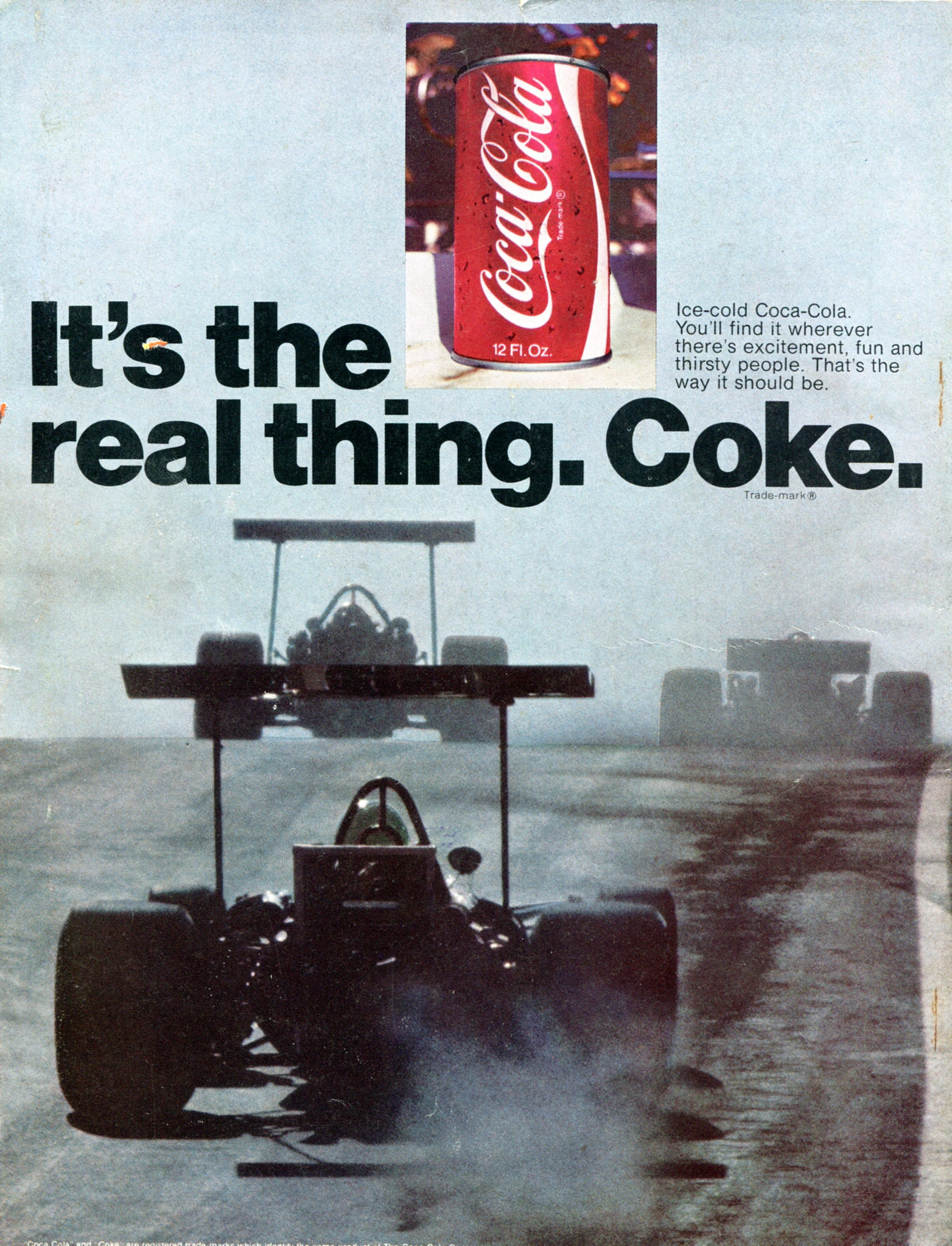
Hot Rod magazine, Sep 1970.

1969.


 movie poster, Atlas rerelease")


")


2 Comments on ““It’s the real thing.” Coca-Cola Ads (1969–74)”
Nothing like a spot of periodism…
Another 1969 ad from this campaign used Times rather than Helvetica.