
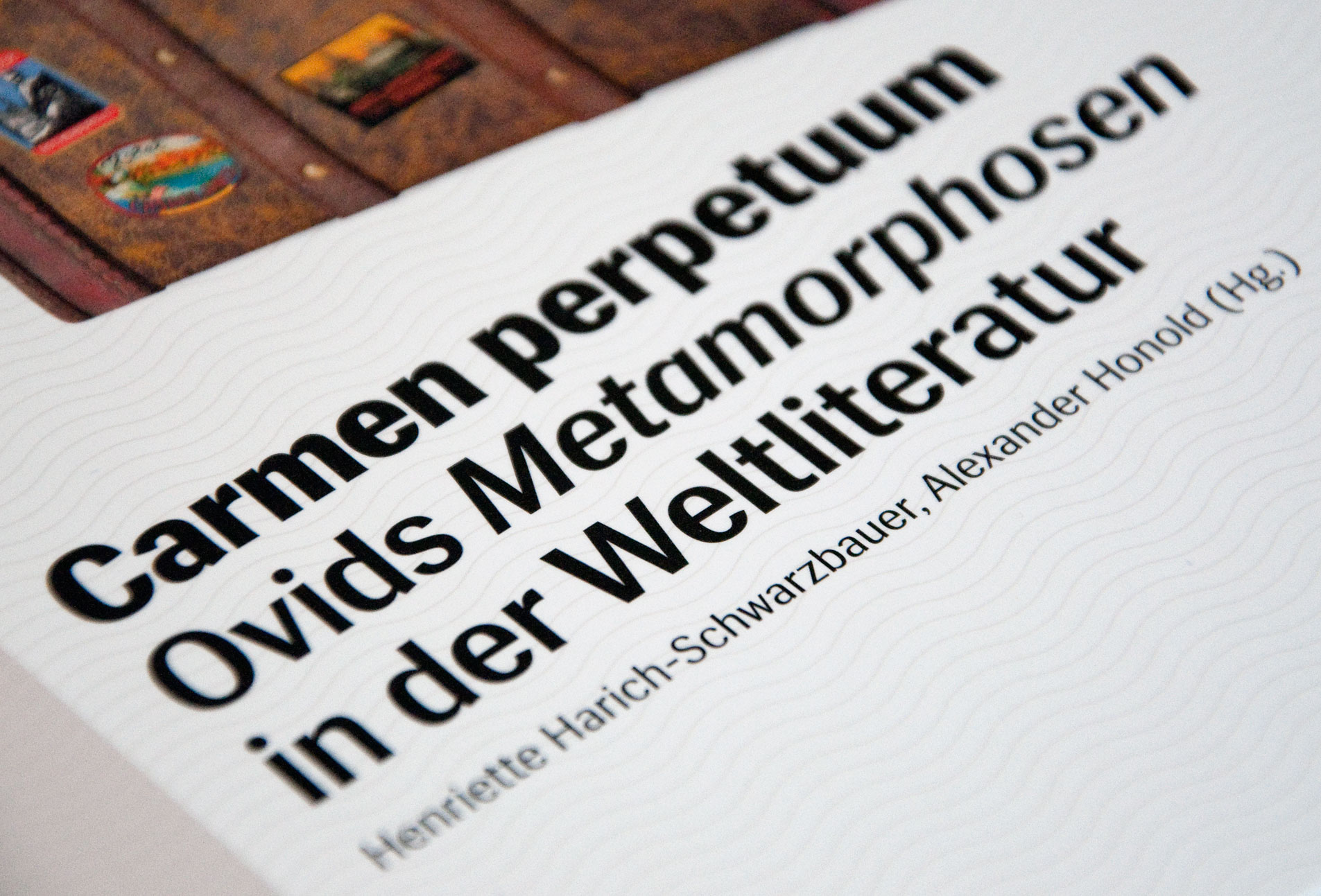
Carmen perpetuum

A few years ago, I was commissioned to design a poster and program flyer for a lecture series at Basel University that focused on the reception, and literary repercussions of Ovid’s Metamorphoses throughout literary history. It was then that I came up with a composite image of the book as traveling suitcase as the central visual.
Last year, when two professors of the same university prepared to edit an academic volume on the same subject, they approached me to reinterpret the design of the poster for the book cover.
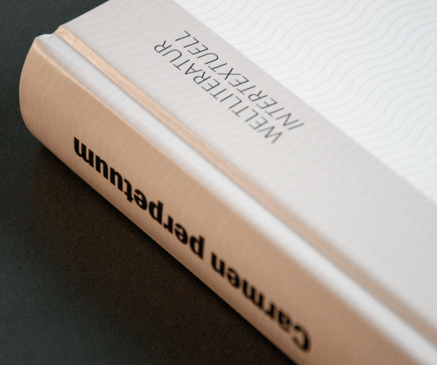
I opted to keep the key visual, but what needed a refresh was the typography. The previous materials, designed by a younger and less type-savvy me, had used Frutiger – a solid but not very interesting choice. So for this book cover I switched to Swedish Siri. Besides being a fresher – and not stereotypically Swiss – design, Siri had the advantage of being relatively dense and space-saving, useful for such a verbose title (especially since the editors wished that the subtitle be just as “visible” as the main title). The wide range of weights also came in handy – right down to the thinnest of weights used for the (potential) series ident, “Weltliteratur intertextuell”, in vertical orientation.


")


")


")


