
Cryptozoic! by Brian W. Aldiss, Avon

First published by Faber & Faber in 1967 as An Age, this science fiction novel by English writer Brian W. Aldiss was renamed Cryptozoic! for the first U.S. edition by Doubleday in 1968. A year later, Avon brought out the first paperback edition, with cover art by Don Punchatz. A second printing, still with Thorowgood Sans Shaded for the type but with different cover art, followed in 1972. Shown here is the third printing from 1977.
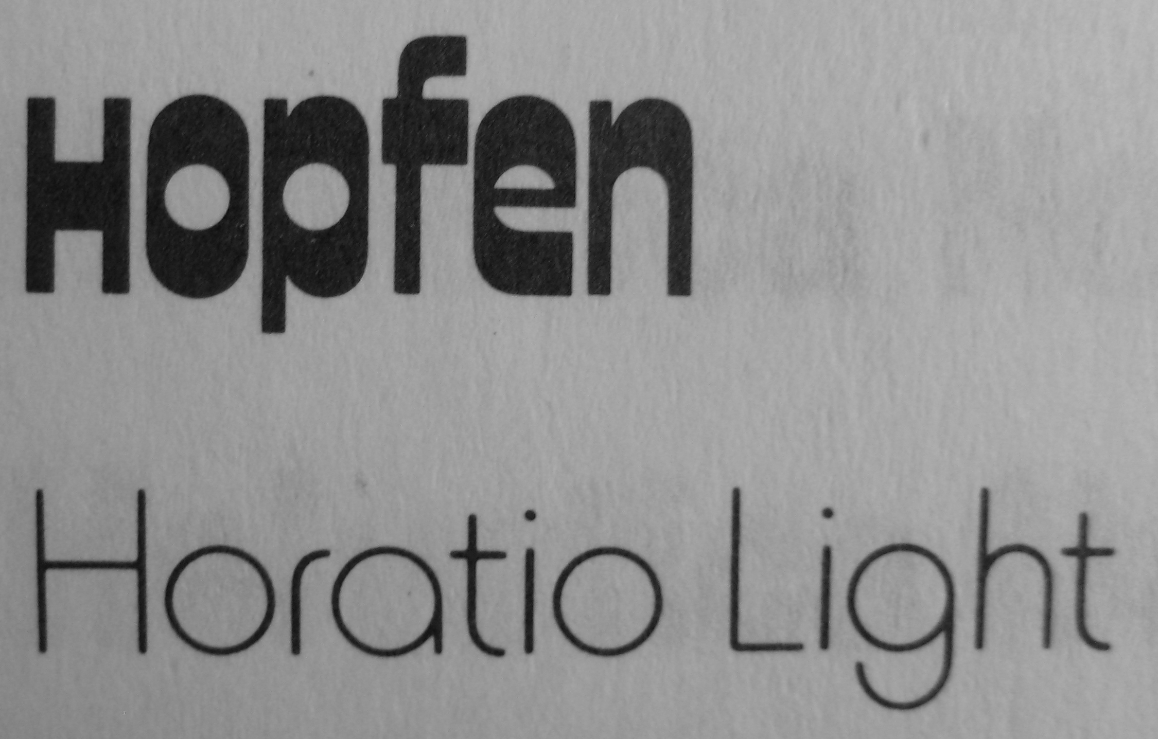
This time the display typeface is Sintex, designed by Aldo Novarese and issued by VGC around 1970. To be more precise, it isn’t the original Sintex, but a copy that added a large number of alternates. One of the added extra glyphs is the S in the author’s name. It looks too heavy and out of place, certainly next to the lighter “ALDI”. The extended copy of Sintex appears under the name Hopfen in catalogs by Castcraft (1978) and FotoStar (after 1981). Already in 1974, Formatt offered a version for dry-transfer lettering named Keyhole. It has the same alternates as Hopfen, but is distinguised by scaled-down lowercase glyphs. I don’t know which came first, Hopfen or Keyhole.
The second line with the title is stretched.
The cover illustration is credited to Don Ivan Punchatz on the copyright page. According to ISFDB, “[t]his art differs from the Punchatz-credited art of the first printing. It’s possible that the publisher failed to update the cover art credit for this printing. There is speculation that it might be the work of Dean Ellis.”

The back cover features another alternate from Hopfen a.k.a. Keyhole: the top-heavy D isn’t part of the original Sintex.


")


")


")


</span>")


