Weingut Klapsch vermouth labels Contributed by TYPE01 on Jan 17th, 2022. Artwork published in 2021. Source: www.instagram.com Niklas Putz. License: All Rights Reserved. 
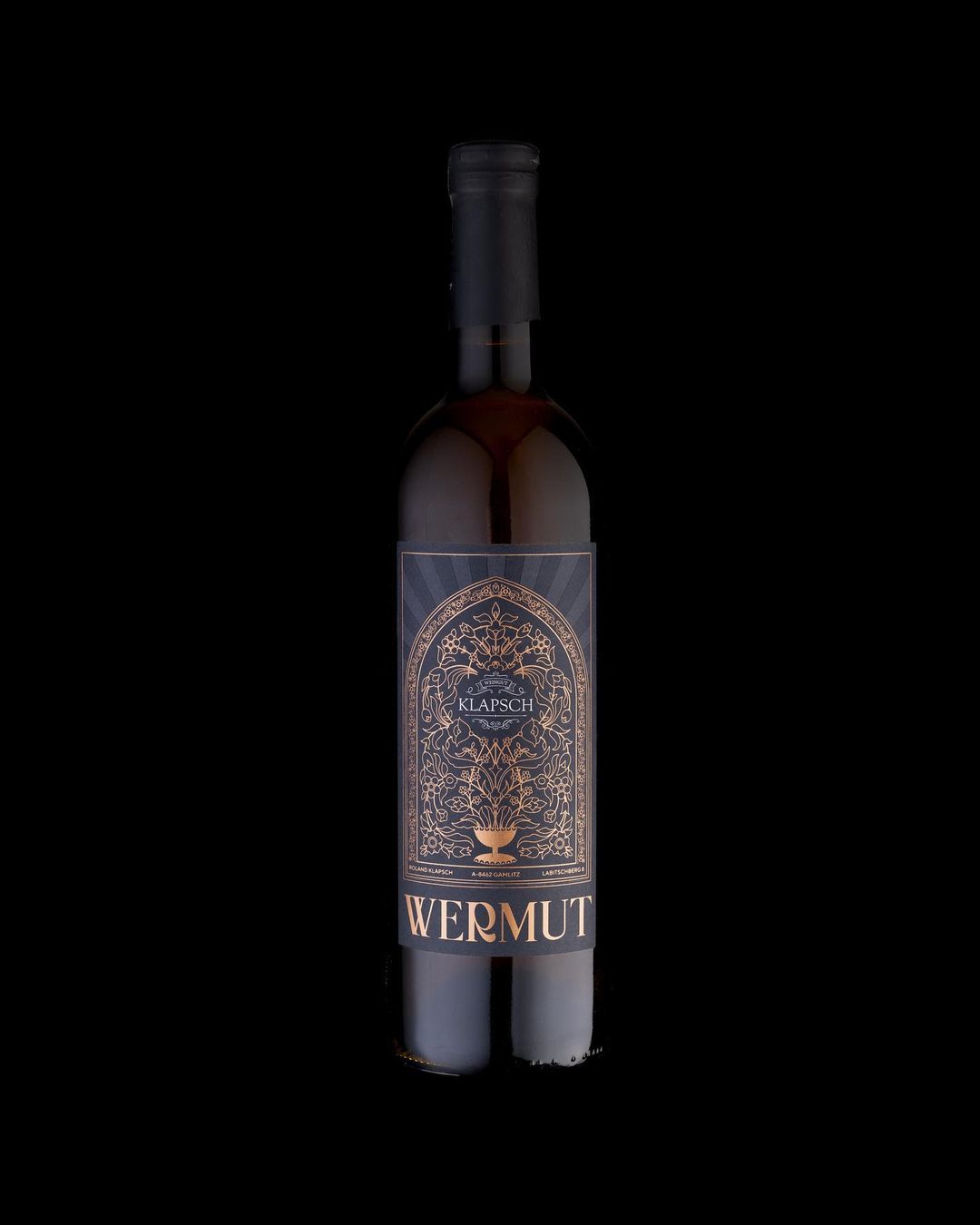
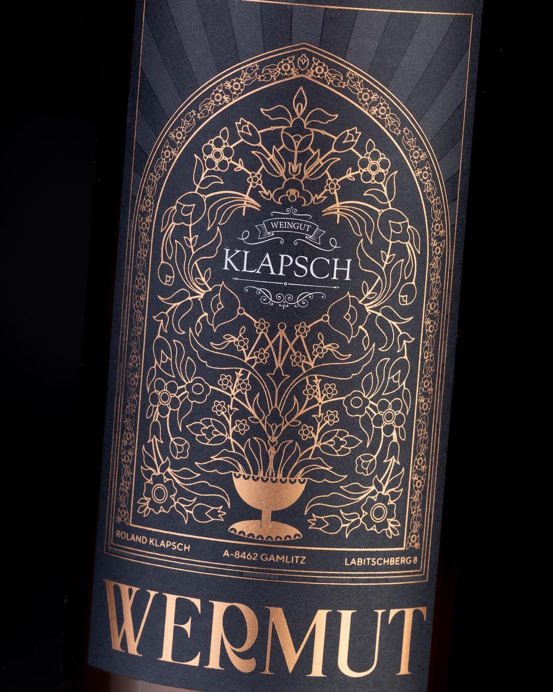
Label design for a vermouth by Austrian Weingut Klapsch, showing off Bagerich’s sleek and elegant flair. The Klapsch wordmark is set in caps from Goudy Oldstyle. The sans used for the address is unidentified. Design by Jonas Grießler, photography by Niklas Putz. Source: www.instagram.com Niklas Putz. License: All Rights Reserved. Typefaces Formats Packaging (1399) Topics Product (986) Food/Beverage (1952) Designers/Agencies Jonas Grießler (1) Tagged withvermouth (1)alcohol (200)bottles (224)labels (178)metallic foil (231)gold (256)illustration (863)flowers (187)all caps (4043) Artwork location Austria (281) Graz (21) Gamlitz (1) 1 Comment on “Weingut Klapsch vermouth labels” Eva Silvertant says: Jan 19th, 2022 12:45 am I have seen the outlines of Bagerich, which lack extrema points so from a technical perspective the typeface seems subpar to me. But when I saw this wine label, it was a good reminder that the technical aspects of a typeface aren’t everything. Really impressive result! Post a comment Name Email – will not be published Website Your response Submit Comment More Goudy Oldstyle in use Vzlyot (1979) Czechoslovak movie poster1980Eva HeřmanskáContributed by Florian Hardwig Tyrannosaurus Rex – My People Were Fair and Had Sky in Their Hair … but Now They’re Content to Wear Stars on Their Brows album art1968George UnderwoodPhoto(s) by Klaus Hiltscher on Flickr. Hay’s Five Fruit ad1925unknownContributed by Stephen Coles Sponsor More in Product John Masters Organicsc. 2017unknownContributed by Barry Parker Olivier Clairec. 2015Brand BrothersContributed by Brand Brothers “Wouldn’t It Be Cool If” WebsiteContributed by Webtype Serif TV website2015Ronan & Erwan BouroullecLewis FrostContributed by Andreas Kofler More in Packaging Lenwich visual identity2020MuccaContributed by Sean O'Connor Staff Pick AVK Chocolate Bar2015Olga SamsonenkoContributed by Andrij Shevchenko Sony C-60HF cassette insertc. 1970SonyContributed by Simon Birky Hartmann Thunderbirds, Captain Scarlet, and UFO TV seriesc. 1970Bob BellContributed by james millner Staff Pick More Fonts In Use Road Grays magazine, issue No. 12019Austin StahlContributed by Austin Stahl Staff Pick 13-inch Lucite® ruler1975Contributed by Chris Purcell Staff Pick Future Now / America’s Goals2017PentagramEddie OparaMimi O ChunContributed by Darden Studio Staff Pick Dramaturgias #1, Sesc2019Tereza BettinardiContributed by Tereza Bettinardi Staff Pick
1 Comment on “Weingut Klapsch vermouth labels”
I have seen the outlines of Bagerich, which lack extrema points so from a technical perspective the typeface seems subpar to me.
But when I saw this wine label, it was a good reminder that the technical aspects of a typeface aren’t everything. Really impressive result!