OutCare
Contributed by Darden Studio on Mar 23rd, 2023. Artwork published in
circa 2015
.0
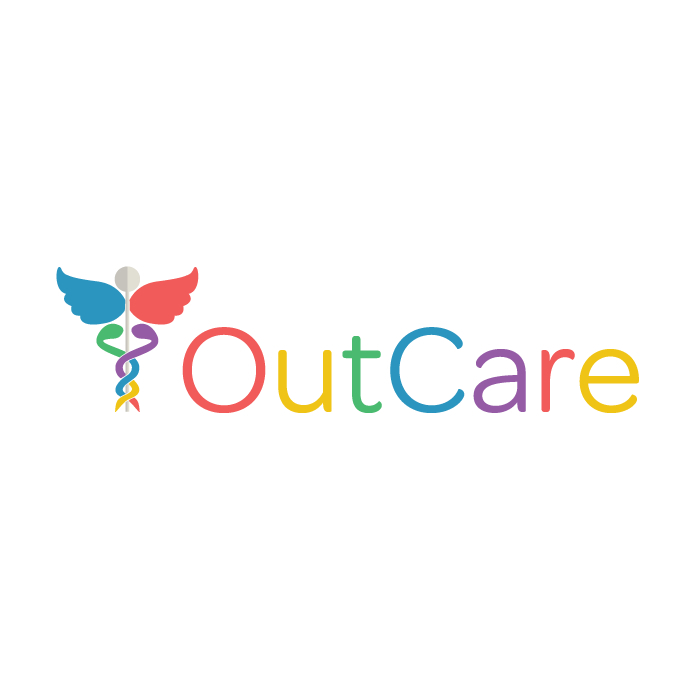
Since 2015, OutCare Health uses Omnes for their logo.
OutCare Health is a non-profit organization with the purpose of providing extensive information and education on lesbian, gay, bisexual, transgender, and queer (LGBTQ) healthcare.
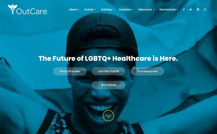
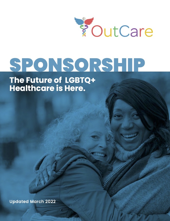
When the logo is shown on white, it uses the sans by Darden Studio with letters in alternating colors. The wordmark is combined with an equally colorful caduceus (☤). In other contexts, the CamelCase logo appears in white, typically against black-and-blue photographs. OutCare pairs the logo in Omnes with changing typefaces. As of 2023, the main typeface for text on the website and in publications is Poppins.
Formats
- Web (3840)
- Branding/Identity (5619)
Topics
- Services (1011)
- Health/Fitness (600)
Designers/Agencies
- OutCare Health (1)
Tagged with
- healthcare (42)
- LGBTQ+ (57)
- logos (3196)
- CamelCase (69)
- alternating glyph colors (208)
- caduceus (☤) (1)
- non-profit (108)
- organizations (11)
- identities (1172)
- websites (1881)
- brochures (134)
- colorful/multicolored (898)
Artwork location
- United States (7312)
- Indianapolis (10)
In Sets
- Darden Studio (Darden Studio) (169)
- JG (Amy Chen) (4)

