
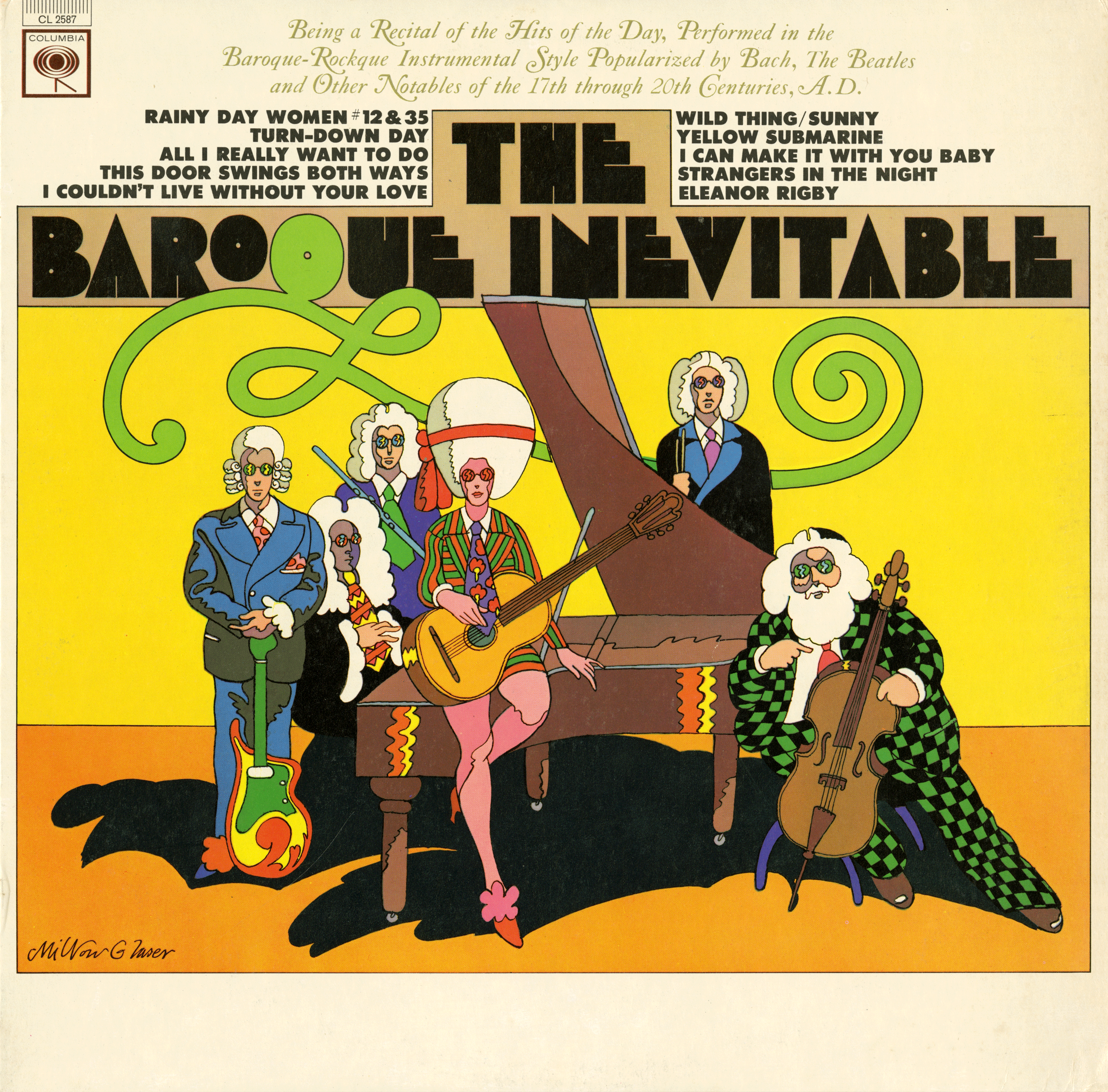
The Baroque Inevitable
Source: www.flickr.com Uploaded to Flickr by David and tagged with “babyteeth”. License: All Rights Reserved.
Cover by Milton Glaser. Love the Baby Teeth font! Does anybody know if there’s an official version of this font available? I have a digital copy called Baby Teeth but I think it must be somebody’s knock off as the letterforms are pretty clunky.


")


")


![“Savage Love (Laxed – Siren Beat)” [BTS Remix] single cover and lyric video](https://assets.fontsinuse.com/static/use-media-items/123/122464/thumb/5f7f7719/@2x/SAVAGE_LOVE_M1.webp "“Savage Love (Laxed – Siren Beat)” [BTS Remix] single cover and lyric video")


3 Comments on “The Baroque Inevitable”
As far as I know, there is no official digital version, but Paratype’s Bebit is a close approximation of Baby Teeth (Line) with the addition of Cyrillics.
The letterforms on the cover appear to be custom drawn, and might predate the film typeface as produced by Photo-Lettering. They are more condensed and mix elements of Baby Teeth Line (A, E), Baby Teeth Dotted (B, O) and Baby Teeth Opaque (N). The asymmetrical placement of the counters (B, H, U) is also different from the typeface samples shown in the One Line catalog from 1971.
The italic Caslon with swash caps is from a Caslon that was also used by Glaser for a book cover from 1960. The track listing is set in caps from PLINC’s Futura Ultra Bold which is distinguished from proper Futura by the ‘G’ with flat section on the right side. Monotype’s Twentieth Century UltraBold appears to match.
Why produce a digital version. It’s like using Comic Sans, instead of writing with markers. Glaser works with hands. Drawing is thinking.
What a great album cover design—thanks for sharing this. I’m guessing the title is a reference to Warhol’s multimedia performance art events called “The Exploding Plastic Inevitable,” which caused a stir in the mid 1960s.