
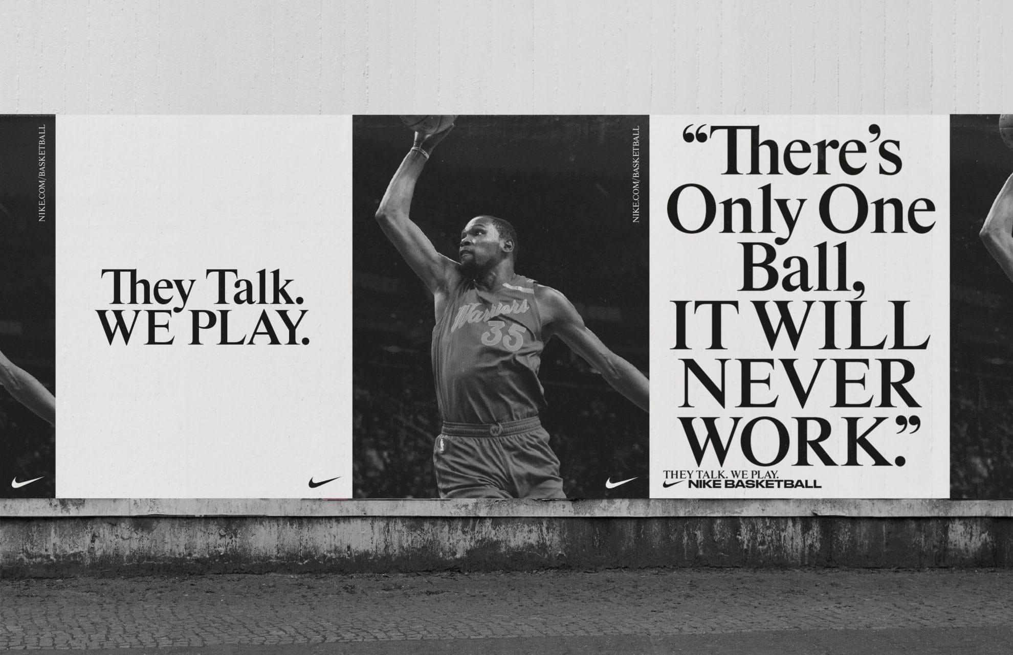
Nike Basketball NBA finals 2017 campaign
Contributed by Balder D. Dysthe on Oct 21st, 2018. Artwork published in
.
Source: the-brandidentity.com License: All Rights Reserved.
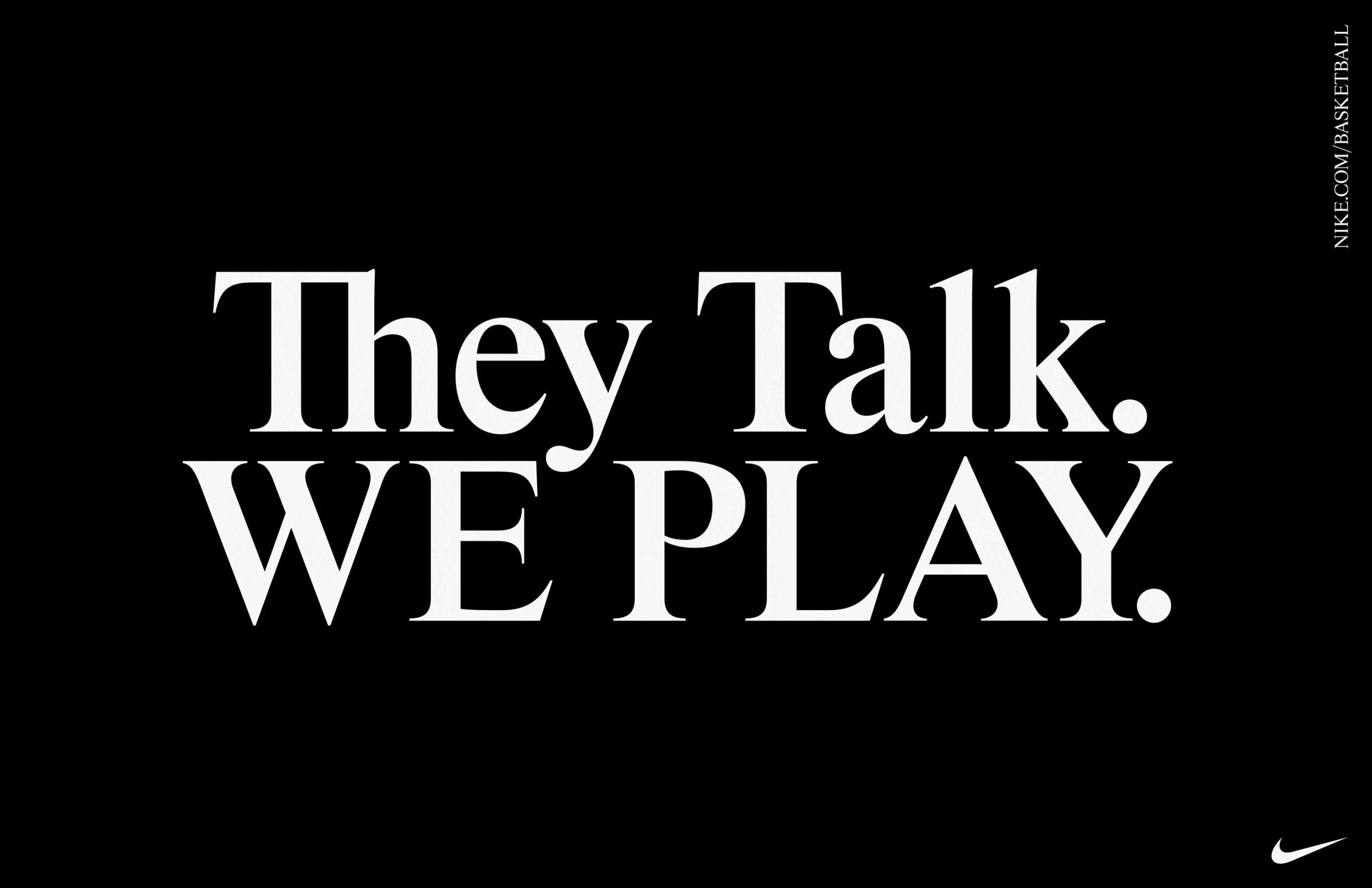
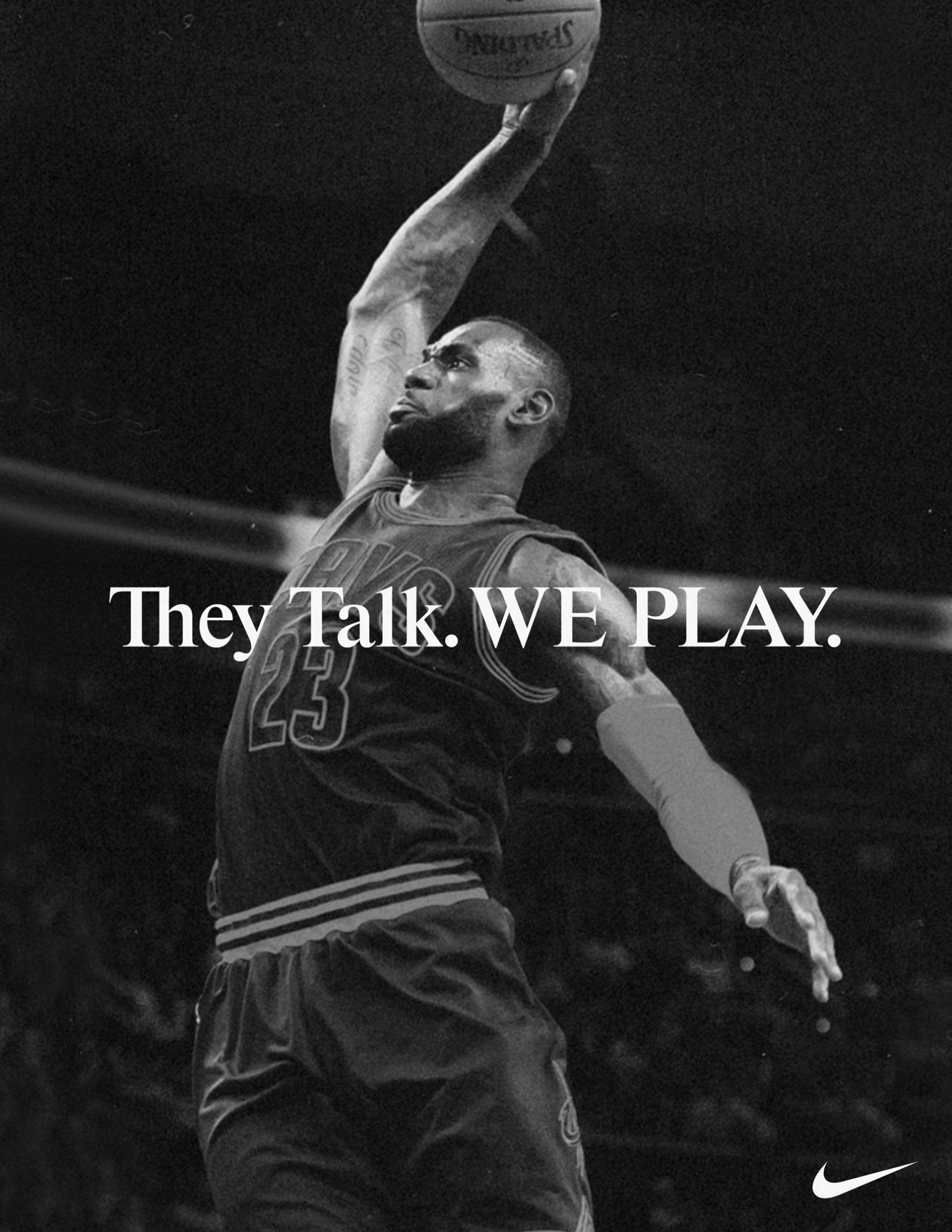
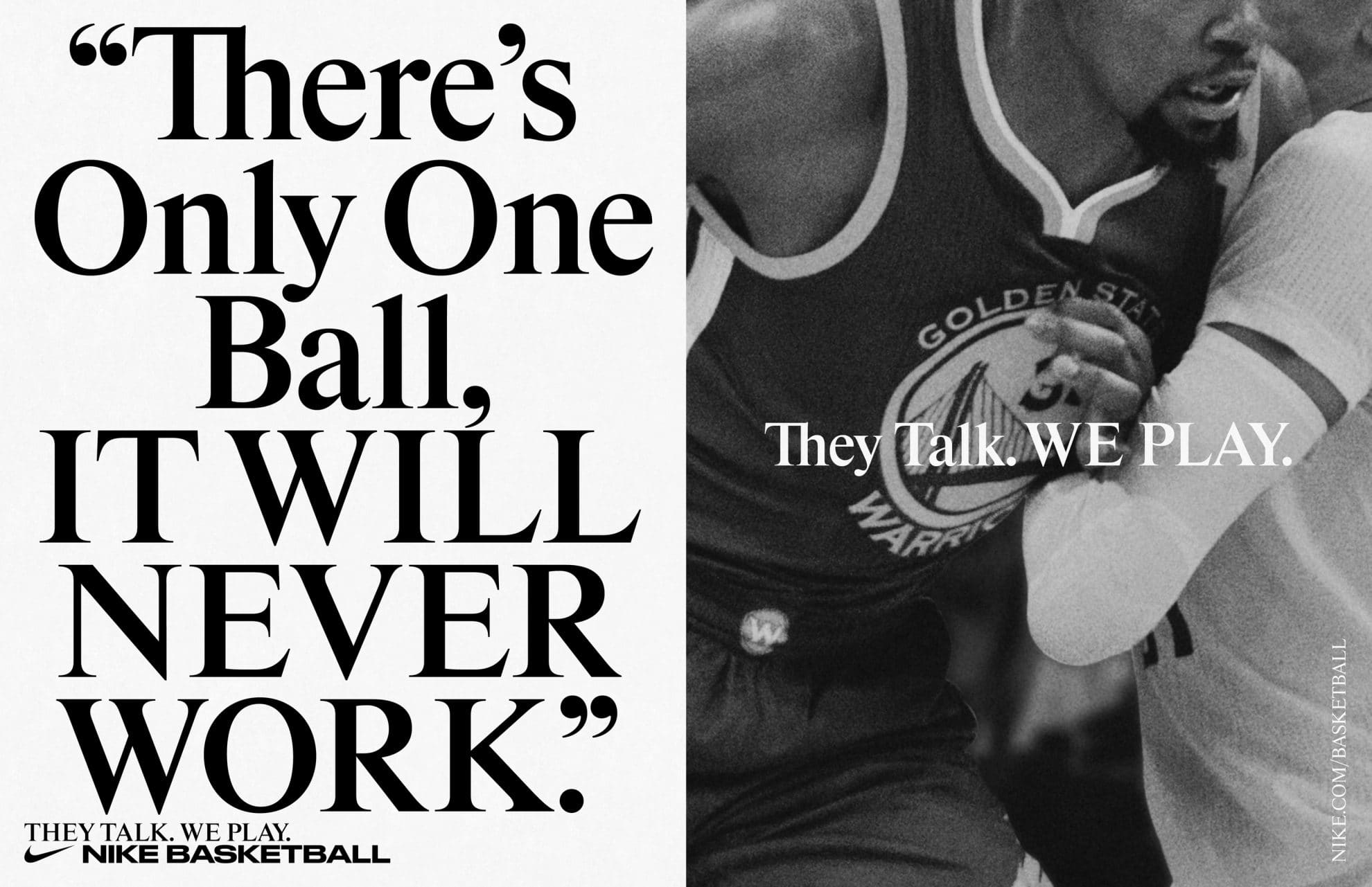
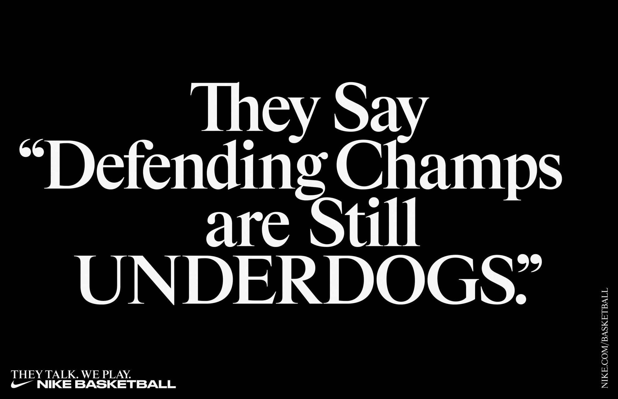
Powerful typographic campaign for Nike Basketball designed by Berlin based studios Hort and Tim+Tim.
Rhymes was built on the proportions of the original undigitized Times New Roman (Monotype, series 327, 48p) template. Specific drawings of several letters and its details come from another derivation, Times Books.
The font has a broad range of 8 weights (674 glyphs per each weight), which are especially in light styles revealing the unrecognized potential of the original Times. Rhymes is less utilitarian and robust, more display and delicate. Rather than a redesign, it is a continuation, a rhyme. — Jakub Samek
See also the Evolution project page at UMPRUM.
Source: the-brandidentity.com License: All Rights Reserved.
Source: the-brandidentity.com License: All Rights Reserved.
Source: the-brandidentity.com License: All Rights Reserved.
Source: the-brandidentity.com License: All Rights Reserved.

Source: the-brandidentity.com License: All Rights Reserved.

Source: the-brandidentity.com License: All Rights Reserved.


 on Netflix")


")


