
Pony Poindexter – Plays The Big Ones album art
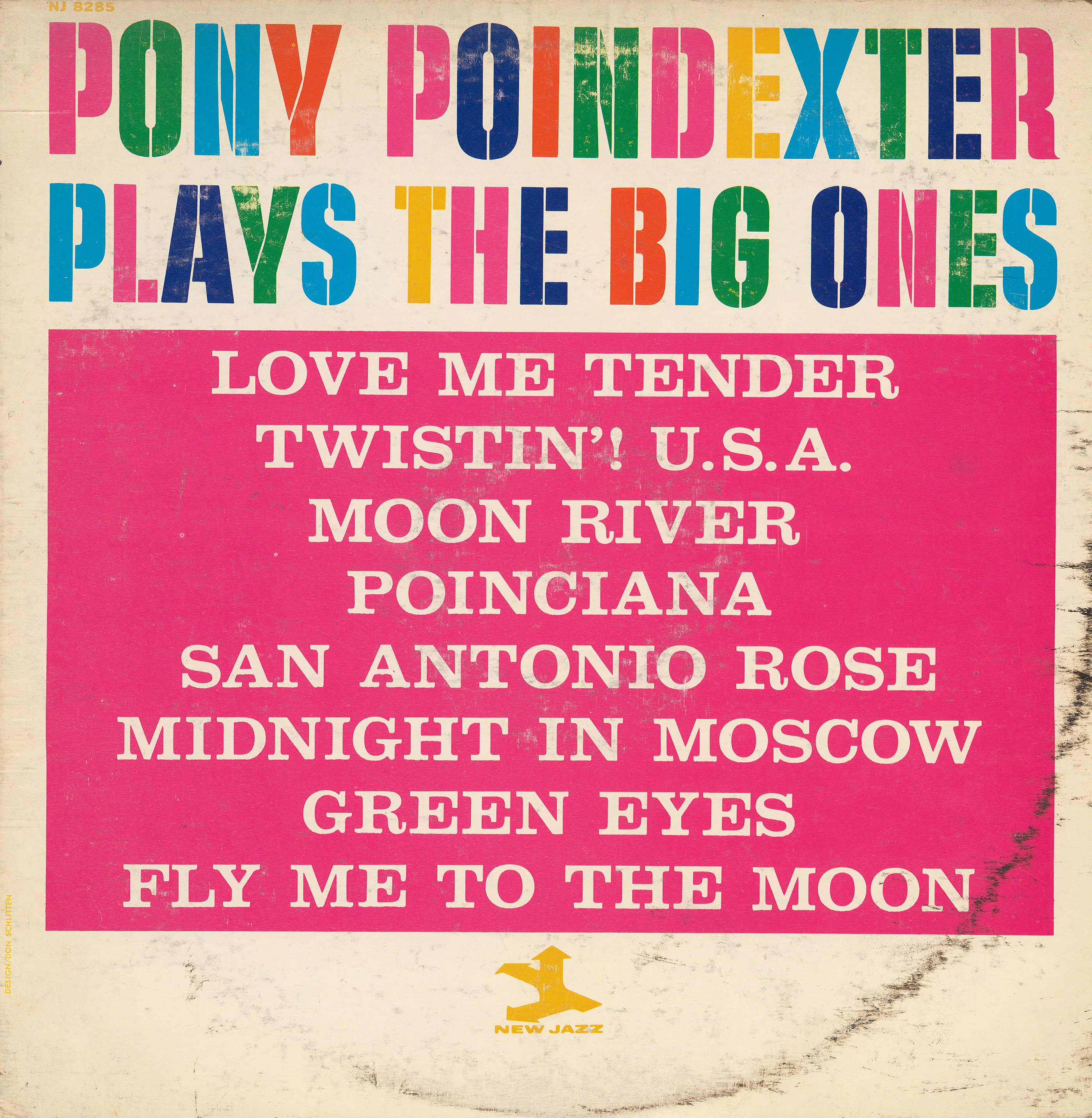
An especially colorful example for our collection of alternating glyph colors, on the cover of a record by American jazz saxophonist Pony Poindexter (1926–1988). No designer credited. From the liner notes by Juleit Lorca:
This is the first album introduding Norwood (Pony) Poindexter as a leader, and attempts to display some of the many facets of this talented artist.
Somehwat ironically, the all-caps stencil face is named Quiet. Designed in the early 1950s, it was among the first of Filmotype’s Novelty designs. It must have been quite popular, at least it appeared in the catalogs of other phototype suppliers as well, including Photo-Lettering, Inc (as Cargo Stencil Bold), VGC (as M-6), and Typeshop (as Expo). In 2010, Quiet was revived by Rebecca Alaccari and Patrick Griffin for the digital incarnation of Filmotype powered by Font Diner. The titles are printed in reverse from all-caps Craw Clarendon (ATF, 1955).


")


")


")


")


