
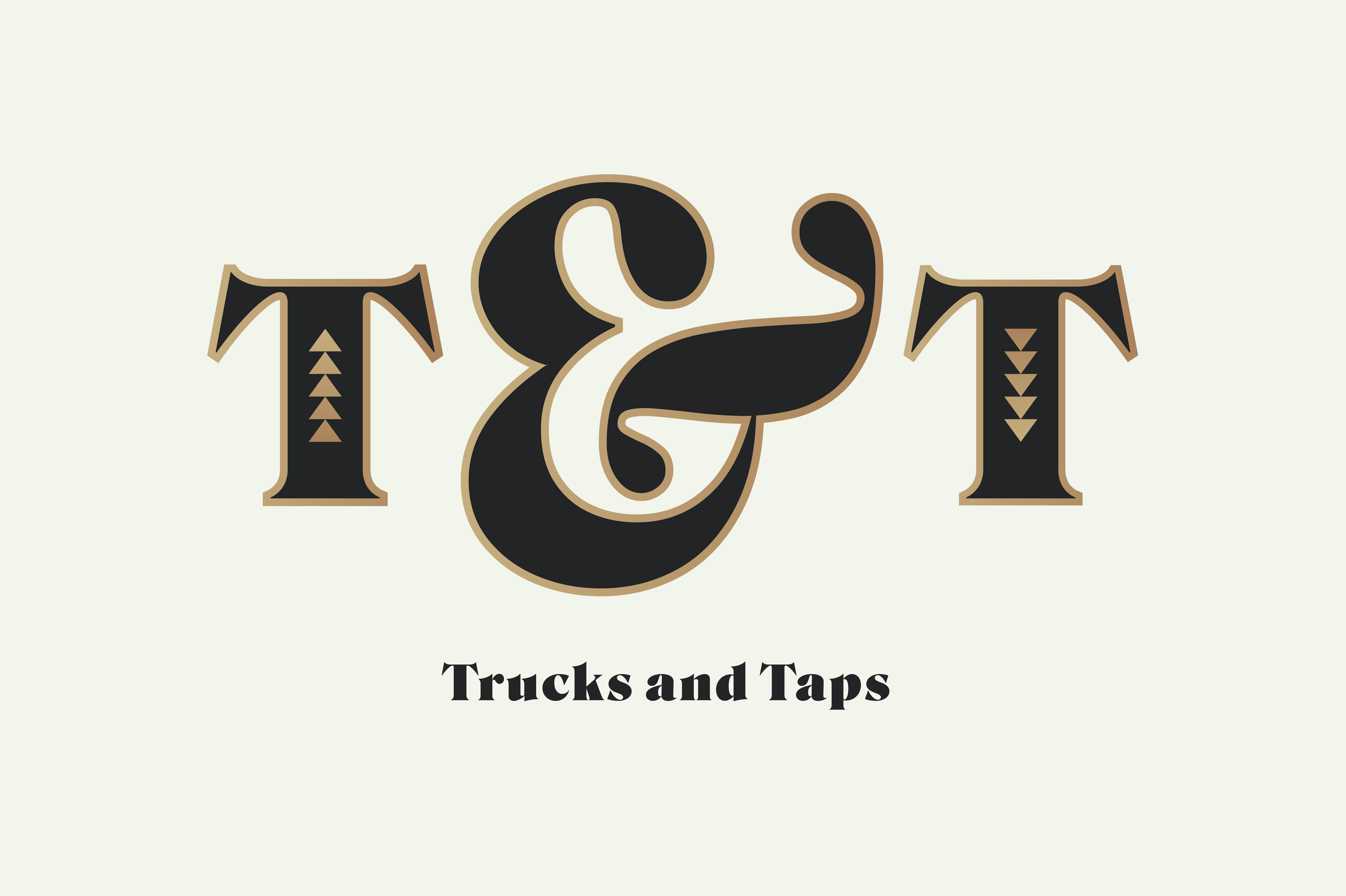
Trucks & Taps brand identity

Logo.
I was commissioned to create a brand identity for a new concept in Omaha, Nebraska called Trucks & Taps.
Trucks & Taps is a food truck hub based out of an old Sonic Drive In building. They will have a few food trucks that use the space as a permanent home and commissary kitchen, with rotating guest food trucks. Underneath the canopy of the old Sonic structure, they have created an outdoor patio space with games.
I used the font Roslindale Ultra, because I instantly fell in love with it when I saw it (and have been searching for a good fit for it ever since). Ultra is the heaviest member of the Roslindale family by David Jonathan Ross. The clients I was working with agreed on a creative brief that I had titled “Miami Retro” which had this nostalgic, retro, colorful aesthetic.
This was the final logo and brand design. The circular logo variation will be displayed on a large monument sign outdoors, and the other variations for letterheads and other printed materials.

9.5 foot by 9.5 foot monument sign.
Letterhead design.

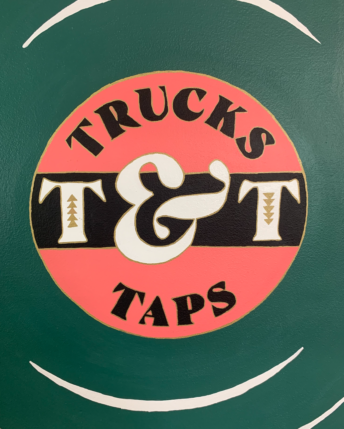
Painting on the inside of the venue.


")


