
Gosforth Park Races bus panel advert by the Newcastle Corporation Transport & Electricity Undertaking
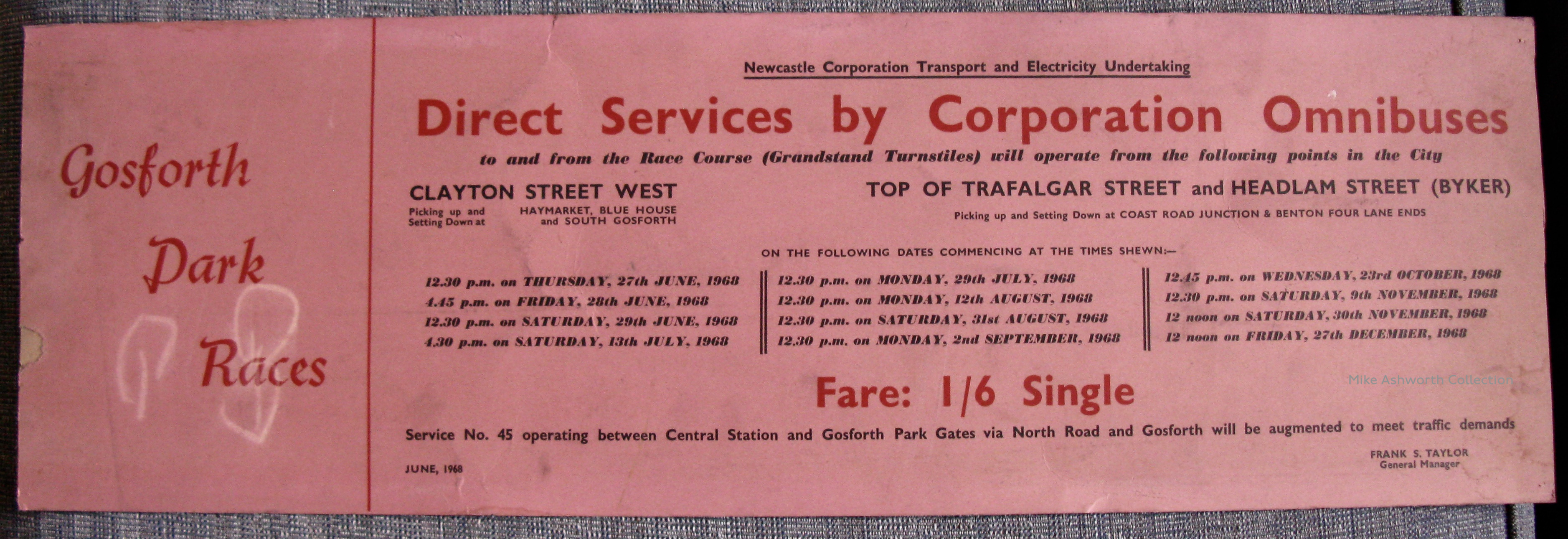
On fetching pink card an advert that would have been slotted into the runner guides on the curve of the bus upper and lower deck ceilings and that were much used by many operators both for their own notices as well as for commercial advertising. This is from 1968 and is for the special services operated by Newcastle upon Tyne’s “Corporation Omnibuses” to the Gosforth Park Races.
I’m sure that the Transport Department were amongst the last, if not the last, to use the joint “Transport and Electricity Supply Undertaking” title as they’d lost their electricity undertaking to nationalisation in 1948. I think, but not sure, that it had hung on due to the continued operation of electrically operated trolleybuses in the city until 1966 – two years before this advert appeared. I do know Newcastle were very unwilling to be ‘merged into’ the newly proposed Tyne & Wear PTE at about this time and issued adverts to that effect so I wonder if it was part of that ‘promotion’?
The typography features three typefaces by Monotype. Gill Sans and Ultra Bodoni Italic are combined with the lesser known Temple Script for “Gosforth Park Races”.
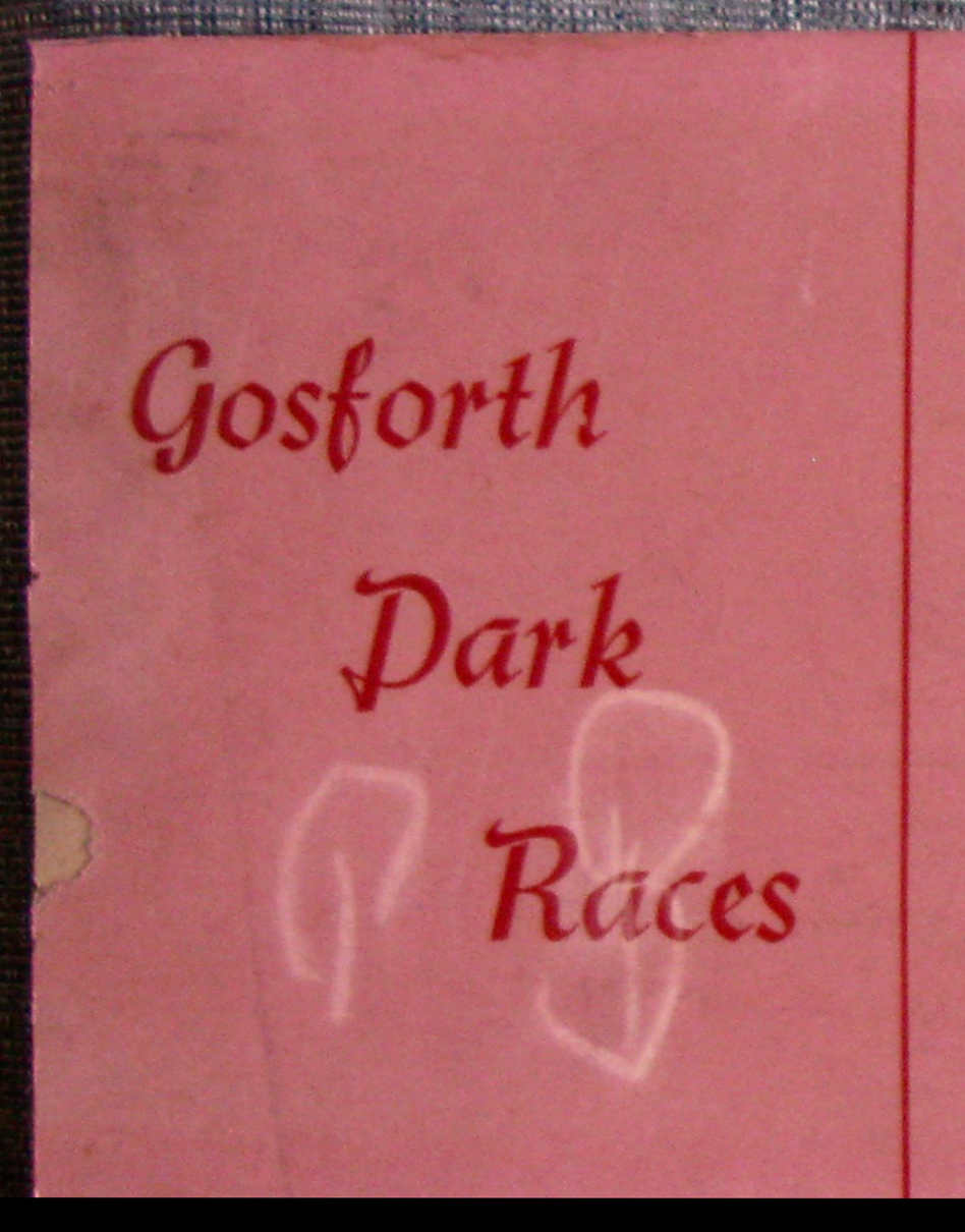
Detail.


")


")


