
Vinnetou Czechoslovak movie posters
Contributed by Florian Hardwig on Apr 25th, 2021. Artwork published in
.

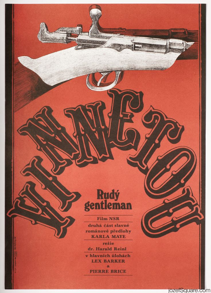
Two posters designed by Zdeněk Ziegler in 1984 for Czechoslovak screenings of Winnetou films. The German-Yugoslavian adaptations of Karl May’s novels were directed by Harald Reinl. The pale brown poster shown above is for Winnetou (1963; Czech: Vinnetou, English: Apache Gold), the red one’s for the sequel Winnetou 2. Teil (1964; Czech: Vinnetou – Rudý gentleman, English: Last of the Renegades). Both feature a pile of caps from Filmotype Quentin.


")


 movie poster")


")


")


2 Comments on “Vinnetou Czechoslovak movie posters”
Quentin gets a closer eye on Carrousel from the T.J. Lyons Collection.
It’s correct that these designs are related. As mentioned on the typeface page, Filmotype’s Quentin (late 1950s) is virtually identical to the caps of the “F” style of Davison Carousel (PLINC, before 1954). I think it’s likely that both are based on a 19th-century design. However, I haven’t found any historical evidence for that yet.
The design did exist in metal, as Vaudeville (Tri-Arts Press, 1966) and Carrousel (T.J. Lyons). But did these precede Davison Carousel? Carrousel isn’t included in T.J. Lyons’ specimen printed in 1958, which, according to Dave Greer, showed “the extent of Lyons’ antique type collection, at that time.” I can’t rule out that it’s the other way around, and that the caps of Davison Carousel F were adopted to metal type. It didn’t happen a lot, but sometimes designs originating in phototype were cut in metal. One such example is Ed Benguiat’s ITC Souvenir. Bernard Jacquet’s Jackson went from transfer type to metal and wood.
Not all fonts shown in that Lyons specimen are “Nineteenth Century Type Faces” as claimed on the title page. For example, Fontanesi as featured on this page was a contemporary release, having being designed by Aldo Novarese and first cast by Nebiolo in 1954.
What we see in Ziegler’s poster designs is probably Letraset’s Quentin or Mecanorma’s Gay Nineties, blown up. These dry transfer adaptations were distributed much more widely than the Filmotype version.