This entry is for the regular-wide upright styles of a typeface
series that originated at the Leipzig punchcutting company Wagner &
Schmidt around 1908. Available from various foundries under
different names.
First shown by Böttger in 1908 (mager)
and 1909 (halbfett, fett) under the generic name (Breite)
Grotesk. Sold by Ludwig
Wagner as Neue moderne Grotesk in four weights,
with the boldest one also known as Reichs-Grotesk.
Perhaps best known under the name Aurora-Grotesk I–IV
used by Weber, or
Cairoli by Nebiolo. Haas cast it as
Accidenz-Grotesk (later spelled
Akzidenz-Grotesk) in the 1910s, added a fifth medium
(“normal”) weight in 1943, and reworked the design in 1954, see
Normal-Grotesk.
Also known as Grotesk breit (2 wts)/Grotesk
modern (3 wts) (AG für
Schriftgießerei u. M.), Grotesk (Numrich),
Grotesk P
(Böttger, later
Berthold),
Germania-Grotesk (Roos &
Junge, 2 wts), Lithographen-Grotesk (Brötz &
Glock, 3 wts), Salon-Grotesk (Hoffmeister, later Stempel), Viktoria (John), Gudrun (Kloberg, 2 wts), Wotan-Grotesk
(Norddeutsche/Johannes
Wagner), Edel-Grotesk (Johannes
Wagner), Planeta-, Saturn-, Jupiter-,
Neptun-Grotesk (Schriftguss, before 1921), Moderne
Grotesk (Rühl), Reform
Grotesque (Tech), Klassische
Grotesk (Trennert),
Favorit-Grotesk (Weisert), Scania Grotesk (Berling, 2 wts),
Doria-Grotesk (Karl
Brendler, 2 wts), Etruria (FTC), Grotesca estrecha (Fundición Tipográfica Nacional), Grotesca
Ideal (Gans),
Helios (Idźkowski, 3 wts), Elite-Grotesk
(Poppelbaum), Ronsard (Warnery),
Ostiglia (Fondografica, fett only). [Wetzig 1926–40] [Reichardt 2011] [Kupferschmid
& Müller] Poppelbaum and Nebiolo had
Greek caps for the Light.
Series: regular-wide uprights | bold
extended | light/medium extended | compressed | bold
condensed | extrabold condensed | italics | open.
Phototype adaptations (4 weights) are shown in Berthold’s
E1 (1974, Aurora-Grotesk; in the E3 from
1982 with Johannes
Wagner credit) and by Typeshop (Aurora)
[Typeshop c. 1977].
Neue Moderne Grotesk FSL (Forgotten Shapes, 2020) is a faithful digitization in
5 weights with roman and italic
styles. Other, less direct digital interpretations include
Pennypacker (CJ
Type, 2021), Dada
Grotesk (More…
This entry is for the regular-wide upright styles of a typeface series that originated at the Leipzig punchcutting company Wagner & Schmidt around 1908. Available from various foundries under different names.
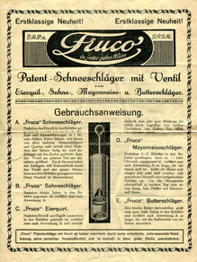
First shown by Böttger in 1908 (mager) and 1909 (halbfett, fett) under the generic name (Breite) Grotesk. Sold by Ludwig Wagner as Neue moderne Grotesk in four weights, with the boldest one also known as Reichs-Grotesk. Perhaps best known under the name Aurora-Grotesk I–IV used by Weber, or Cairoli by Nebiolo. Haas cast it as Accidenz-Grotesk (later spelled Akzidenz-Grotesk) in the 1910s, added a fifth medium (“normal”) weight in 1943, and reworked the design in 1954, see Normal-Grotesk.
Also known as Grotesk breit (2 wts)/Grotesk modern (3 wts) (AG für Schriftgießerei u. M.), Grotesk (Numrich), Grotesk P (Böttger, later Berthold), Germania-Grotesk (Roos & Junge, 2 wts), Lithographen-Grotesk (Brötz & Glock, 3 wts), Salon-Grotesk (Hoffmeister, later Stempel), Viktoria (John), Gudrun (Kloberg, 2 wts), Wotan-Grotesk (Norddeutsche/Johannes Wagner), Edel-Grotesk (Johannes Wagner), Planeta-, Saturn-, Jupiter-, Neptun-Grotesk (Schriftguss, before 1921), Moderne Grotesk (Rühl), Reform Grotesque (Tech), Klassische Grotesk (Trennert), Favorit-Grotesk (Weisert), Scania Grotesk (Berling, 2 wts), Doria-Grotesk (Karl Brendler, 2 wts), Etruria (FTC), Grotesca estrecha (Fundición Tipográfica Nacional), Grotesca Ideal (Gans), Helios (Idźkowski, 3 wts), Elite-Grotesk (Poppelbaum), Ronsard (Warnery), Ostiglia (Fondografica, fett only). [Wetzig 1926–40] [Reichardt 2011] [Kupferschmid & Müller] Poppelbaum and Nebiolo had Greek caps for the Light.
Series: regular-wide uprights | bold extended | light/medium extended | compressed | bold condensed | extrabold condensed | italics | open.
Phototype adaptations (4 weights) are shown in Berthold’s E1 (1974, Aurora-Grotesk; in the E3 from 1982 with Johannes Wagner credit) and by Typeshop (Aurora) [Typeshop c. 1977].
Neue Moderne Grotesk FSL (Forgotten Shapes, 2020) is a faithful digitization in 5 weights with roman and italic styles. Other, less direct digital interpretations include Pennypacker (CJ Type, 2021), Dada Grotesk (Optimo, 2005), Slavia (Superior Type, 2018), Cairoli Classic, Cairoli Now (Italiantype, 2020), and RMU Royal Sans (RMU, 2021). Also influenced Scout, Woolworth, and Metodo.


