
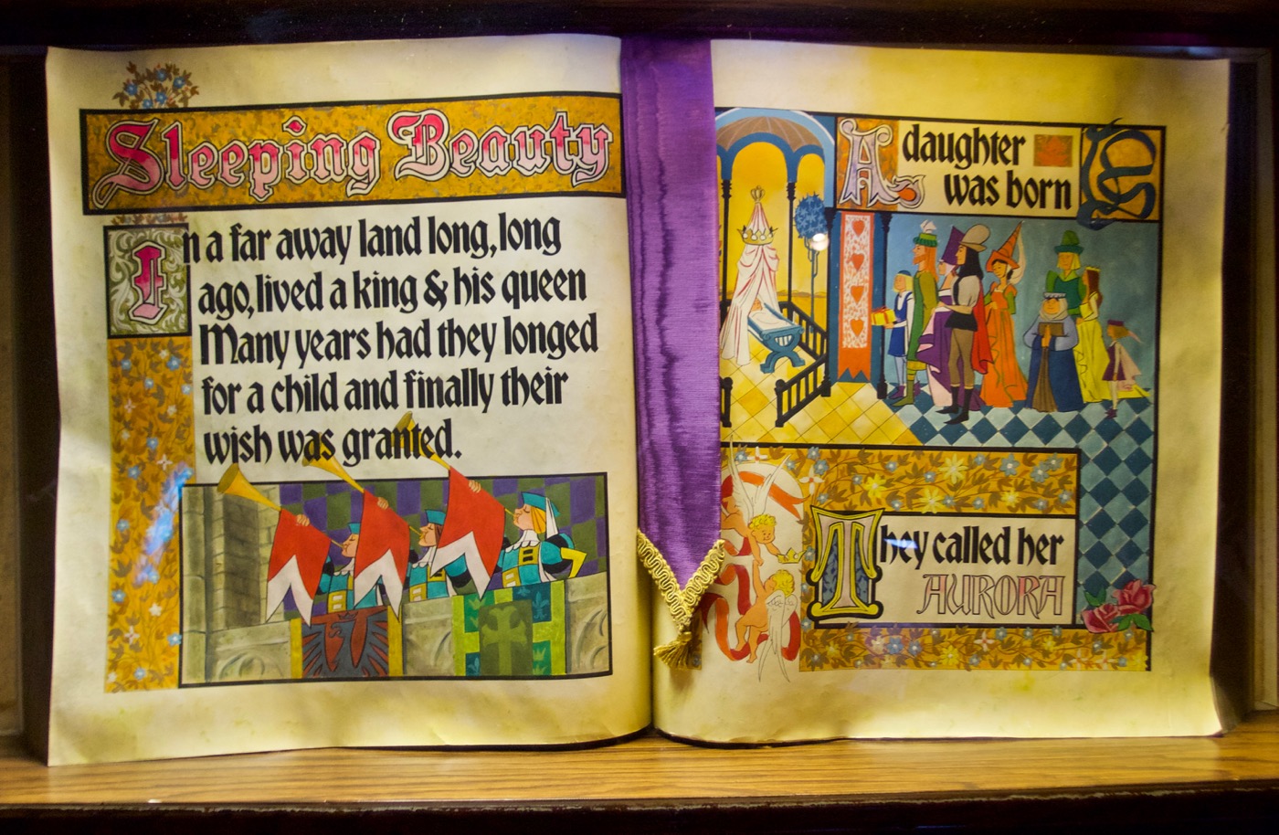
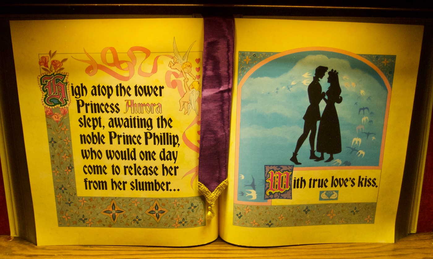
Sleeping Beauty Castle Storybook
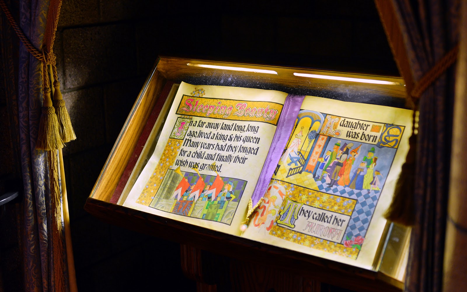
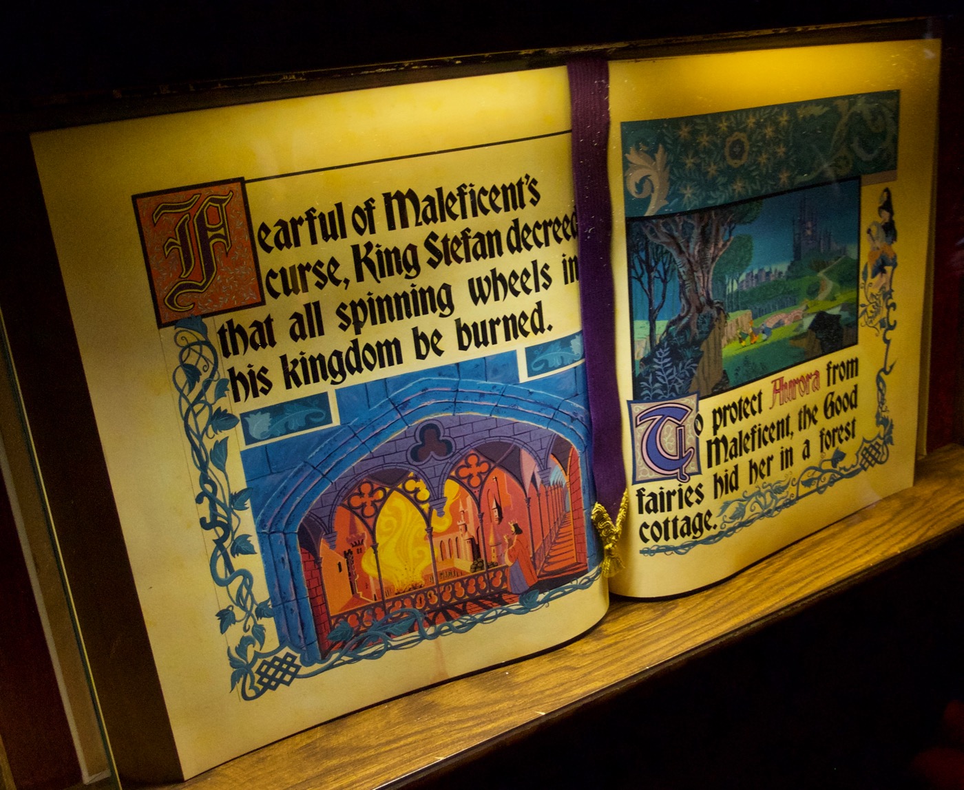
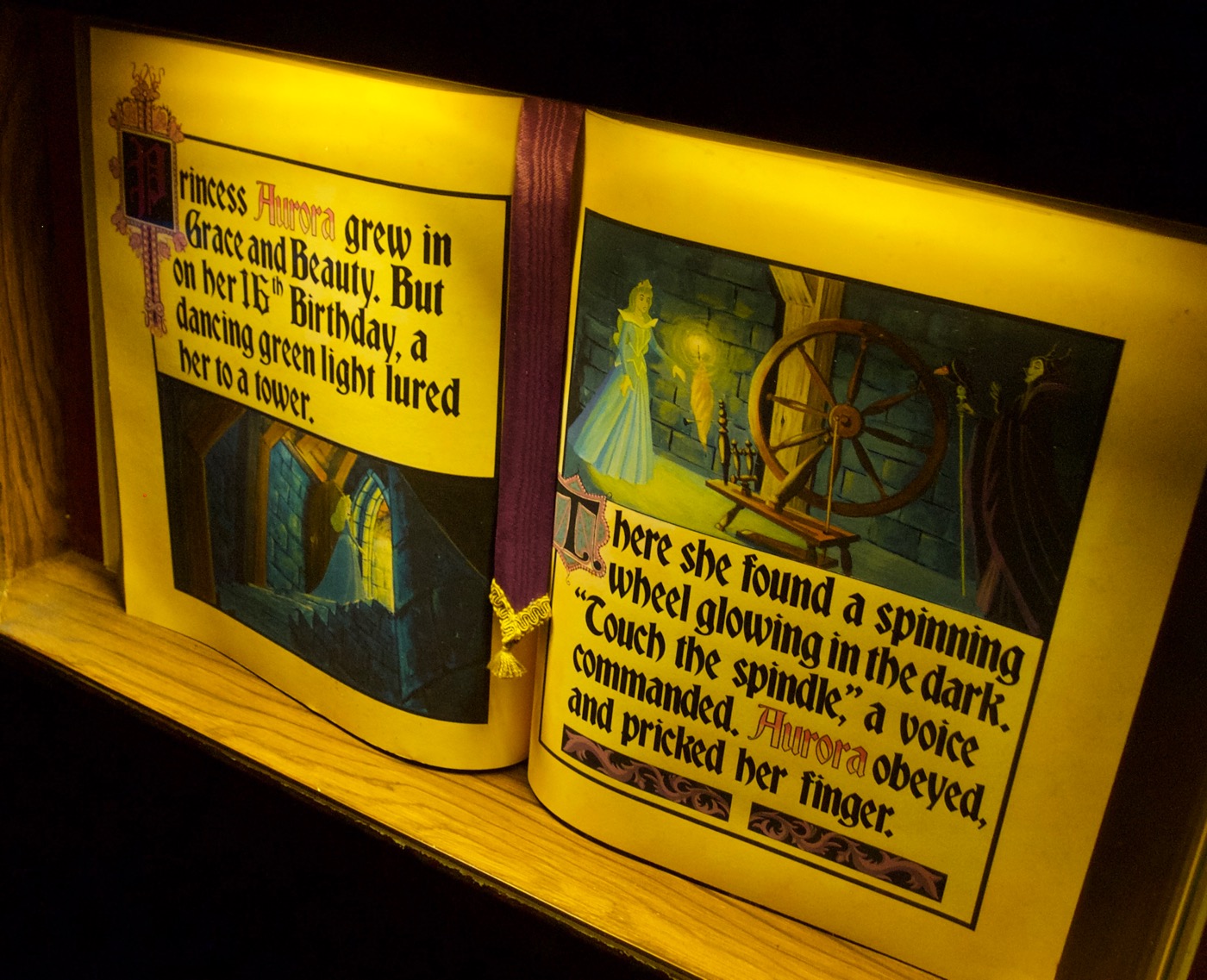
From its logo to park signage and decoration, Disneyland is strongly associated with various styles of fraktur, particularly simplified and romanized versions of the style that are more palatable to those unfamiliar with traditional blackletter. Bradley is one of the typefaces used frequently throughout the park, especially in Fantasyland. It plays a starring role in Disneyland’s castle centerpiece, wherein the story of Sleeping Beauty is told through several dioramas, along with book displays. The walk-thru was originally designed in the style of Eyvind Earle, production designer for Disney’s 1959 film Sleeping Beauty, including books with hand calligraphy. After various changes to the castle interior over the years, Earle-style dioramas returned in 2008. I assume that’s when these new books appeared, typeset primarily in Bradley.
The central character’s name, Aurora, is set in an outlined version of the typeface (which was one of the styles released early on in 1897) and given a color gradient treatment. The “Sleeping Beauty” title and illuminated initials use Italian Black and hand lettering or other typefaces.
There are many half-hearted revivals of Bradley, and it’s not clear which one (if not their own proprietary version) Disney uses. Among many other differences, the original metal typeface featured caps that dipped below the baseline to feel vertically centered with the lowercase (in all but the smallest sizes: 6 and 8 point). Disney’s font does not have this distinction, instead sporting a common baseline, like all the amateur digitizations do. Fortunately, there is now a proper revival of the typeface designed by David Jonathan Ross: Bradley DJR.


")


")


")


")


")


3 Comments on “Sleeping Beauty Castle Storybook”
In another entry I’ll share examples of other attractions in Fantasyland, but here’s Bradley appearing again on a sign just outside Pinocchio’s Daring Journey.
Bradley doesn’t always do well in all caps, but it’s tolerable in this instance.
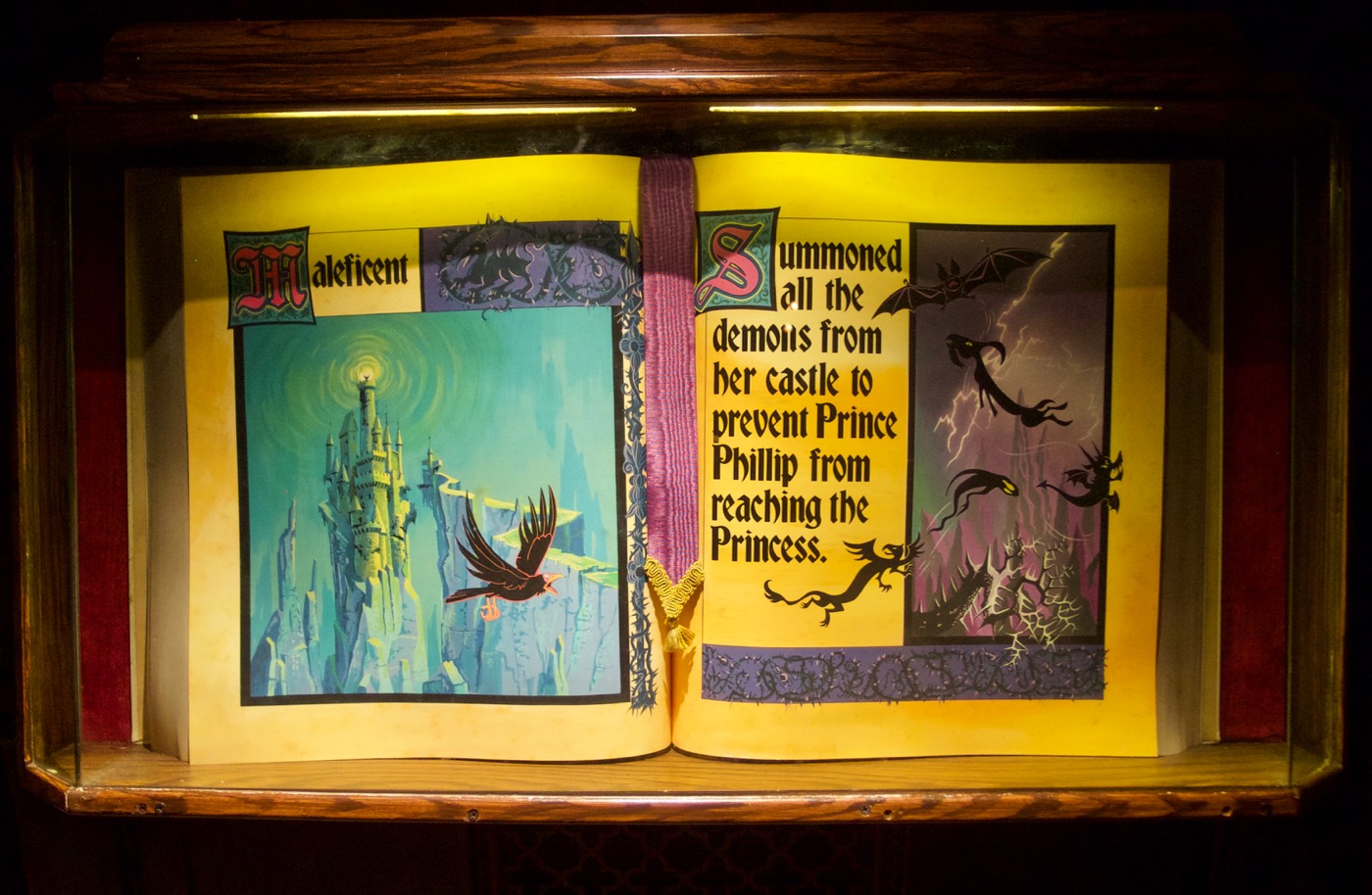
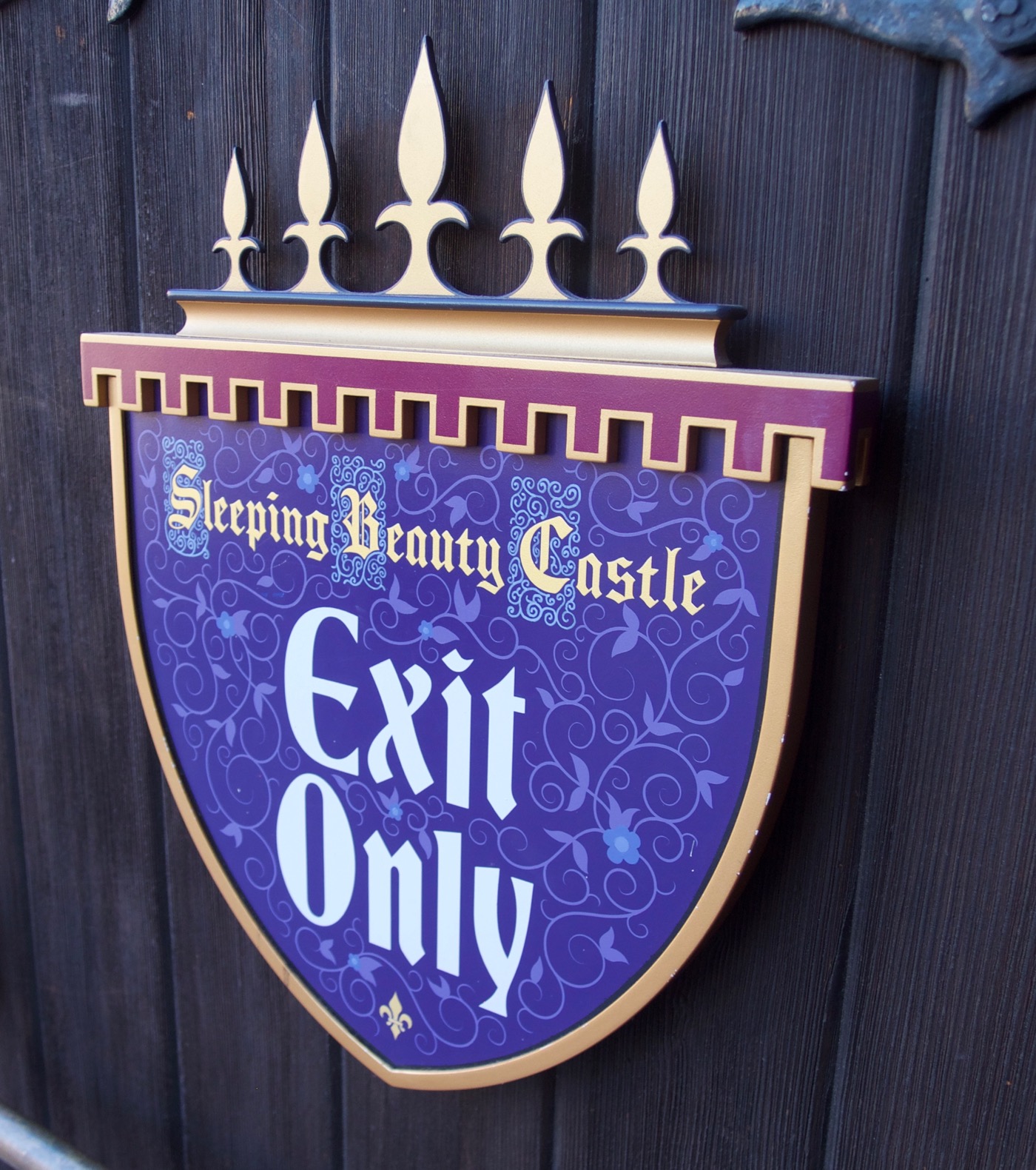
This post focuses on Bradley. For those who wonder about the other fonts used for the Sleeping Beauty Castle: The book’s title (shown in the first two images) and some of the initials are in Italian Black Ornamented AKA Pamela. The Corridor of Goons (not pictured here) uses Duc de Berry. I couldn’t find a match for the font used in the logo on the main sign (also shown in the last picture) – some of its letterforms are similar to Manuskript-Gotisch.
Thanks, Florian! Added Italian Black Ornamented to the main text.