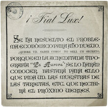
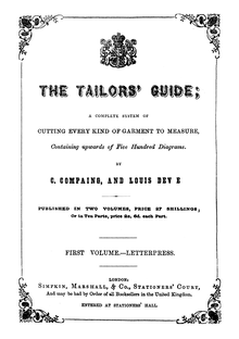
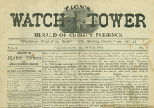
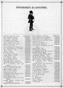
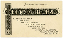
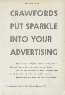
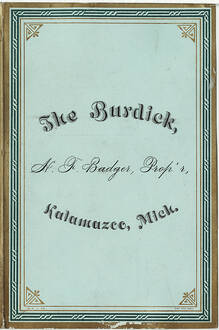
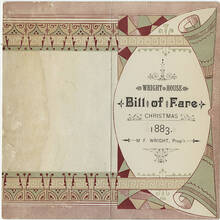
This is a generic grouping for 19th-century English and Scottish
derived typefaces with strong contrast, vertical stress, and
bracketed serifs. Until the early 1900s most English-speaking
foundries called these simply Roman, Light Face, Modern, Scotch,
or listed them with numbers, not names. They evolved into named
faces like Century
Expanded and De
Vinne (used for this sample). Today, the term “Modern”
has come to be applied to faces with higher contrast, and “Scotch”
for type with lower contrast, but these distinctions were not
standardized at the time. (See De Vinne’s 1885
description and
comments.)
Monotype had four families in the category, first called
Old Style and then Scotch Roman:
Series 36 (1903), 43, 46 (1906), and
137 (1920), which the most faithful
recutting More…
This is a generic grouping for 19th-century English and Scottish derived typefaces with strong contrast, vertical stress, and bracketed serifs. Until the early 1900s most English-speaking foundries called these simply Roman, Light Face, Modern, Scotch, or listed them with numbers, not names. They evolved into named faces like Century Expanded and De Vinne (used for this sample). Today, the term “Modern” has come to be applied to faces with higher contrast, and “Scotch” for type with lower contrast, but these distinctions were not standardized at the time. (See De Vinne’s 1885 description and comments.)
Monotype had four families in the category, first called Old Style and then Scotch Roman: Series 36 (1903), 43, 46 (1906), and 137 (1920), which the most faithful recutting of Miller & Richard’s Old Roman.
Monotype’s digital Scotch Roman is based on Series 46, a “clumsy adaptation”. Miller (Font Bureau) is a closer follower of the older Scotch models. [Mosley]


