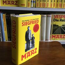
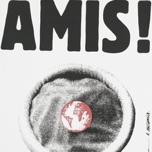
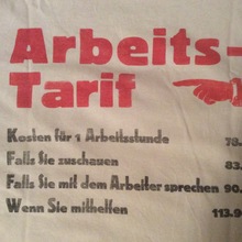
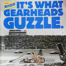
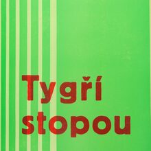
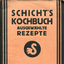
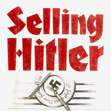
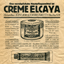
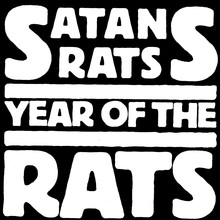
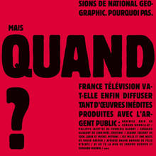
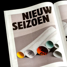
Released in six styles;
Reklameschrift Block (bold, 1908),
halbfett (regular, 1913),
mager (light, 1913, credited to L. Oppenheim, also cast by Ardinghi),
schmal (condensed, 1920),
schwer (heavy, 1920), Kursiv (italic, 1927), eng (compressed,
before 1927) [Reichardt
2011] [VdS]. The
inclusion of various width alternates and ligatures helped to
justify a block of text, hence the name. [H. Hoffmann: Das Haus Berthold
1858–1921] At least four weights were also made in Cyrillic
versions (1921–26) [Wetzig
1926–40] Also available in
steel, and, in bigger sizes, in wood.
Hochblock
(“High Block”, 1926) is a variant with enlongated caps and
ascenders. Graublock
(“Grey Block”, 1929) is a hatched version. Berthold used the
established name also for other unrelated styles, like
Block-Fraktur and Block-Signal.
Berliner
Grotesk (1913) is a related lighter weight, and was
advertised together with Block.
Halbfette Block is essentially a bold companion to
Berliner Grotesk (see e.g. the ‘g’), and is sometimes
listed as such. The mager was available with “Schlagerbuchstaben”
with filled in counters for ‘a’ and ‘o’.
Blok Apis is a copy of the eng, cast as part of
Idźkowski’s
Blok series which additionally comprised three styles
of Hermes-Grotesk.
For similar but unrelated series, see also Block
(Poppelbaum), Werbeblock,
Lichte
Block, Hermes-Grotesk
by Woellmer (later Schriftguss), Neue Block
by Scholz, and Freihand-Groteske
by Krebs.
Digital versions More…
Released in six styles; Reklameschrift Block (bold, 1908), halbfett (regular, 1913), mager (light, 1913, credited to L. Oppenheim, also cast by Ardinghi), schmal (condensed, 1920), schwer (heavy, 1920), Kursiv (italic, 1927), eng (compressed, before 1927) [Reichardt 2011] [VdS]. The inclusion of various width alternates and ligatures helped to justify a block of text, hence the name. [H. Hoffmann: Das Haus Berthold 1858–1921] At least four weights were also made in Cyrillic versions (1921–26) [Wetzig 1926–40] Also available in steel, and, in bigger sizes, in wood.
Hochblock (“High Block”, 1926) is a variant with enlongated caps and ascenders. Graublock (“Grey Block”, 1929) is a hatched version. Berthold used the established name also for other unrelated styles, like Block-Fraktur and Block-Signal. Berliner Grotesk (1913) is a related lighter weight, and was advertised together with Block. Halbfette Block is essentially a bold companion to Berliner Grotesk (see e.g. the ‘g’), and is sometimes listed as such. The mager was available with “Schlagerbuchstaben” with filled in counters for ‘a’ and ‘o’.
Blok Apis is a copy of the eng, cast as part of Idźkowski’s Blok series which additionally comprised three styles of Hermes-Grotesk.
For similar but unrelated series, see also Block (Poppelbaum), Werbeblock, Lichte Block, Hermes-Grotesk by Woellmer (later Schriftguss), Neue Block by Scholz, and Freihand-Groteske by Krebs.
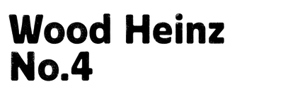
Digital versions include Berthold’s (eight styles, lacking the mager, but adding one weight and two italic/oblique styles, derived from the film version), URW’s (1994, aka Rund No1, five styles, discontinued), Gothic 821 (Bitstream, Condensed only), Bloc (ParaType) (Tagir Safayev, 1997, three weights with Cyrillics), Informal Black (Keystrokes/Monotype, Heavy in two widths only). None of them have the extras of the original. Halbfette Block was revived by Erik Spiekermann as Berliner Grotesk Medium (Berthold, 1979). Bannertype (Wiescher, 2013) is a weathered version of the Condensed. Amsi (Stawix, 2015) is based on the Condensed and expands the design into three widths and 49 styles.


